A common misconception is that branding is all about your logo.
While it is a massively important visual element of your brand (and deserves your special attention), it isn’t the end-all-be-all of building a strong visual brand.
You need more than a logo to become a recognizable, memorable brand.
Your logo will help your target audience understand who you are at a quick glance, but you also need to pair it with other thoughtful design choices.
Think about McDonald’s. We know them for their big arched logo, but there are many other design decisions that went into their overall visual brand. Each design choice had a purpose.
They chose the basic primary colors of red and yellow because they wanted their signs to stand out to weary travelers on the road. Their font is also very easy to read, even from afar. This was done for the purpose of being clear rather than being trendy.
Other well-known logos – like Nike, Spotify, Netflix, and Google – use the same principles of design. How do you learn from these successful visual brands? That’s what we’ll talk about in the rest of this blog post.
How do I craft a long-lasting visual brand?
It comes down to a few key factors. We already mentioned your logo, but here are a few other visual elements that are worth creating:
Moodboard
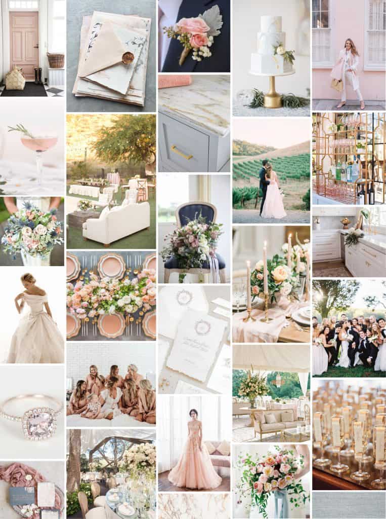
This is one of my absolute favorite parts of the whole visual branding process! It is usually a highlight for my clients, too. Most of us have seen moodboards floating around Pinterest before, but how do you go about creating your own?
There are a few easy-to-download templates on Pinterest if you want to DIY your own, but I highly recommend waiting on this step when you are working with a designer. If you start the process too early, you may find it difficult to fit the work you’ve already done into the designer’s process.
Since you can create your own moodboard on Pinterest, what are the benefits of crafting it with a professional designer? When you put together your own moodboard, you may not know how to put images together, pull out certain colors and textures, or know how specific pins fit together.
Designers have a trained eye to look through your Pinterest board and see the message your pins are communicating. I have had conversations with clients where we talk through what I see in their Pinterest boards, and they can’t believe how unspoken elements of their brand were coming through in just a few lifestyle photos!
It’s good to note that every designer has a different moodboard process. Mine comes at the very beginning of my visual branding process so I have a clear idea of how to move forward with each client’s logo design.
Once you have a beautiful moodboard that feels just like you, you can start to pull out colors from the moodboard to assemble a custom color palette.
Color palette
There are so many nuances to creating a cohesive color palette, and we only have so much time to go over them in this blog post. The reason why creating a color palette is so important is that most brands use more than one color.
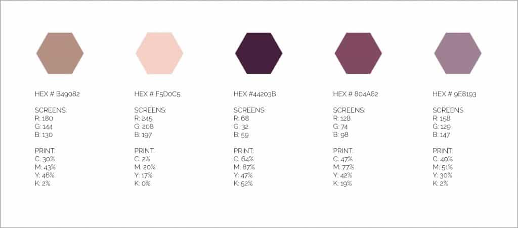
Even if your brand primarily uses black and white, it’s very common to see more than one accent color. But how do you know which accent colors work well together?
This is usually a question for a professional designer because they have an extensive background in understanding the color theory (yeah, there is an actual theory behind all of this!), but this post can help you understand more in the meantime.
For an example, let’s take a peek at my website. I use a rich, deep navy color along with a soft gold and blush pink. These choices were made because the gold and pink colors speak to my audience of wedding professionals and photographers who have a feminine flair, but I also added a dark navy color to ground the lighter colors.
Your visual branding will be completely different, but take a moment to look at some of your favorite brands and try to pick out the colors you see them use often. Chances are that the colors are in the brand creator’s color palette!
Fonts
There’s nothing designers love more than a beautiful typeface! I could get lost in a sea of fonts all day and not even be sad about it. Finding fonts you love is not usually an issue, but finding fonts that pair well together can be a bit tricky.
When do you choose a serif over a san-serif font? Should you also include a script or calligraphy font? What about hand lettering your own font? There are so many font choices to make when you are creating a full visual brand, but working with a designer will help you narrow down your selections.
Each font evokes a specific emotion. Calligraphy fonts usually transport us back in time while bold fonts with straight lines give us a modern, clean, minimal feel. Handlettered fonts feel perfectly imperfect while serif fonts feel high-end and remind us of newspapers and magazines.
Because many entrepreneurs create logos that highlight these signature fonts, it’s really important to intentionally select the right fonts your first time around. Trying to tweak your fonts down the road is a difficult process, and you may find yourself feeling like you need to redo your whole visual brand for only one tweak.
I’ll help you sift through the confusion as we find the perfect, most swoon-worthy font pairings to elevate your visual brand. It doesn’t matter if you are looking for an inviting, inclusive look or a high-end, boutique flair – we can create a visual brand that evokes the right emotion every time!
Brand Style Guide
Once you have created all of the visual elements above, you can put them together in a brand board. Some people call this your “branding guidelines” while others call it your “brand style guide”. It all means the same thing!
When you create a brand board, you are essentially presenting all of your visual brand elements in one easy-to-use format. This brand board can be shared with your collaborators, employees, and anyone else who may need this resource.
It can be especially helpful for team members who may touch your design. If you have a virtual assistant (VA) or a designer who is on-call, your brand board will help them understand your visual brand at a quick glance. It saves you from having to answer questions about what fonts and colors to use because everything is there on the brand board.
Here’s a peek at two of my favorite brand boards:
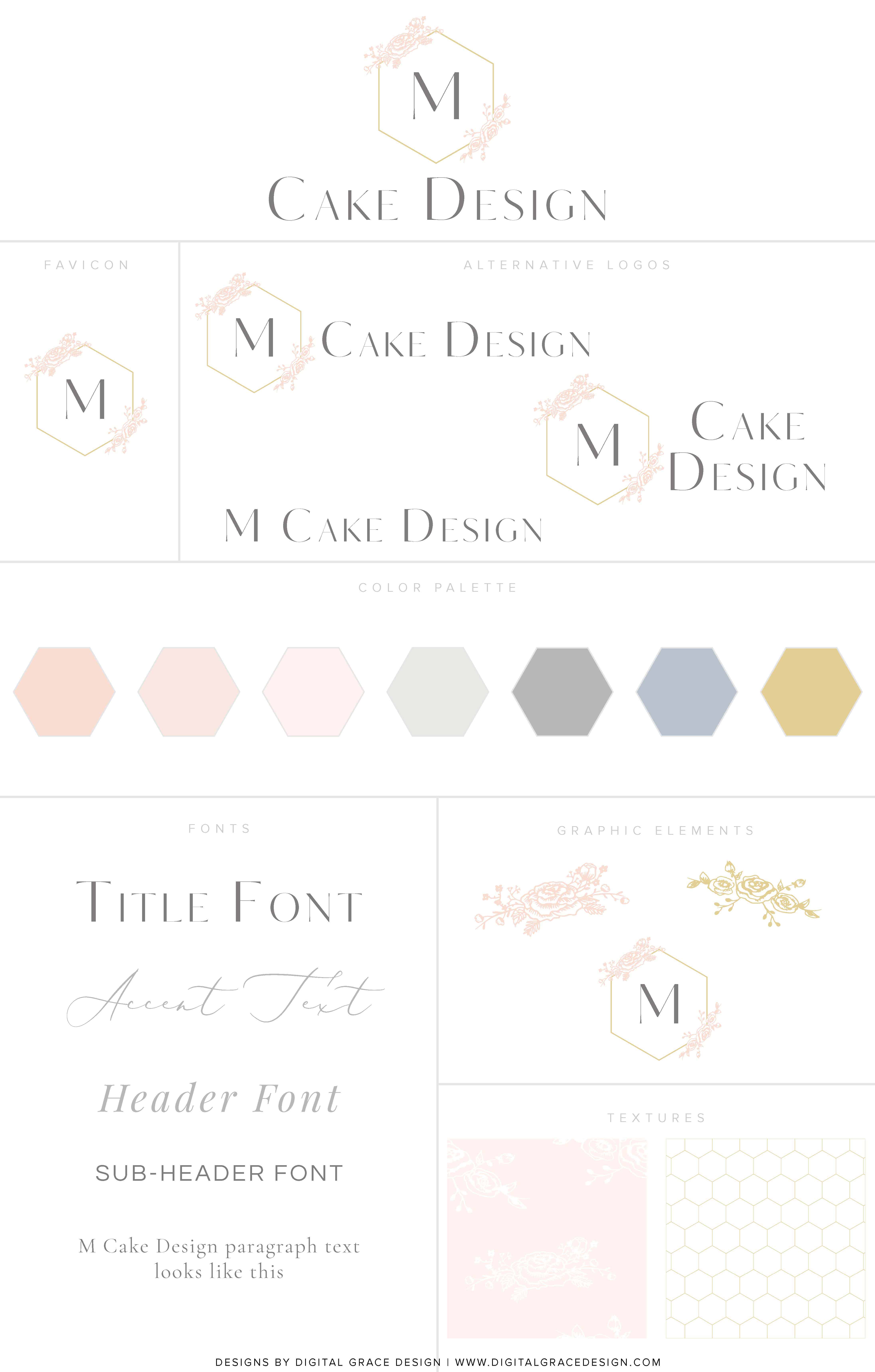
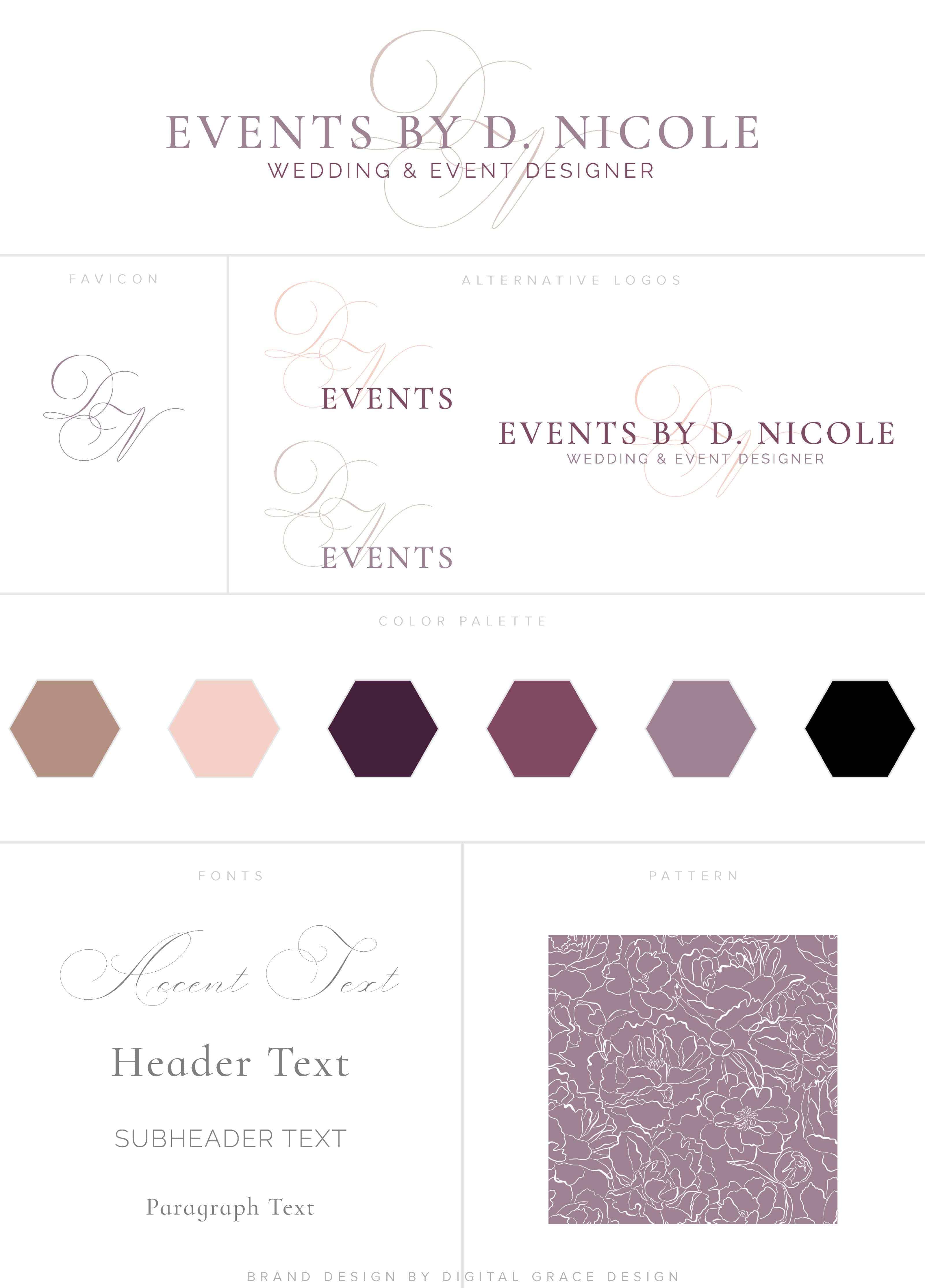
You’ll notice that each visual brand is completely unique, even though they both are wedding professionals. Just because you are in the same industry doesn’t mean your brand board should look the same!
The more your visual brand stands out, the better! That doesn’t necessarily mean you have to go with bold fonts and neon colors. You can make a statement in many other ways.
Closing thoughts on successfully creating a visual brand
By now, you know that a visual brand is created from a place of purpose and intention. If you only choose what you think is “pretty”, you run the risk of having to refresh your visual brand every year or so when you grow tired of it.
I don’t want the same for you!
That’s why it can be so beneficial to go through an in-depth visual branding process. You’ll have the time and space to answer deep brand foundational questions, uncover what your audience wants, and put all of your elements together to create a truly unique brand identity.
As you consider if it’s the right time to rethink your visual branding, it’s best to keep these tips in mind. That way, you don’t rush the process or forget the most important aspects of branding before you begin.
(This is the kind of advice I’d share with you if we were talking like longtime friends over coffee. I’d be sipping on iced coffee. How about you?)
Don’t only choose visual brand elements you love. Of course, it is important for you to like your visual brand, but it’s even more important that your audience connects with it. After all, you are trying to appeal to your customers with your visual branding. If you love big, bold lettering but your customers love loopy script calligraphy, you may need to compromise between your style and theirs. This can be a delicate balance, so I’ll help you walk through this process!
Make ample room on your calendar for the branding process. It takes time to create a longlasting brand with staying power. Your initial time investment will really pay off when you realize you don’t have to tweak your logo every few years. That’s the goal of everything we create at Digital Grace Design!
Don’t ask for feedback from everyone you know. Then you’ll have too many cooks in the kitchen! I know it can be tempting to get your best friend’s advice along with feedback from everyone in your immediate family, but they don’t know your ideal client as you do. It might be better to ask people who fit your ideal client description what they like (and don’t like!) so you know how to proceed.
Know when it’s time to hire a professional. If you’ve been operating in your business for a couple years under a DIY logo that doesn’t seem to speak to your target audience today, that’s usually a good sign to invest in a more comprehensive visual brand. It can also be helpful to have someone outside of your brand to create a visual brand identity that feels true to you while thinking outside-the-box. Ready to get started? Let’s hop on a 15-minute call to chat through your vision!