Have you ever been to a website that just felt like home?
Maybe you thought to yourself, “Can I just live in this website? It’s so pretty!”
That’s when you know you’ve found a great one! So how can we create better websites that give our ideal clients this feeling as soon as they land on our homepage?
Since your homepage is often your most visited page, it’s an important page to optimize. Many of your first-time visitors will scroll through it and make the decision on whether or not to continue exploring the rest of your website based on their user experience.
After learning more about what essential things you need on your About page last month, let’s shift gears and talk about your homepage.
Homepages can seem difficult because they are somewhat of a central hub, summarizing your website’s content and introducing who you are at a quick glance. It can only give your audience a small look into what you offer before they navigate to other pages of your website for more depth.
As visitors land on your homepage, how do they feel? How do you want them to feel? By going through each of these five essential homepage elements, I’ll help you get closer to evoking the right emotions and making a stronger connection with your audience.
Stunning imagery and brand photography
No website element says “look at me” quite like your visual imagery. This might sound biased coming from a website designer, but it’s totally true! Your graphics and photography should communicate your brand story and value at a quick glance.
It has been said that our brains process images 60,000 times faster than text, so people will notice your imagery well before your copy. While both elements are important, your imagery can steal the show if you utilize it well.
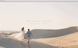
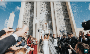
I find myself gravitating toward Showit templates and designs that have large hero images, meaning they have a large photo banner that is placed usually at the top of their homepage. Since it is front and center, it will make a bold statement and capture your audience’s attention.
Here are a few examples of how you can use hero imagery on your homepage design from Heather Payne Photography and Mishelle Lamarand Photography:
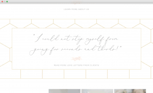
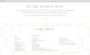
You can also use imagery throughout your homepage. For M Cake Design, we decided to use the custom honeycomb-inspired pattern we created for her visual brand to create a background for their client testimonials and cake menu.
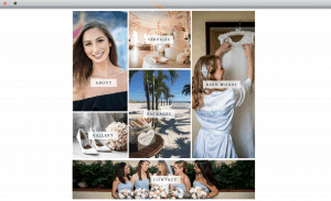
For Luna Events, we created a photo grid to display the different pages her audience could choose to explore and find more information about their services. It’s much more interesting and visually appealing than a list of links, wouldn’t you agree?
The possibilities are endless! You can use branded graphics, custom illustrations, hand-drawn icons, and so much more. Each visual element you include will keep your audience engaged and increase the likelihood that they will click into another page of your website or contact you.
Personal introduction
After you grab your audience’s attention with imagery, it’s time to introduce who you are. I see too many websites that forget to add this in. While it’s crucial to have a separate About page to explain who you are and what you offer, it’s nice to give your audience a taste of this on your homepage.
Personal introductions are even more important for solo entrepreneurs who are the face of their business. If your business is named after you but you don’t give any information as to who you are or include a photo of yourself, you won’t be able to make as strong of a personal connection on your homepage.
Even if you have a team of people, it can still be helpful to give a more personal introduction to your audience. You can still use the “we” voice that fits your team, but include details about your core values or how you work together as a team so visitors can connect with you on that.
If you only place photos on your homepage but don’t include any other text, you might be losing visitors. Instead, you can add more substance and value to your website with the content you include. For inspiration, I love how my clients Paige of The Legal Paige and Mishelle of Mishelle Lamarand Photography introduced themselves on their homepages.
Easy-to-navigate footer
There are few things I love more than a well-designed website footer. Your footer will probably be placed at the bottom of every page of your website (unless you request otherwise), but it still deserves a spot on this list since your first-time visitors will likely see it on your homepage as they scroll to the bottom.
When you think about what your footer should look like, you have a few options. You can create different columns that allow you to highlight several links (like we did with Michaila Chodur Photography’s website), or you can use the space for your beautiful Instagram imagery (like with Heather Payne Photography’s website).
To decide what you want to include in your footer, think about what the most important elements are that you want to highlight at the end of your page. Is it a specific website page? Is it your submark or logo? Is it an additional space for links that didn’t make it on your top navigation bar? This will help you get closer to what your footer should include and look like.
Email signup form and lead magnet
If you’ve been running a business, chances are you’ve heard how important it is to build an email list. Multi-seven figure entrepreneurs like Marie Forleo and Jenna Kutcher have built the majority of their income through email lists. Okay, now I really have your attention!
Depending on the goals of your business, you may also be interested in building an email list of current and prospective customers or clients. Your email list is a great place to establish a connection with your audience, give them exclusive updates and content, and talk about your services.
By putting yourself in front of your clients and customers consistently with your email marketing, you stay top-of-mind when they are ready to make a purchasing decision. If email marketing is a priority for you, having an email signup form on your homepage will be crucial.
There are so many email signup form placement options, but I recommend placing it below your photo banner if email marketing will be your focus or next to your footer if you want it to be on the homepage but not the main goal.
Along with your email signup form, you can also create a lead magnet, which will allow you to collect email addresses in exchange for a free downloadable. Lead magnets can be anything from PDF guides to checklist worksheets to email courses. You can test a few out for yourself and see what works best for your audience!
Call-to-action
You didn’t think I would forget this, did you? I saved the most important element for last. If you aren’t exactly sure what a call-to-action (CTA) is, don’t worry; the definition is easier to understand than you may think.
When you include a CTA in your homepage, you are essentially asking your visitors to take a specific action as they scroll through your website. An example of a call-to-action could be to sign up for an online course waitlist, visit a Services page, or fill out a contact form. Optimizing your website for a strong call-to-action is well worth your time and energy.
To find what CTA makes the most sense for your homepage, think about what you want people to do when they scroll through your homepage? What is the intended action? Then you can get creative about the different ways you can display that on your homepage.
How many of these five things do you currently have on your homepage? Are you adding any additional elements after reading this blog post? Let me know in the comments!