
How is it that some brands use color in such a predictable way while others really stand out with a palette that looks extraordinary?
It may seem like there’s a magic formula behind choosing brand colors, but it can be done in a few simple steps. If you want to choose colors that seamlessly work together, the kind you don’t mind using over and over again, you’re going to love this guide.
Since most brands use more than one color in their visual branding, you’ll need to create a brand color palette to ensure your colors stay consistent and cohesive.
You may already know the kind of colors you and your audience gravitate toward, but are they the right strategic choice for your palette? Can they stand the test of time? That’s what I want to talk about today.
First, let’s go over some best practices when you’re choosing brand colors.
Best practices when creating your brand color palette
Although I almost exclusively offer Showit website design services now, I also have experience as a visual brand designer. Many entrepreneurs consider visual branding to be their logo, but it also includes your colors, font pairings, textures, patterns, illustrations, icons… I could keep going on but I’ll stop there.
An effective visual brand is one that understands the unique function of each design element and gives guidelines for how the designs can (and should) be used. This, of course, includes your brand colors! It just so happens to be one of my favorite parts of the branding process, too.
There are few things I love more than seeing a gorgeous brand color palette come together, but there’s an art to it. Here are a few things you’ll want to keep in mind as you put together your own palette.
Consider color theory
Have you ever wondered why certain colors make you feel a different way? Well, it’s not just your mind playing tricks on you. It’s something psychologists call “color theory.” Think of it as the science that explains why certain colors evoke different emotions.
When you are choosing a brand color palette, it’s important to choose colors that will connect your ideal clients or customers to your brand. You don’t want to turn them off with an ill-fitting color just because you like it. We need to be more strategic than that in the visual branding process.
If each color inside the color wheel has a different emotion or meaning, what are they? Some of them you may already know, but here are a few descriptors for each color:
- Red: passionate, urgency, love, energy
- Pink: feminine, soft, sentimental, romantic
- Orange: vibrant, fresh, creative, adventurous
- Yellow: warm, bright, youthful, playful
- Green: growth, wealth, earthy, organic
- Blue: calm, trustworthy, reliable, nurturing
- Purple: royalty, high-end, sophisticated, majestic
- White: pure, clean, minimalistic, simple
- Black: depth, elegant, formal, luxurious
Of course there are different variations of these colors, but each shade will intensify or soften these emotions. Choose wisely!
Incorporate your colors consistently
Using distinct colors can improve your brand recognition by up to 80%, meaning it’s best to utilize consistent colors when you create various marketing materials. This is true for everything from your website to your social media graphics to even your internal resources.
One of the best pieces of advice I can give you is to choose colors you won’t easily get sick of. Even though Pantone comes out with a different signature color every year (called their Color of Year), you shouldn’t change your colors that often.
I totally get how tough it can be to come up with new designs that feel innovative when you use the same colors over and over again, but it’s important to keep things consistent. That way, your brand stays recognizable and you’re able to position yourself as an expert your clients or customers can trust.
When you choose your brand color palette, try to stay away from choosing a trendy palette. Instead, think about the longevity you hope for your brand to have and how it can stay relevant in five, ten, or even fifty years from now.
Once you have an idea of the colors you want to include, you’ll want to pick the perfect shade for each. There are a lot of nuances that go into this decision, so I recommend reading this resource if you want to read an in-depth brand color palette guide.
When you find the right shades, you’ll want to grab their HEX, RGB, and CMYK codes. HEX and RGB codes are typically used in digital formats while CMYK codes are needed for printed materials. It might seem like it’s a mess of numbers, but these numbers tell most programs how to create the exact shade you need to stay consistent with your visual branding guidelines.
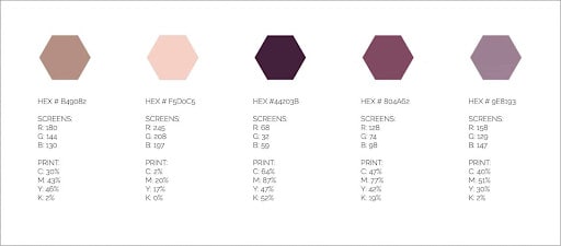
Keep these codes in a safe place so you can refer back to them whenever you are designing something for your business. You’ll use them more than you think!
If you decide to use a design tool like Canva to create graphics, they have an option to save your brand color HEX codes right on their platform so you can use them consistently whenever you want. Flodesk, my favorite email marketing platform, and all of the Adobe softwares offer the same feature! It makes it so much easier to incorporate your brand colors into your visual marketing.
Create a moodboard to complete the look
You’ve probably seen moodboards floating around Instagram. It’s hard not to “ooh” and “ahh” over how pretty they are, but did you know these moodboards can actually be highly strategic?
It’s not just about choosing attractive photos and piecing them all together (although that can be a lot of fun, too!). Instead, to create an effective moodboard, you need to first identify your colors and make sure they are reflected in ALL of the imagery you choose.
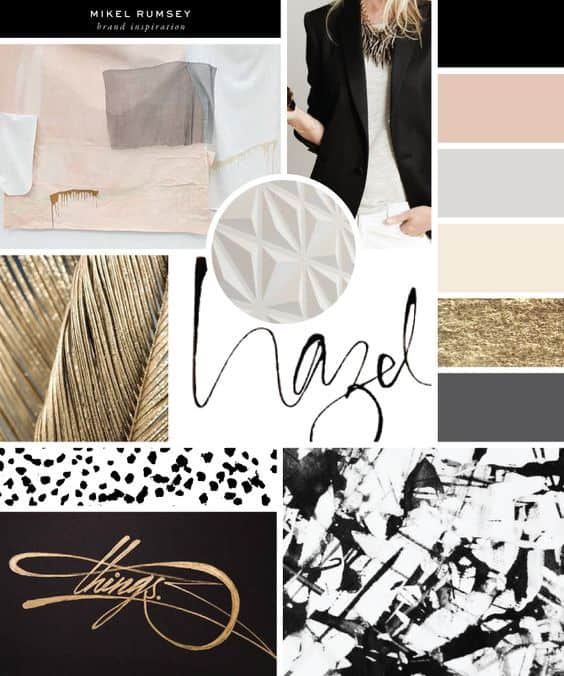
Color is incredibly important when you create a moodboard. So important, in fact, that most examples will include the brand color palette right in the moodboard. Here are a few to show you what I mean:
-
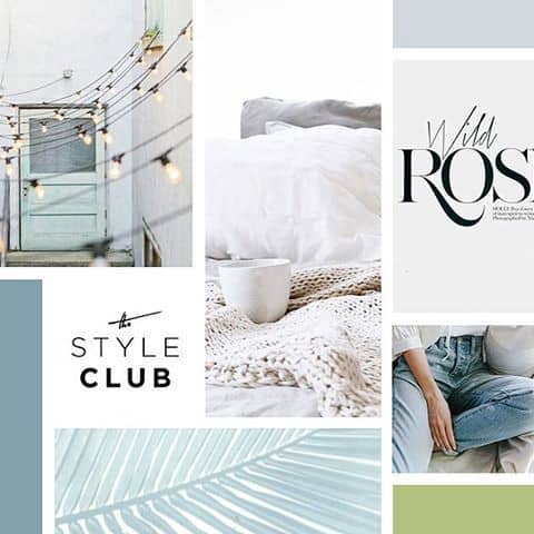
- AllieMarie Design via Pinterest

-
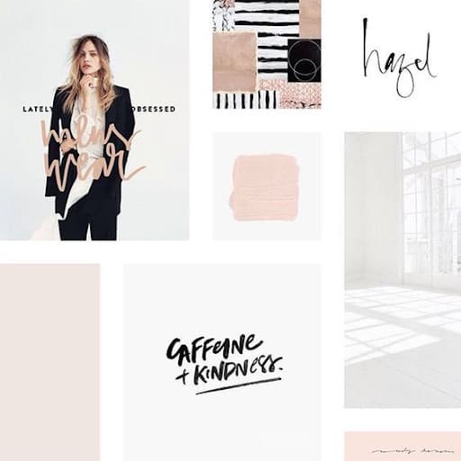
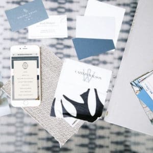
- Hannah Rose Creative via Pinterest

-
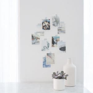
- Salted Ink via Pinterest

-
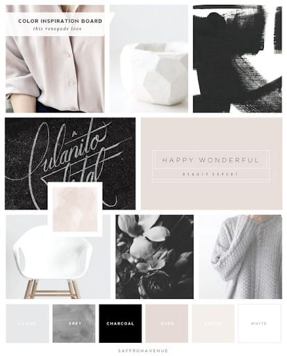
- Saffron Ave via Pinterest

If it’s unclear by looking at your moodboard what your brand color palette looks like, it won’t be a useful visual guide for your branding.
Even though it might be tempting to pin images you love that feature different colors, try to resist the urge to put them on your moodboard! Instead, you can pin them to another Pinterest board for safe keeping.
If you aren’t sure where to start with putting a moodboard together, think about if you are DIY-ing your visual branding or working with a brand designer. Many designers include this as a part of their process, so you might go through the exercise with them.
It’s best to ask if moodboard creation is a part of your visual branding package before you book someone, but if they don’t include it or you’re working on your branding, you can still create a moodboard on your own with these free moodboard templates via Pinterest.
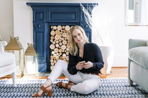
Invest in a brand photography session
Okay, you have everything you need to create a great brand color palette when you’re designing graphics, but what about imagery? We can’t forget about that!
The most successful entrepreneurs are those who invest in professional photography for their website, social media platforms, and more. There are several kinds of photography, but some of the most common are in the form of personal headshots, product photos, and more. It’s no surprise, then, that your imagery must reflect your brand color palette.
As you hire a brand photographer and start planning your photoshoot, there are a few ways you can ensure your brand colors are involved:
Wear outfits in your brand colors. This is one of the biggest mistakes I see business owners make when they invest in brand photos. For example, don’t wear a bright red shirt if red is nowhere on your brand color palette. It will make your images stand out, but not in a good way. Make sure you choose your wardrobe carefully!


Choose props in your brand colors. To add more personality to your photos, it’s a great idea to add props! This can be anything from business cards and printed materials, to laptops and journals, to candles and other office decor. No matter what you choose, make sure it isn’t in a color that doesn’t match your brand color palette. Your props are meant to blend in with the environment, not become a distraction.
Make sure your background doesn’t clash. Even if you are dressed in your brand colors, the background of your photos can totally ruin the photos if it doesn’t match. Depending on where you live, it might be difficult to get the right background. If this is the case for you, I recommend investing in an Airbnb that fits your palette or scheduling a brand photoshoot when you go on a vacation that matches your ideal vibe.
I hope this gives you inspiration and a bit of creative direction before your brand photoshoot. Feel free to consult with your brand photographer if you have any questions about incorporating more of your brand colors. Better yet, send them your full color palette and moodboard so they are completely prepared!
Now that you’ve seen all of the different ways you can use your brand color palette, it’s time for you to get down to business and choose your own shades. If you need to look for more visual branding inspiration, feel free browse on Pinterest or Instagram to spark your creativity. Happy creating!


