Client Launches, Creative Entrepreneurs, Interior Designers, Photographers, Showit, Website Design, Wedding Professionals
Looking through my design projects from last year, it’s hard to choose a favorite (or even a few).
It’s even more difficult when you’re lucky enough to work with incredible creative entrepreneurs and wedding professionals like I am.
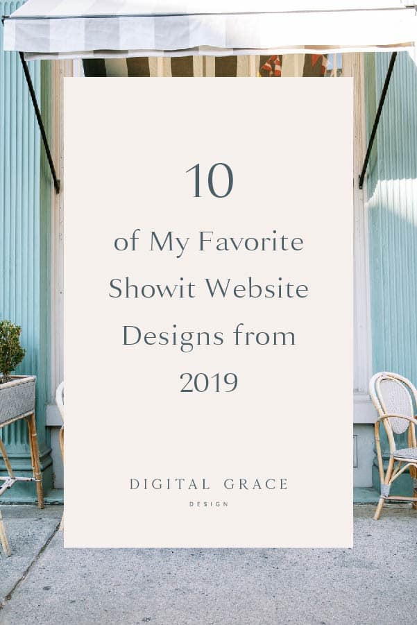
While true, I thought it would be worth recapping some of my favorite designs since 2019 was a big year for my business.
Not only did I get to work on some amazing creative projects, but 2019 also gave me the opportunity to host website coaching and SEO sessions at United, Showit’s annual conference. I went to United in 2018 too, but getting to come back to lead these one-on-one sessions was a dream.
If you’ve been around my small corner of the internet for a while, you already know I use the Showit platform to design all of my client websites.
So imagine how surprised and delighted I was to receive Showit’s 2019 Designer of the Year award! (Seriously, it took me a moment to realize they even called my name to accept the award on stage!)
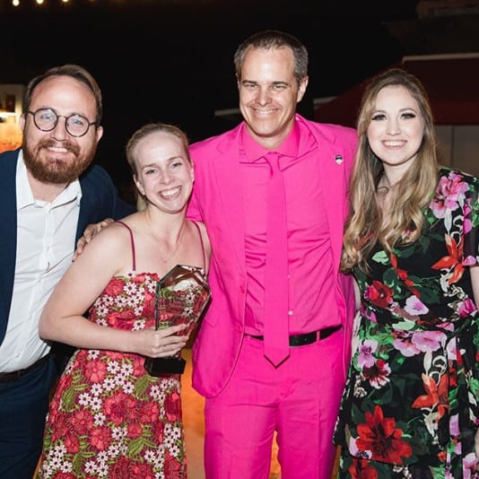
It’s still so surreal. I even have the award sitting next to my desk in my Harlem apartment.
It only seems natural to share some of the website design projects that contributed to one of my best years yet. I couldn’t have received this honor if it weren’t for the clients that you’ll see in this roundup.
If you’re curious to see what I’ve been working on, here’s a fun preview!
Aevitas Weddings
Based in Southern California, Henry Chen of Aevitas Weddings is a wedding photographer who does an incredible job of featuring helpful content for his clients. This is especially true with his wedding guides that are crafted for different religious and ethnic weddings.
With a wide variety of wedding traditions he’s already captured, we decided to highlight this key differentiator on his website. Along with creating a separate landing page for religious and ethnic weddings, we also included bright and bold imagery on his homepage to showcase the diversity of weddings he’s captured.
I loved having the opportunity to bring Henry’s vision to life on his vibrant and elegant website.
Providence Vineyard
Tasked with creating a visual brand and website design from the ground up, Providence Vineyard decided to work with me on their full online presence. Since the venue is still in the process of being built, it was incredibly important to us that we made the brand look professional and beautiful before couples were able to tour it in person.
It was a bit of a challenge to design around a completely new business where the venue didn’t exist yet, but it also made it exciting to play a part in shaping the brand from its very start. The combination of the brand identity and website design create an immersive and cohesive feel throughout their marketing.
With their new Showit website, they’ve been able to book couples before the venue is finished. This is because the website design highlights the venue’s features and is upfront about expectations and timelines, making sure that incoming visitors can trust the brand from day one.
| What Kelly from Providence Vineyard said about working together:
“When I began working with Sarah at Digital Grace Design I was overwhelmed and needed direction. Sarah was always prompt in her responses and walked me through every step. She never made me feel bad about asking a million questions. She is incredibly creative & talented!” |
Hotsource Yoga
While much of my portfolio is packed with design work from the wedding industry, I also love working with health and wellness-centered brands. It gives me the ability to flex my creative muscles in new ways and adds more variety to my day-to-day work.
Interestingly enough, this is the third website I’ve worked on with the Hotsource family. In addition to working on a website for their founder, Nicole Duke, and their non-profit, You Are Enough Yoga Project, I had the opportunity to work with their team on a new website design for Hotsource Yoga. I must admit it’s my favorite of the three!
Based in Aptos, California, this full-service yoga studio offers classes, workshops, and teacher training for yogis of all experience levels. They already had great branding and cohesive brand photography before working together, so my main focus was to elevate their overall brand identity through their messaging and website design.
We wanted their brand voice to feel welcoming and approachable while speaking to the importance of practicing yoga. We even created a landing page that speaks directly to first-time visitors who want to know what to expect before taking a class. This eliminates any feelings of intimidation or worry before someone joins the studio.
The overall design of the website was kept fairly simple and streamlined so the brand photos could speak for themselves. We used their branded submark throughout the website but decided to highlight their brand messaging with a calming color palette and consistent sans-serif fonts.
Don’t you feel more relaxed just scrolling through their website? That was the goal, and I think it’s safe to say we accomplished that.
Lindsey Drewes Photography
Lindsey Drewes and I had the pleasure of meeting at Showit United in 2018. I met some of my favorite creatives while I was there. (If you’re a photographer or creative entrepreneur, you should totally join us next year!)
When Lindsey asked me to design her new visual branding and website design, I knew we were going to create something beautiful and unique. Since she is endlessly inspired by Architectural Digest, we had a lot of creative freedom to run with architecture-influenced designs.
Lindsey is a multi-passionate photographer, meaning that she shoots weddings but also loves capturing interiors and architecture spaces. These two photography niches are quite different, but it gave us an exciting challenge to work on when creating her website.
We wanted to make sure that both styles of photography were equally highlighted on her website. As such, her homepage features a slideshow photo gallery in the main banner with a variety of wedding and interiors. You might notice that every other photo is a wedding or architectural-focused image. That was done intentionally!
We included the headline “photography for authentically curated homes, weddings, & lives” by the photo banner to emphasize her two focuses. Lindsey also calls herself a “wedding and architectural photographer” to further illustrate her point. All in all, we’re really happy with how both styles of photography have come to life on her website!
I absolutely loved mixing her photography with a clean, editorial, California chic, and timeless aesthetic. You can explore her website here to see what I mean.
| What Lindsey Drewes said about working together:
“Before working with Sarah at Digital Grace Design, I was frustrated because I couldn’t take the ideas from my head and make them a reality. I had to settle every time I tried. I was worried though that if I invested in a custom brand & website that I wouldn’t see a return on my investment. I’m happy to share that I now LOVE my new brand and website, and I’ve absolutely seen a return on investment. In fact, I booked a wedding today and she specifically mentioned how much she loved my website! I promise you won’t regret collaborating with Sarah. Her attention to detail and ability to bring your vision to life is worth so much more than any other investment you could make. My favorite part of working together though was making a new friend in the process!” |
Allie Atkisson Imaging
Have you ever received an initial inquiry message that made you cry? That’s exactly what happened when Allie of Allie Atkisson Imaging reached out to me about her project.
As a husband-and-wife photography duo, Allie and Tommy put so much heart into the work they do. It’s clear to see that from reading their website copy, but we also wanted to include more of those personal touches throughout her design.
We worked really hard to place specific photos where they matched the messaging, and then trickled in a few “love is…” statements throughout her website. This was my absolute favorite feature of the whole design!
Here are a few screenshots and examples from their website:
- Love is when your home becomes a person, not a place.
- Love is cold feet under a warm butt.
- Love is a note your mom snuck into your lunch box.
I love how the final website is professional yet real and authentic. It’s truly a reflection of Allie and Tommy, and that’s precisely why it’s become one of my favorites.
| What Allie Atkisson said about working together:
“I was at my wits’ end trying to figure out my website. Full-on break down. Luckily, I found Sarah and now I’m speechless. This talented woman not only spent special time getting to know our brand and values, but she also spent time getting to know my husband and me. She took special interest in what we stand for and the experience we give our clients. For two years, our site didn’t represent who we are. Now, I can proudly send this new site to any client, knowing good and well I’m about to book the crap out of them. I was blown away by her professionalism, creativity, and approach in making our site unique and beautiful. If you are struggling, if you are just starting, if you’re a long-time pro, if you need a website makeover or just a little spruce up, contact this beautiful human right now and know that your hard-earned money will be put to great use. I want to yell this from the rooftops, y’all. There is no question in my mind that I will double my bookings this year because of my new website. Call her. Book her. LOVE HER!” |
Kennedy Occasions
As a wedding planner and floral designer, sometimes it’s hard to create a cohesive website when you rely on imagery from multiple photographers. Luckily, Emily from Kennedy Occasions had a beautiful photography archive of her work for us to pull from.
Her website is the perfect example of how powerful it is to have consistent brand imagery even if it’s from separate weddings and different vendors. All of her photos look like they belong together.
It’s clear to see Emily has a distinct style which blends natural and organic elements with romantic and elegant designs. She’s a master of her craft.
I also like how her Press page came together with the logos overlaid on each featured photo with a link to the specific publication. It really elevates the overall perception of her brand.
| What Emily of Kennedy Occasions said about working together:
“What a whirlwind! I started this process with a jumble of ideas and a stress level through the roof! Sarah was able to walk me through each step with ease and encouragement while offering great advice and great tips. The finished product FAR exceeds my expectations and has already turned heads and generated leads. The BEST investment I’ve made for my business and an incredibly seamless, stress-free process!” |
The Holistic Mrs
Fun fact: Rachel from The Holistic Mrs and I first met in high school but we reconnected in the Showit Facebook group one day when she was looking for a website designer. Such a small world!
Rachel is a holistic health coach, doTerra advocate, and now a Crunchi rep. It was fun to tie the three aspects of her brand together into an umbrella with the common goal of living a healthy, non-toxic lifestyle.
This is usually what I recommend doing for clients who are multi-passionate and don’t want to box themselves into one thing, but still want their messaging to feel consistent. Just a little food for thought.
Speaking of food, we thought it would be fun to include pops of food photography and other imagery that speaks to the holistic lifestyle she’s promoting through her brand.
I love the feel of her website. It’s clean, cozy, welcoming, natural, fresh, and grounded. The color palette also makes me want to live inside this website. (Have you ever felt that way when looking at a website? It’s the best!)
| What Rachel of The Holistic Mrs said about working together:
“Before I began working with Sarah, I was attempting to self-build my website. Because I am not tech savvy, I kept running into a wall and knew that eventually, this was something I would need to outsource to someone who could really understand my vision and bring it to life. Finding Sarah was the biggest blessing when it came to my website design! The process was so easy and seamless. She has very well-thought out questionnaires for you to answer and provide her with all the information she needs to understand your brand and the creative vision. She hit it right on the nail with everything I gave to her and knew exactly what I wanted (and more!). Sarah is one of the most professional and responsive people I have worked with in my business and was there every step of the way. Her flexibility, patience, and drive to ensure I was satisfied before the site launched was exactly the type of person I was looking to work with. She also provides her own very detailed tutorials on how to edit the site on your own once it’s launched. For someone like me who is not super tech savvy, these tutorials were perfect! Now that my site is up, I have been getting tons of accolades on how beautiful it is, easy to navigate, and that it really does remind people of me. I am in LOVE with the site. Thank you again, Sarah! I will be referring you to anyone that is in need of a website designer!” |
Marnie Cornell Photography
Many wedding photographers like to feature polished and sophisticated photos of their couples, but not Marnie Cornell. Instead, she shares the candid, quirky moments from real wedding days with her website design. The result is beautiful in its own unique way, of course.
Here are a few of the candid photos she highlights on the site to show you what I mean:
Her photography does a great job of attracting the laid-back, low-key couples she wants to work with while repelling those who may not be a fit. This is a smart marketing move! The more you can cater to your ideal audience, the better.
Everything about her website screams fun! There’s a slight bohemian vibe to her work, but we decided to balance it with a clean and streamlined design. It really helps her photos shine.
One of my favorite aspects of Marnie’s website is her About page introduction. She talks about how her wedding photography has been largely inspired by having her first child. This hits home for many visitors who will be reading through her page, helping them make a stronger personal connection with her.
Refine for Wedding Planners
One of the most common struggles online educators have is trying to fit all of their offerings underneath a large umbrella brand. Amber from Refine for Wedding Planners shows us how it’s done with her website.
I loved collaborating with Amber to create a more user-friendly and functional home for her audience of wedding planners. It was fun to create a website design that was hyper-focused on one specific audience, even with many products, services, and in-person experiences in the mix.
There are a few features I love about Amber’s site, but I’ll narrow it down by sharing my top two.
One is the video banner at the very top of Amber’s homepage that gives a sneak peek into what it’s like to attend one of her retreats.
The other is the bold “unpopular opinions” slider that we created for her About page. Visitors will get a peek into Amber’s personality when they read opinions like “coffee is disgusting” to “day-of coordination is a term that needs to die.”
No matter how you feel about each opinion, it highlights her strong brand voice. It can all be summed up with this line of copy from her website: “I tend to say what everyone else is thinking but no one is willing to say!”
The overall design of her website is feminine, polished, and elegant. We used pops of pink and darker blues for a gorgeous color palette. With clean serif fonts and small touches of script writing, Amber can feel confident directing traffic to her website.
Corry Frazier
What do essential oils and brand photography have in common? Corry Frazier, of course! Similar to a few other examples in this roundup, Corry has multiple passions that she wanted to highlight on her website.
There are a few ways we balanced these two offerings:
- We gave Corry the title of “brand photographer and essential oils advocate.”
- We created a personal bio on her homepage that talks about her journey to discovering her love for brand photography and essential oils.
- We added a “what’s next?” section to her homepage to give her visitors an opportunity to choose whether they wanted to learn about photography or essential oils (see below).
We both really loved how the finished website came together. Corry was an absolute joy to work with, and her website feels like an extension of her services and personality. She wanted the website to feel like home—warm, welcoming, and approachable—and I think it does.
Is a new Showit website on your to-do list for 2020?
Let me know! I’d love to chat about your business, goals for the future, and your vision for your new website so that we can create the best plan forward for you! Schedule a call here or fill out the form on my contact page to get in touch with me. I can’t wait to chat with you soon!