Online course sales pages usually put the “long” in long-form copywriting.
You know what I mean. When you land on most sales pages, you have to scroll dozens of times before you even see the offer. You may be wondering why entrepreneurs do this, and it’s because they understand sales page psychology.
While some sales pages are written effectively, others may feel like a long, drawn-out pitch that makes you want to click the exit button. What’s the difference between the two? That’s what we want to uncover today.
In this article, we’re going to walk through what elements are needed to create a successful online course sales page and what yours might be missing.
Is your online course sales page missing these crucial elements?
No matter if you’ve already created your sales page or are in the process of designing it, this article will help you correct any missteps and give you new ideas to implement right away.
So, let’s get started!
A compelling headline
One of the first things your audience will see when they land on your sales page is the headline. This short line of sales copy acts as a hook to draws people in. It’s used to engage new visitors and convince them to keep scrolling through your sales page.
Without a headline, visitors may struggle to know what your sales page is about or if it’s something that’s worth their time. Your headline can ask an enlightening question, make a strong statement, or highlight one of the course’s main benefits.
You’ll notice my sales page headline invites readers to imagine the possibilities of what they can accomplish with better SEO. It communicates that I understand how they want to feel about their website and how excited I am to help them get there.

As much as I like this headline, it wasn’t the first one I came up with. You can’t expect to write the perfect headline from the very start of your brainstorming session.
That’s why I recommend writing several headline variations until you find the right one. To start, list at least five to 10 headlines before you narrow down your list. You can also A/B test different headline variations. By measuring their performance, you’ll have a better chance of increasing website conversions.
An understanding of the customer’s objections
Sales copywriting experts often call objections a customer’s “pain points.” The more you understand someone’s deepest pain points, the better your sales copy will be.
Pain points refer to the problems or struggles a customer is currently facing. However, you’ll want to be careful not to overly agitate these pain points. It’s more ethical to state what they are and quickly offer your course as a solution.
For example, my sales page has a list of questions that my customers often ask themselves. By listing them here, I’m able to connect with visitors who are already thinking these things before they come to my sales page. It will feel like I’m reading their mind!
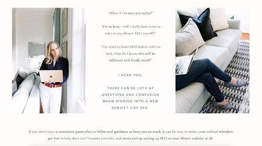
It’s not enough to simply state the pain points; you need to show that you know a way to resolve them. If my customer’s most common objections are a lack of time and SEO knowledge, I need to reassure them that my online course will fill in the gaps.
That’s why I included this powerful sentence, which acts as a transition between the pain points and the solutions of my online course:
If you don’t have a consistent game plan to follow and guidance to keep you on track, it can be easy to make some critical mistakes, get lost in help docs and Youtube tutorials, and never end up setting up SEO on your Showit website at all.
After this statement, I introduce the name of my online course for the first time. It’s the perfect moment for me to explain why someone should care about my course.
A clear explanation of the benefits
You might be tempted to share everything that’s inside your online course at this stage. Instead of leading with a full list of features, it’s better to explain the benefits of your online course. The benefits paint a picture of what kind of results someone might see from implementing the online course lessons.
On my sales page, I include benefits like:
- Escape SEO overwhelm
- Watch your website rank climb
- Increase organic leads
- Grow your business
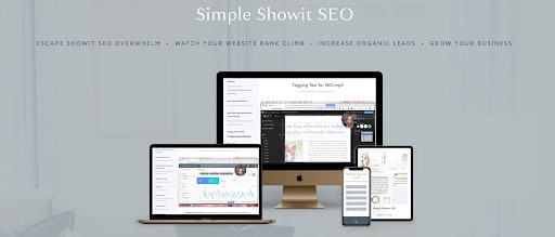
Each of these benefits speaks to the overall feeling of accomplishment, measurable success, and confidence my students receive after completing the online course. This is important because people want to see that your online course will be transformational.
Once you’ve discussed the benefits, then you can list the features. Features are usually defined as the deliverables inside your course that have tangible (or intangible) value. This can include mastermind calls, video lessons, community support, worksheets, and more.
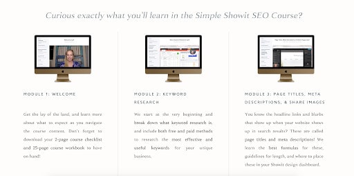
On my sales page, I explain the value of each feature with a mockup photo that gives a small preview of what someone would find inside the course. By doing this, I’m able to communicate everything that’s inside the online course while putting the most important information front and center.
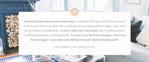
Social proof and testimonials
Since 83% of consumers trust reviews over advertising, it’s important to show multiple cases of social proof. This is usually found in the form of testimonials from past students who have seen success in your online course.
It’s more powerful for someone else to say your course helped them radically change their business for the better than for you to say it. People trust the endorsements and success stories of past customers, so it’s important to launch your sales page with several testimonials.
If it’s your first time launching your online course and you need testimonials, I recommend creating a beta round of your course. This will allow you to receive real feedback from students, test the accessibility of your content, and get testimonials in the early stages of your course.
As you receive testimonials, think about asking your course students if they’d be willing to create a video. 59% of consumers would rather watch a video testimonial than read a text testimonial, so these can be really powerful for selling your online course.
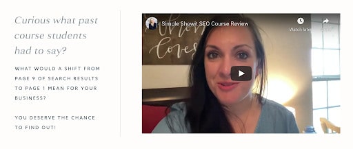
I added this video from a past course student who was able to jump from Page 9 on Google to Page 1 in her photography niche. While this is a great soundbite, including a one-minute video testimonial gives this success story even more meaning and credibility. You can do the same when launching your own online course.
Bonuses
Another way to add even more value to your sales page is to offer bonuses. This can either be a digital product you sell in your online shop or something you’ve created exclusively for your online course students.
Great online course bonuses include:
- Checklists
- Worksheets
- Ebooks
- Interviews
- Group coaching
- …and more!
In addition to all of my online course lessons, I also include a bonus Instagram landing page template for all students.

I usually sell this Instagram landing page template on Showit’s site for $27, but now, I offer it for free inside the course. It’s a nice way to sweeten the deal!
A strong call to action
You can’t have a successful online course sales page without a strong call-to-action (CTA). A call-to-action describes the specific action you want someone to take on your sales page. For most course creators, this will be a “buy now” CTA button.
Choosing the right CTA is an incredibly important decision, even though it may not seem like it at a first glance. You’ll want to use action-oriented words that get your audience excited to click. You can also include the price of your online course in the button text, but that’s completely optional.
When choosing my CTA, I decided to go with “enroll now” to make the call-to-action sound clear, concise, and instructive. I use the same CTA language throughout my sales page to keep the messaging consistent.

You might also notice that my CTA buttons are in a distinct orange color. This helps it stand out from the various background colors I use on the sales page. If your CTA button isn’t clearly visible, it may be difficult for your audience to find, which can reduce conversions. When in doubt, choose a high-contrast, on-brand color for your CTA buttons!
Transparent pricing of your online course
I am a huge advocate for publicly displaying the price of your online course! If someone reads through your sales copy and is interested in making a purchase, why keep the pricing hidden?
By transparently showing the price of your course, you’ll be able to attract course students who are the right fit. They’ll also know if they need to budget for a high-ticket course or if they can immediately make a purchase for a conveniently priced course.

You’ll notice on my sales page, I give two payment options: pay in full or a three-month payment plan. This makes my online course more accessible to people who would like to split up the payments but also rewards those who want to pay in full. I highly recommend taking a similar approach when pricing your online course.
Frequently asked questions (FAQs)
To cut down on emails in your inbox, it might be worth it to include a FAQs section. This will allow you to answer some of the most frequently asked questions in one place. It’s best to place this toward the very end of your sales page so it doesn’t distract from the other information.
Before a potential customer contacts you with a question, you can direct them toward the FAQs to see if it’s already been answered. This saves you both time and energy.
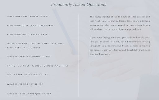
You can repurpose some of the same questions I’ve used here and sprinkle in some of your own. To end your FAQs section, include a question like “What if I still have questions?” and give your contact information in the answer. That way, people can get a hold of you if they have any questions that weren’t listed here.
Personal bio
One of my favorite parts of a sales page is the tailored personal bio. A personal bio gives you a chance to personally connect with potential customers and tell them why you’re fit to teach on this subject.
This isn’t meant to be the same bio you use on your About page or a media kit, though. Instead, create a new bio that features your knowledge on the particular subject of your course and highlights any relevant expertise. You can also share any related experience and why you’re so passionate about teaching on this subject.
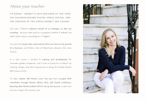
You’ll notice in my bio, I include:
- How many people have taken my course
- Why I created this course
- What experience led me to create the course
Then, I end with a personal invitation to begin the journey through Simple Showit SEO. Also, don’t forget to include a photo of yourself! This will remind your audience they’re learning from a trusted business owner.
Final sales pitch
Now the time has come to finally wrap up your sales page. When you craft your final sales pitch, try to summarize your final thoughts in an actionable headline. This should pack a real punch and re-engage your audience members as they reach the end of your sales page.
For my sales page, I decided to end with this final pitch:
Stop drowning in search results, and start getting found organically by your future clients.

This final action gives people who may be on the fence more confidence in making a purchase. It touches on a relevant pain point while also showing a key benefit of investing in the course.
If you are having trouble creating a final pitch, take this framework from my sales page and make it your own:
Stop ________, and start ________.
Now you’re ready to craft an effective online course sales page
I hope this article has been helpful in breaking down all of the necessary elements inside a well-crafted online course sales page.
If you need more inspiration, feel free to review my Simple Showit SEO sales page in its entirety or look on Pinterest for more sales page inspiration.
Happy creating!