Getting your audience to take action on your website can be tough work.
You’ll need to offer valuable, educational content that helps them make a personal connection with your brand on every page, all while delivering a beautifully designed website experience.
No matter where they land on your website, you’ll want to do everything you can to keep your visitor’s attention once you have it.
Not only that, but you’ll want to direct their attention toward an action you want them to take. This is done through call-to-action (CTA) buttons.
A CTA button is commonly used on websites to get people from where they are to where they want to go. It’s essential in creating a seamless user experience.
Without CTA buttons, visitors may not know what actions they should take and, consequently, won’t stay on your website for long. We want to make sure your visitors aren’t reaching for the exit button!
By following this guide to designing your website with CTA buttons, you’ll learn about the best strategies in creating effective, conversion-ready buttons.
Let’s dive right in!
Best practices when designing CTA buttons
As a long-time website designer, I have (mostly) a love-love relationship with CTA buttons. When I’m creating a website strategy for a client, they’re a huge consideration.
I’m going to start with the most obvious advice before we dig deeper into recommendations you’re going to love. Feel free to take notes as we walk through these best practices and even review your own website to see if you’re following these guidelines.
Better conversions are on the way when you streamline how you’re using CTA buttons!
Make your button look like a button
This may seem like an odd piece of advice to add to this article, but if your CTA button doesn’t look like a button, some of your visitors may miss it altogether.
While a big, bold button may not be as aesthetically pleasing as you’re hoping for, it’s important for the button to clearly stand out. You don’t want visitors to have to search high and low for a way to convert.
The buttons we created on Sonia’s Glossible website are a perfect example of how to do this well. The black-filled button clearly stands out against the white background.

You can’t miss it!
You can change the button’s color, font color, font size, and if it has round or sharp corners.
Just make sure it looks like a button!
Contrast is more important than color
Speaking of color, let’s talk about choosing the best color for your button. It’s best to choose a button color that’s on-brand, meaning it fits within your visual branding guidelines.
Having a well-defined visual brand identity is important when you enter the website design phase, so let’s assume you have one, complete with a brand color palette and font selections you love.
It could look a little something like this:

While we’ve been talking a lot about color, you may not realize how important contrast is for your button. I’d actually say it’s more important than color when it comes to CTA buttons!
You can use on-brand colors that fit within your guidelines and still fail to create a button that stands out. For example, if you created a dark violet-colored button on top of a deep purple-colored website background, it will be technically on-brand but it’ll be really hard to see.
Instead, you’ll want to choose two on-brand colors that contrast well. It seems to go without saying, but even if the colors contrast well, make sure they also look flattering together.
Let’s see how this works in action.
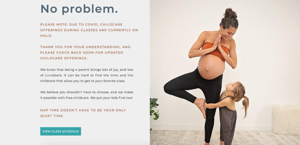
When you look at my client Hotsource Yoga’s homepage, does the CTA button stand out? Of course it does! Not only is it on-brand with its bright teal color, but it also stands out against the darker blue backgrounds.
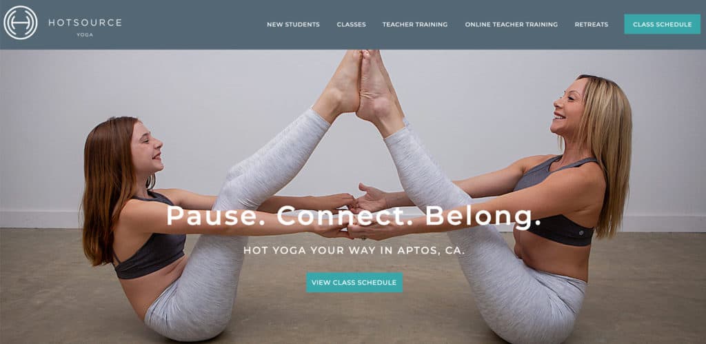
No matter where you visit on the site, the same colored CTA button still stands out. Yes, even on lighter backgrounds like in this section of the homepage.
We were able to use the same CTA button color throughout her website, and it always had a great amount of contrast. This is what I call a win!
Keep this tip in mind the next time you create a CTA button on your website.
Button placement matters
So we know color and contrast matters, but where you place your button matters, too.
Many entrepreneurs know they need to have CTA buttons on their website but have a tough time knowing exactly where to put them. If this sounds like you, you aren’t alone!
In studying the latest website strategies, I’ve found through my research that there are a few things to keep in mind when you are placing buttons on your site.
One is to make sure you don’t have too many CTA buttons. If you create a website page where the same button can be seen in every scroll motion, you probably need to delete a few of them.
A good rule of thumb is to have a CTA button every three to four scrolls.

This is especially true on long sales pages for online courses, masterminds, membership communities, and other digital product offers. You want to give your visitor enough time to read through the next sections of content before reminding them of the main call-to-action.
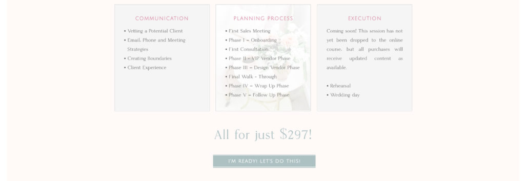
We used the same strategy for my client Amber of Refine who wanted to use a page to sell her course to wedding planners. When you visit the page, you’ll notice there are CTA buttons every three to four scrolls.
The soft teal color of the buttons stands out from the page’s light colored backgrounds but still fits with her website’s design.
It’s also a good idea to place a CTA button above-the-fold. That’s what we call anything that can be seen on a website page before someone scrolls.
A great example comes from my client Carolyn Teague who happens to be a holistic functional medicine practitioner. When we created her website, we wanted to make it easy for visitors to book an appointment with her so she could schedule more virtual consultations.

While we include this same CTA button throughout her website, the first time most of her visitors see it is above-the-fold when they land on her homepage. You can do the same by making sure you have a CTA button that can be immediately seen when someone comes to your website.
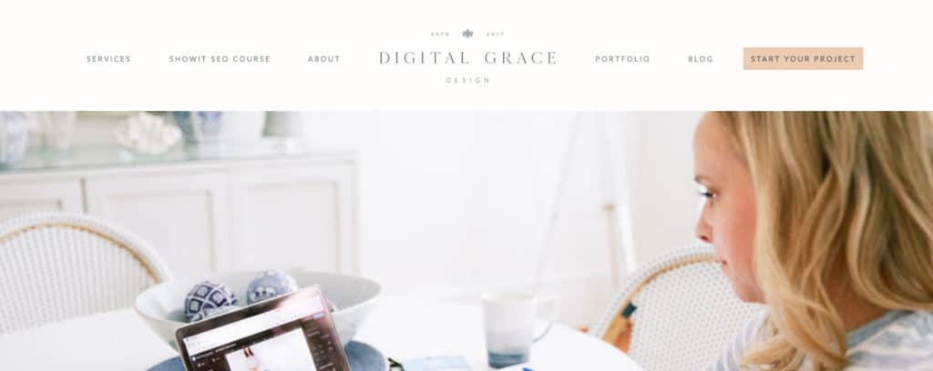
Put a CTA button in your website navigation
Speaking of elements that you’ll see above-the-fold, when you look at the top of a website, you may see a navigation bar with a list of page links to click on. This is done to create a better user experience for visitors because they can clearly find the information they’re looking for.
During the website design process, you might be tempted to overlook your website navigation, but it’s incredibly important when it comes to decreasing your bounce rate and encouraging visitors to continue browsing your site.
Take a peek at my client Lindsey Drewes’ navigation bar.

You’ll find a list of these page links:
- About
- Weddings (Services page)
- Architecture & Interiors (Services page)
- Praise (Testimonials page)
- Blog
- Contact
Depending on where her audience wants to go, the navigation bar will direct them to her About page, Services page, or any other number of pages when they click the corresponding title.
But what if there was an even better way to use your website navigation?
This is where CTA buttons come in! Instead of only including a list of page links, why not dress up your navigation bar with a single CTA button?
All you need to do is figure out what the main goal of your website is and what important step you want them to take. Then you can turn that action into a button on your top navigation bar.
I’ve used this strategy for countless Showit website design clients over the years, and I currently use it on my own website!


All of these CTA buttons are different—from their color to the website page they link to—but they all work in the same way to guide people toward their ultimate destination. You can use this same strategy on your own Showit website!
Include a CTA button in your announcement bar
There’s another place to put a CTA button that you may not have thought of.
I’m talking about an announcement bar.
Many website builders, like Showit and Squarespace, give you the opportunity to create a bold announcement bar at the top of your website.
It can look a little something like this:

You’ll notice that I use this announcement bar feature on my own website to direct more traffic toward my website platform quiz.
Since I created the quiz to help my visitors understand which platform is best for them while also qualifying leads for my services, it makes sense to use a separate CTA button here. I can turn off the announcement bar at any time, but it’s been helpful to users so far so I’m keeping it for now.
You can also use an announcement bar with a CTA button that goes to your:
- Sales page for a digital product launch
- Newsletter landing page to sign up for your list
- Services page to learn more about your packages
- Evergreen webinar or another lead magnet
The sky’s the limit!
Now you know exactly how to use CTA buttons when designing your website.
The next step is to choose the right CTA button language. I’ve already created a resource on that, so you can start reading it below.
How to Choose the Right CTAs for Your Website (with a Copywriting Focus)