One of the most overlooked pages on a website is the Contact page.
It may not have as much information as a Services page or as much imagery as a Homepage, but it makes a big difference when it comes to increasing your website conversions.
Creating a user-friendly website is the first step in bringing more visitors to your Contact page, but the next step you need to do is optimize the page.
Ask yourself if you’d be inspired to take action and complete your own contact form based on your current Contact page. If not, it may be time to make a change.
Today, I’m going to cover some of the most important elements of a Contact page. While reading, open your own Contact page and make a mental checklist of what you’ve already included. Then, let’s determine what’s working and what isn’t so your Contact page is ready to convert.
Let’s make some improvements to your Contact page, ASAP!
Is your Contact page missing these important elements?
Too many entrepreneurs treat their Contact page as an afterthought because the rest of their site is competing for more of their attention.
You might write more content for other pages, but with all the effort you put into driving traffic toward your Contact page, you don’t want the visitor’s journey to end there. The best way to ensure people complete your contact form is to include the right information around and on it.
Less is more when it comes to crafting your Contact page, so let’s go over these essential elements.
Welcome message
Before coming to your Contact page, a visitor may have read multiple pages on your website or simply clicked its page link in your main website navigation. No matter how they get there, it’s important to remind them that they’re in the right place.
The primary way to do this is through your welcome message. Some website creators skip this step, but it’s one of the best ways to continue nurturing your relationship with incoming visitors.
Here are a few tips to follow when writing a welcome message:
- Use actionable words so your audience is inspired to take action by filling out the form fields.
- Reintroduce yourself by including your name and writing your welcome message in first person if you’re a personal brand.
- Show your excitement for the opportunity to potentially work with them on their upcoming project.
- Explain the next steps in booking a consultation call or getting in contact with you through the corresponding contact form.
Lindsey of Drewes Real Estate accomplished all of the bullet points above with her Contact page. Her welcome message is short and sweet, giving all of the necessary information for her real estate clients to feel comfortable taking the next step.
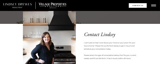
It’s smart for Lindsey to shorten this welcome message because her ideal clients are likely busy and want to skim the information in their search for the right realtor. Lindsey’s instructions are clear, concise, and helpful, solidifying her as a great fit for her client leads.
Simple contact form
Of course, what would a Contact page be without a contact form? After you finish writing a small welcome message, you can focus your attention on crafting a minimal contact form.
First, it’s important to know there’s no one-size-fits-all contact form option for entrepreneurs. While studies show having three to five form fields is best for conversions, you may need to gather more information upfront. However, try to make your form as easy to fill out as possible.
Some industries—like wedding photographers and event professionals— may need to include more form fields in their contact form. This could include information about a potential lead’s wedding date, venue, budget, and more. Sometimes, screening your leads upfront is the way to go, depending on your business goals.
If you go to my own Contact page, you’ll see that I include more than five form fields too! However, I use a few clickable multiple-choice options so it’s easier to fill out my form. You can use the same strategy with your contact form. When in doubt, test it out!
For The Abundance Group, we decided to keep their contact form really simple with four main form fields: name, email address, how someone heard about them, and an open message box.
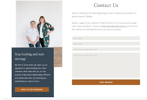
Then, they can respond to incoming lead inquiries with more information depending on what their message says. By keeping it simple on their Contact page, they’re able to connect with more people who don’t mind filling out this short and straightforward form.
Call-to-action button
Once someone fills out your form, you need a call-to-action (CTA) button that tells them what happens next. Much like your welcome message, you’ll need to use highly actionable language on this button to entice people to click.
It’s also best for this call-to-action button to stand out on your Contact page. You can accomplish this by choosing a high-contrast color from your brand color palette.
In this example from Hotsource Yoga, you’ll see how their “Send Message” CTA is easy to understand and says exactly what comes next. In a signature teal color, the button stands out more than any other element on this page.
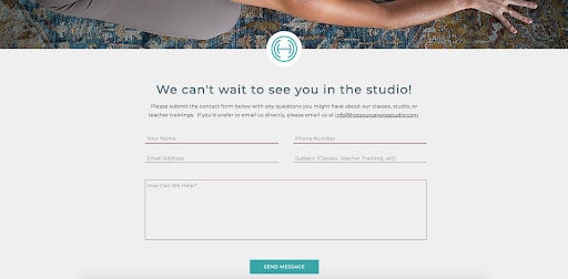
You can raise your conversions by making your button easy to find. If it doesn’t stand out, you may miss an opportunity to connect with your ideal clients. In this case, clarity is more important than a specific style of design.
Direct email address
What if someone doesn’t want to contact you through the contact form? Every so often, a visitor will want to directly communicate with you through email. To ensure they have the information they need to get a hold of you, include your email address on your Contact page.
If you are open to collaboration opportunities, press requests, or brand sponsorship opportunities, it’s even more important to include your direct email address. These collaborators won’t want to fill out your usual contact form because they’re not looking to become a client lead.
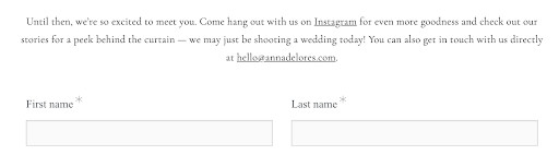
When creating a Showit website for Anna Delores Photography, we wanted to make sure Anna’s email address was front and center. Not only does she include her email address at the end of her welcome message, but she also includes a link that opens an email draft in the visitor’s default email provider.
Since everyone has a different request or preference when landing on your website, it makes sense to optimize your Contact page for every possibility.
Location
If you run a local business, it will be incredibly important to include your location. While some include an embedded map feature that shows their location, you can keep it simple by including your studio address.
If you don’t have a physical location, you may want to include the city or state where you are located. Something as simple as saying you’re “based in _____” could work. If you frequently serve clients in your local area, including this location will be great for local-based SEO.
Since Crossed Keys Estate is a wedding venue, including their venue location is a no-brainer. That’s why you’ll see it right underneath their rotating photo slideshow on the left-hand side of their Contact page.
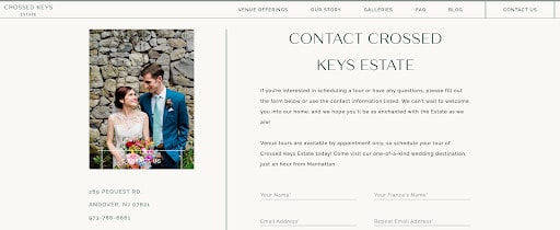
If a visitor wants to see where the venue is located, they can click on the address which directs them to a Google Maps listing. Then, interested brides will see a collection of glowing Google reviews they’ve received. All of these actions help to solidify Crossed Keys Estate as a great option for their wedding day.
Communication expectations
Think about the last time you sent an email. Isn’t it difficult to not know when you’ll receive a reply? This is even more true for people who are inquiring about your services. Instead of leaving someone waiting, let them know when they’ll hear from you.
I recommend leading with transparency by stating how many hours or business days it will be until you’ll respond to their request. Most entrepreneurs say within 24-48 hours but you can choose a timeframe that works best for you.
Andi Bravo Photography ensures brides that she’ll respond to all inquiries within 24 hours. That way, visitors know exactly what to expect from Andi. This builds trust with her brand before they jump on a call or decide to work together.
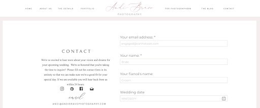
You can build the same level of trust in your own Contact page. However, be honest about how promptly you’ll be able to reply. If you don’t check your email inbox often or can’t sustainably respond to the requests coming into your inbox, you may need to adjust this expectation.
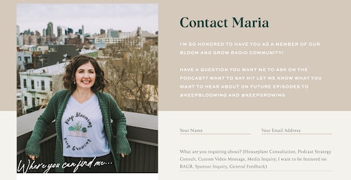
Personal photo
To make your Contact page feel a little more personal, think about including a photo of you or your team. This is a great way to remind new leads of who you are and who they’ll be hearing from.
If you’ve already invested in a brand photoshoot, you can reuse one of the headshots from your archive. It’s best if the photo feels warm and approachable at this stage in the conversion process.
I love how Maria of Bloom & Grow Radio included a photo of her smiling on a rooftop while wearing a plant-inspired tee. It’s obvious how much she loves plant care when you scroll through her website, but her headshot here solidifies it.
If you aren’t sure which photo to include, you can find more inspiration by looking at my Portfolio page. You can also visit my own Contact page to see the two photos I decided to use, both from my brand photoshoot with Josie Derrick.
What will you be adding to your Contact page?
Of these seven important elements, which ones are missing from your current Contact page? Feel free to make a tally and get ready to implement them into your website.
To summarize, here they are again:
- Welcome message
- Simple contact form
- Call-to-action button
- Direct email address
- Location
- Communication expectations
- Personal photo
Happy editing!