Is it just me, or does it seem like there is an abbreviation for everything in the marketing world?
Search engine optimization is shortened to SEO, metrics to KPIs, and actionable goals to CTAs. You may have heard these abbreviations before, but few people take the time to break down what they actually mean.
Today, I’m going to explain exactly what a call-to-action (CTA) is and the different ways you can use them.
What is a call-to-action?
A call-to-action refers to the intended action you want someone to take. On your website, this can take many different forms depending on your goals.
One thing to keep in mind is to only choose one intended action per page. Seriously! The only page that is an exception to this is your homepage, which acts as a digital hub for all of your resources and content.
Otherwise, keep it to one CTA whenever possible. Some entrepreneurs think by offering several options per page, they’re increasing the likelihood of visitors taking an action. It’s actually the opposite.
When faced with too many options, most people refrain from choosing any. This is what psychologists call “analysis paralysis,” and I’m willing to bet you’ve experienced it before.
Using only one call-to-action will keep your audience’s attention focused on the main thing you want them to do.
How to choose CTAs for each website page
The first step to choosing the right CTAs for each page is to write down a list of the pages you plan to create. I’ll show you how it works with an example.
Let’s say I’m creating a very simple website with four main pages: Home, About, Services, and Contact. If I was tasked with choosing CTAs for each page, I’d immediately notice that each page needs to serve a specific purpose.
Because of this, my CTAs might look like this:
- Home
- Goal: Inspire visitors to explore my site further by getting them to where they need to go based on their goals
- CTA: Add multiple CTAs to other pages on my website based on their importance
- About:
- Goal: Encourage visitors to read my story and learn more about my brand, thus helping them determine if I’m a good fit for them
- CTA: Direct their attention to my Services page to learn more about working together
- Services:
- Goal: Share more details about my services with interested visitors so they see my services as their best-fit solution
- CTA: Get them ready to start our project by visiting the Contact page
- Contact
- Goal: To turn my visitor’s initial interest in my brand into a project inquiry
- CTA: Fill out a contact form or sign up for a discovery call through a scheduler
Do you see how defining these call-to-actions allows me to see what path I want most visitors to take, no matter where they land on my website?
You may have more than four pages on your website, but you can use this same exercise to determine what path makes the most sense for each visitor. Then, and only then, can you create CTAs that inspire your audience to take action.
10 simple call-to-action examples you can use
Once you have your CTAs chosen based on the goals of each website page, it’s time to write your CTA copy. Luckily, this is the easiest part!
Keep reading to discover new ways to write your CTAs so you can turn more passive visitors into passionate clients or customers.
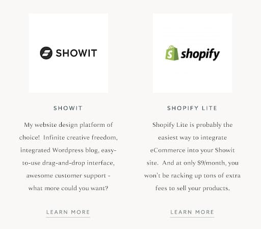
Learn more
One of the easiest ways to direct website visitors to another area of your website is to use a “Learn more” call-to-action. It’s best to use this CTA when someone is interested in browsing and researching but not in taking direct action quite yet.
I use this simple CTA in my Resources page, but you can use it anywhere on your website. I also like using “Learn more” CTAs when directing visitors toward an About page or Team page for my clients.
Start your project
This CTA is perfect for attracting visitors who are ready to start working with you. If they want to cut to the chase and get on your calendar, a “Start your project” call-to-action will work well.
When you use this CTA, make sure you direct visitors to the next step in your booking process. You might bring them to a Contact page with an inquiry form or a scheduler to sign up for a free discovery call. No matter what you choose, make sure it integrates well with your website conversion funnel and sales strategy.
“Start your project” is the primary CTA I use on my Services page as well as my main website navigation. I’ve found that it helps me determine which visitors are ready to talk about their upcoming website design project or need more time to browse my portfolio. Keeping the CTA consistent in multiple places on my site reminds my visitors of this crucial action I want them to take.


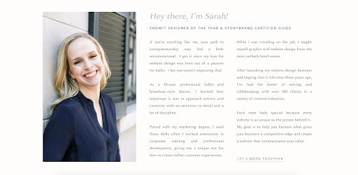
Let’s work together
Think of this as the sister CTA to “Start your project.” If you’re looking for a more collaborative way of enticing visitors to contact you, saying something like “Let’s work together” may do the trick.
If you use this call-to-action, it’s best for it to go to a Contact page so they can email you right away about working together. You’ll be so glad you used this CTA when the lead says “I knew you were the person I wanted to work with.” It’s the best feeling!
Contact us
Another contact-related CTA you can use in your copy is “Contact us.” You’ll see this used on many websites because it’s simple and easy to understand. Your website visitor will assume that this CTA button will take them to a contact form, so make sure that’s the next step.
Providence Vineyard, one of my favorite clients, uses this call-to-action all throughout their website. Since they like to start by getting in touch with potential couples who may want to book their wedding venue, this CTA makes a lot of sense.

View our services
If someone is interested in browsing your services and seeing if they’re a good fit, you may want to use a CTA that says something like “View our services.” Similar to other call-to-actions, you can customize the language to fit your needs.
With this in mind, you may create a CTA button that says:
- See our services
- Browse our services
- Explore our services
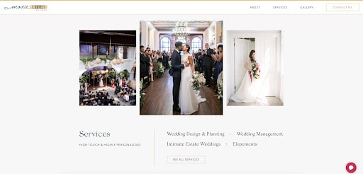
Any variation of this CTA is great for leading people to your Services page. This is what we did for my client Moxie Bright Events’ Services page when I created their StoryBrand-inspired copywriting. We used this “See all services” language throughout their website so everything looked cohesive and simplified.
Book appointment
If your services start with an appointment or a consultation call, you might decide to slightly adjust your CTA copy to fit this next step. With a call-to-action like “Book appointment,” you’ll help leads know what happens when they wish to start the process of working with you.
You can make variations to this CTA button by stating:
- Book your session
- Schedule your discovery call
- Schedule a free call
Make sure the language you choose matches the terms you use in the booking process, much like my client Carolyn Teague who uses the “Book appointment” CTA as her main action.

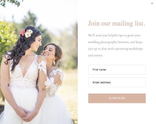
Subscribe
When your primary goal is to build your email list, using a CTA like “Subscribe” will tell your visitor exactly how to join your email community.
Not only can you use it in the static email opt-in forms you embed into your website, but it can also be added to a pop-up. Since pop-ups have been known to drive as much as 1375% more email subscribers, you might want to consider adding them to your website. (I recommend Flodesk for this!)
My client Kiamarie at KSS Photography & Films created a pop-up with a simple “Subscribe” call-to-action button, and it’s been performing well with her audience. Maybe it will for you, too!
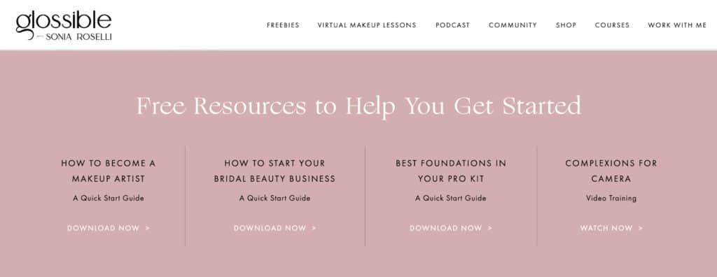
Download now
Speaking of growing your email list, one of the best ways to attract more email subscribers is by offering valuable freebies or lead magnets. To increase urgency and give your audience immediate access to free resources, use a simple CTA like “Download now.”
My client Sonia of Glossible did this on her homepage, helping her audience easily find what they need. Each “Download now” call-to-action leads to a dedicated landing page so her audience members can grab their copy of the free resource.
View the gallery
If your audience is still in the browsing mood, you can use a variety of CTAs that invite them to further explore your website. The exact CTA copy you use may differ based on your website goals and the industry you work in, but these examples should help you brainstorm.
- View our gallery: leads to your main Gallery pages
- View our portfolio: leads to your main Portfolio page
- View our work: leads to your main Gallery or Portfolio page
You may wish to tweak this call-to-action copy to fit your needs, but make sure you keep it clear and concise. You don’t want to confuse people by being overly clever with your button copy. My client JH Events does a great job of this on their website.

Add me to the waitlist
Many entrepreneurs (myself included!) love adding passive income products to their business models. Selling digital products is a great way to teach what you know and share your knowledge.
You’ll be able to serve more people with these products than you could through a 1:1 service, but maybe you’re like me and enjoy serving clients in both ways.
If you decide to create an online course or similar digital product, you may want to test with two main sales strategies: open-and-close launches and evergreen products. Evergreen products are always available for purchase whereas open-and-close launches are only available for a limited time.
If you decide to follow the launch marketing model for your digital product, you may want to use an “Add me to the waitlist” CTA. Then, you won’t miss out on nurturing warm leads who are interested in your offer even if it’s not available yet.
I use this CTA with my Simple Showit SEO course, which began as an evergreen product before I transitioned into an open-and-close launch model. I love connecting with visitors who want to improve their SEO and continuing that relationship until the next launch. My launch conversions continue to increase because of this CTA, so I’m a big believer in it!

Which CTAs are right for your creative business?
That’s up to you to decide! Based on the exercises and examples I’ve shared, you should have everything you need to get started. This work is going to make a huge impact on your website conversions, so you can thank me later! 😉