After launching your website, you may think it’s the perfect time to kick back and relax as you watch the sales roll in.
That’s what we usually think will happen when we unveil the site we’ve been tirelessly working on behind-the-scenes, but sadly, it’s not always the reality.
So, what do you do when the launch buzz wears off and you’re left with a website that doesn’t consistently generate the kind of results you were hoping for?
One thing’s for certain: it doesn’t matter how much traffic you’re driving to your website if you aren’t able to convert those people into email subscribers or client leads.
Most entrepreneurs I’ve talked to wish they would have spent more time incorporating website conversion tips and strategies into their site than focusing on all the pretty elements of their design.
Don’t get me wrong; I love ALL of the pretty things! They make your website stand out and give your audience something to remember, but it’s just as important to think about how your website functions and converts. Maybe even more important!
Website conversion tips and strategies you’ll love
Even if your website isn’t converting as well as you expected, it doesn’t mean you have to start from scratch all over again. That sounds exhausting!
Instead, I want to share some small but impactful tweaks you can make to your own website to increase conversions.
You can take this advice and implement the changes into your website within a few minutes or hours. It won’t take months to work through this list, I promise!
As you begin, I recommend auditing your own website to see how many of these website conversion strategies you’re already using and how many you need to incorporate. Once you have your final list, you can put them into action one at a time.
Sounds easy enough, right? Good! Let’s dive into the first recommendation.
Make sure every page has a call-to-action (CTA)
This is one of the biggest mistakes I see creative entrepreneurs make with their websites. They spend so much time considering which brand photographs they should highlight or which brand colors they should use, but then they forget the most important element: their CTA.
A call-to-action is what inspires your website visitors to take a specific action. This is usually done by pointing them in a specific direction on your website, which helps them figure out what to do or where to go next.
You can use different CTAs throughout your website (in fact, I recommend it!) but you only want to use one main call-to-action per page. I repeat, only ONE (with the exception of your homepage since you’ll let visitors choose where they want to go).
If you include too many CTAs on a single page, visitors won’t know what they should do. More offers doesn’t equal more conversions. Instead, it gives your audience a feeling of analysis paralysis which will dissuade them from taking any action. That’s not what you want!
For example, my client Melanie of Melanie Anne Photography focuses this page on the one CTA: contacting her to see if she’s available for a specific wedding date.
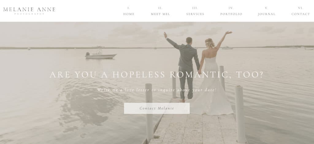
The action she wants potential clients to take is simple, clear, and easy to understand.
You’ll also notice there is only one button, giving her audience the choice between clicking the button to contact her or continuing to scroll through her site.
Challenge: Review every page of your website and determine if they have a single CTA. If they don’t have a CTA or have too many, make a list of the pages you need to edit. This should only take about 10-20 minutes if you have a simple website, so it is an easy but important fix!
Add testimonials and other social proof
It’s one thing for you to write website content about how great your services are or how well you collaborate with others. It’s another for past clients to say it for you!
Adding testimonials is one of the best things you can do for your website. In your client’s own words, they’ll be able to share valuable information about what it’s like to work with you inside your unique client process.
These testimonials are a form of social proof, but they can come in many forms. Even though most entrepreneurs use text-based testimonials, you can also include audio or video testimonials on your website.
When someone is willing to use their face, name, and reputation to endorse your company and give you a positive review, it leads to a LOT of trust. Then, you can turn that trust into more sales.
So, where do you start with testimonials? Like many of the websites in my Showit website design portfolio, I decided to create a custom testimonial block for Jodi of JH Events.
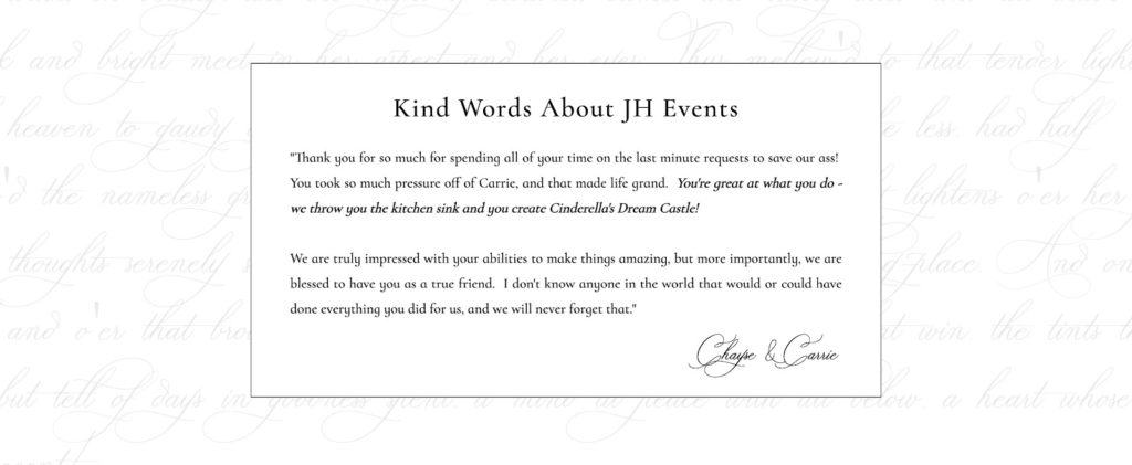
You’ll notice I added a few unique elements to her testimonial block:
- Script-style signatures of her clients’ names
- Faded elegant script background that makes this section pop
- Bolding and italicizing the most impactful sentences
- Consistent use of fonts that fit her visual branding
I take a different approach for each client based on who their clients are and what their testimonials look like, but as a general rule, I add testimonial slideshows to most service pages and sales pages. I might also add them to a client’s homepage if it fits our website strategy. It all depends on the needs of each client!
Challenge: Ask yourself if you’ve included any testimonials in your website. If so, are you highlighting your strongest testimonials? How long has it been since you updated them? If your website is missing testimonials, take a moment to reach out to three to five past clients and ask them if they’d be willing to give you a testimonial.
Simplify your website design
Have you ever landed on a website that was so confusing, you had to hit the exit button? I’ve been there! I’ve always found it interesting that while many entrepreneurs are worried they don’t have enough on their website, they’re usually the ones that end up doing too much on their website.
Just because you can add a bunch of custom designs and interactive features doesn’t mean you should. A few of them may do the trick, but you don’t want to distract your visitors by overwhelming their senses.
Instead, it’s best to simplify your website design with these core principles:
- Add white space whenever possible
- Remove any and all distractions
- Increase your margins
- Vary text sections with imagery
- Keep your fonts, colors, and other elements consistent
These are the guidelines we followed for Karen of Karen Lewis Photography’s website. When working together, we decided it would be best to include ample white space so her gorgeous photos could do the talking.
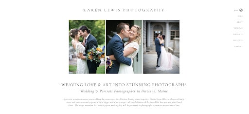
We chose a simple color palette and made sure all of her text was in classic black. The final look can be described as clean, understated, and editorial.
Your design doesn’t need to be as pared-down as Karen’s website, but it’s a good example of how to incorporate simple design elements that keep your audience focused on what’s most important: your visuals and messaging.
Challenge: Take a look at your website’s homepage to start with. Are there too many things asking for your audience’s attention? If so, think about how you can streamline your website so your visitors stay engaged as they continue scrolling.
Add a button to your top website navigation
We already talked about how important it is to have one main CTA, but how do you make sure it stands out? One way is to create a sitewide CTA button that stays in your website navigation.
No matter which page your audience lands on, your CTA button will be completely visible. This can be done by choosing a Showit template that already includes this feature or by investing in a custom Showit website design!
It’s best to use your brand color palette to choose a button color that contrasts with the background of your website navigation bar. You do NOT want the button to blend in with the rest of the navigation links. It should clearly stand out and entice people to click on it!
My client Nicole of Hotsource Yoga uses a CTA button on her website’s top navigation bar to make sure any new visitor can view the class schedule.
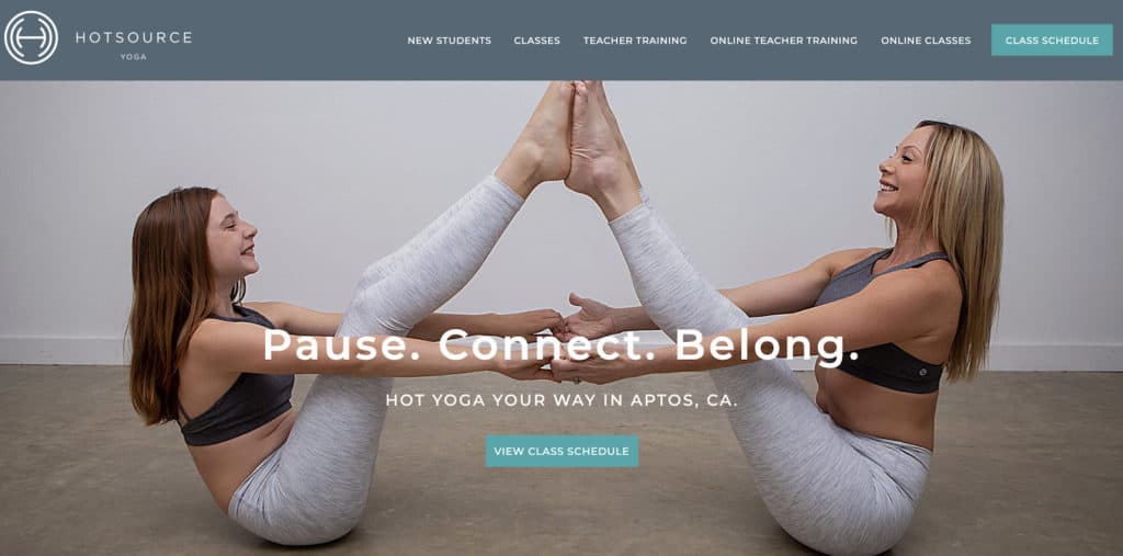
So, how did we choose which CTA to highlight on the button? Since yoga instructors are able to more easily convert new students when they have a chance to compare class schedules with their own calendar, she wanted this information to be readily available and accessible on the site.
Challenge: Taking inspiration from Nicole’s example, think about what your most important CTA is. For educators, it might be building your email list. For service providers, it may be scheduling a free discovery call. No matter what you’re selling, make sure this CTA is the perfect fit for most (if not all) website visitors and won’t change frequently.
Share your pricing on your website
This may seem like an odd website conversion tip to include, but it can make a HUGE difference when it comes to attracting more leads.
Think about it for a second. Businesses who sell physical and digital products almost always share the product’s price on their website. This transparency helps potential shoppers decide whether or not they want to place the item in their online cart or immediately buy it.
It’s a pretty straightforward process with eCommerce entrepreneurs, but in the creative world, service providers don’t always reveal their pricing on their website.
In the end, this comes down to personal preference (so you do you!), but if you’ve been struggling to attract leads that have the right budget, you may want to think about sharing your pricing upfront.
What should you do if you’re offering a service that has custom pricing? I get asked this a LOT, and I get it. While most of my design packages have a set price, I know it’s not the case for everyone.
If you don’t have a specific price, you can give your audience a “starting price” so they know what to expect. (Psst… you should also set expectations around the timeline of your project, how you like to work, what’s included, and more.)
Many of my clients have followed this website conversion tip, including Kiamarie of KSS Photography & Film. In addition to offering photography and videography services, she also educates other photographers through retreats and workshops.
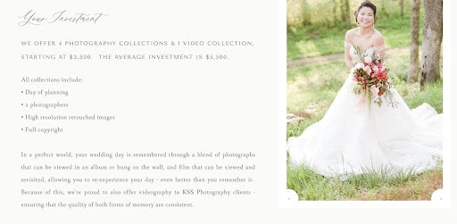
For her wedding photography and film packages, she includes a starting price along with an average investment that client leads can expect when working with her. If a website visitor doesn’t fit inside this budget range, they can look elsewhere and save time for everyone involved.

For her education packages, it makes more sense for her to charge one specific rate for each workshop or 1:1 mentorship session. It’s easy to set this price because what’s included in each offer doesn’t change and isn’t overly customized like the other packages.
Challenge: Are you currently sharing your pricing on your website? What are the pros and cons of doing so? No matter what, it’s important to choose a pricing strategy that works best for you and how you’ve set up your business. While sharing your pricing can increase the quality of your website leads, it’s completely up to you!
Streamline your contact form fields
It’s no secret that most entrepreneurs focus their attention on driving website visitors to their Contact page. That’s why it’s so important that you don’t treat this page as an afterthought!
You may think it’s just a page with a simple form, but it’s often the main place where visitors transform into potential clients. We need to make sure it’s streamlined and optimized! No detail is too small.
Most default contact forms will show a few main form fields:
- First Name
- Last Name
- Email Address
- Message
While I’m all for simplifying your website, this type of contact form is really vague. There’s no prompt asking about the visitor’s budget, timeline, or any other details you may need to know in order to decide if they’re the right fit for your business.
The best thing you can do is to make a list of all the things you need to know about a new lead before you jump on a sales call or confidently proceed with booking. If your list is pretty long, you don’t need to ask all of these things in your initial contact form. Instead, go through it and put a star next to the most important questions to ask from the get-go.
This is what my client Emily of Kennedy Occasions and I did when we created the form on her Contact page. You’ll notice it’s not overly complicated but still asks for details like the bride’s wedding date, venue, budget, and even their Pinterest board style.
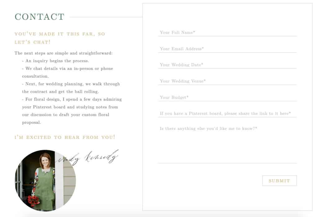
You may have different questions you want to ask, but you can still take a page from Emily’s book and create a contact form with five to seven questions. Anything more than that could be too much.
Challenge: Visit your own Contact page and think about what the user experience is like for a brand new visitor. Is it easy for them to contact you? Are you asking them the most important questions upfront? You can then make changes based on the answers to these questions.
Offer free lead magnets on your site
We’ve talked about how to get more people to convert on your website, but lead generation doesn’t always have to look like filling out a contact form. Sometimes it looks like asking people to join your email list.
If you’ve been around here for a while, you probably already know how much I LOVE email marketing. Along with your website, it’s one of the only platforms you own. You don’t have to worry about changing social media algorithms or paying advertising dollars just so people who are following you can see your content when you have an email list.
When you’re ready to go all-in with email marketing, it’s a good idea to offer a few lead magnets on your website. A lead magnet is just a fancy word for the freebies business owners often offer on their sites in order to get you to sign up for their list.
Freebies can look like downloadable PDF guides, ebooks, checklists, workbooks, templates, and more. The sky’s the limit! Instead of creating just one lead magnet, consider creating a couple based on specific things you teach or know your audience is interested in.
My client Rachel of The Holistic Mrs did this by offering a free ebook on her homepage. The ebook promises to give her new email subscribers access to 18 healthy recipes they’ll love. Who wouldn’t want to sign up for that, right?
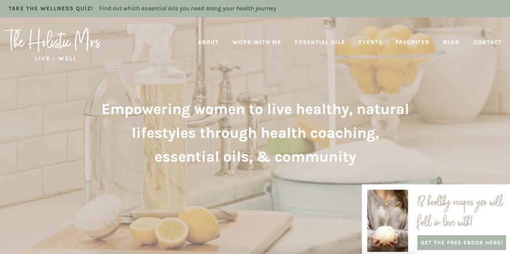
Since Rachel and her audience share a passion for wellness and healthy living, this ebook topic makes sense for growing her list. No matter what industry you’re in, you’ll be able to create a lead magnet that entices your audience to sign up. Just make sure you’re giving immense value in exchange for their email address!
Challenge: Pick one topic you want to be known for and choose a lead magnet type you can easily create. With free design tools like Canva, you don’t have to spend a lot of money to start building your list. Start experimenting with a few lead magnet types and check your analytics to see which ones are the most successful. Keep doing this over time and increase your website AND email conversions!
Include an email pop-up
Speaking of growing your email list, another way you can direct visitors toward your lead magnet is through an email pop-up.
I know, I know. We all have different feelings about pop-ups. Some of us feel indifferent while others hate them, but I’m willing to bet we’ve all encountered pop-ups that are annoying.
The important thing to remember is that email pop-ups, when used correctly, can be super effective. Email pop-ups can average between 3-9% conversion rates, meaning they often perform better than static email forms.
However, you’ll want to keep these best practices in mind:
Keep your offer simple and clear. You can usually do this in the headline but make sure it is also reflected in your description copy when necessary. Make it short and sweet!
Don’t add gimmicky opt-out language like “No, I don’t want to achieve success” to close out of the pop-up window. It doesn’t create a great user experience.
Don’t ask for too much information. All you need is their first name and email address. That’s it! Don’t ask for their phone number, address, website, and other information here.The point is to make this pop-up conversion quick and easy!
Make sure it doesn’t show up immediately. If your visitor sees the pop-up before they have a chance to scroll through your site, it creates a poor experience. You’ll probably see them exit out of your website faster than they came in. Make sure it shows up at least after a few seconds of interacting with your website.
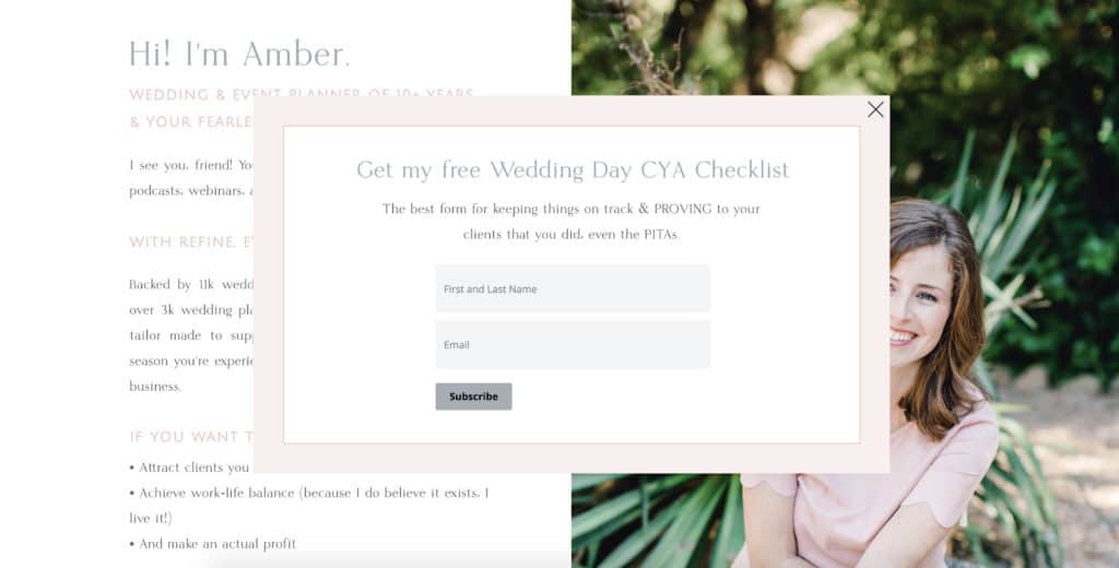
All of these best practices were followed when we created a simple email pop-up for Amber of Refine for Wedding Planners. We kept the copy simple and included insider talk that her ideal audience members will love. The colors are also soft and light so it doesn’t feel like a big obstruction to the rest of her website.
Challenge: Take a moment to consider if an email pop-up is the right strategy for you. It’s by no means a requirement! If it doesn’t fit into your plans, feel free to disregard it. However, you’ll want to come up with other ways to draw attention to your email list. The next recommendation can help with that, too!
Use an announcement bar
If pop-ups aren’t your thing, or you’d simply like to double-down and really highlight your email list, a website announcement bar might be the perfect solution. Usually created in a bold color, an announcement bar typically stretches the whole width of your site and asks your audience to do something specific.
Almost always, your announcement bar will include one line of copy with a simple CTA button. When the button is clicked, your audience will be taken to the page or offer that’s connected to the button.
For my own website, I decided to use an announcement bar to highlight my quiz. Since quizzes typically get higher conversion rates than other lead magnets (the proof is in the pudding!), it was a no-brainer for me.
Also, the quiz is structured in a way that drives qualified leads toward my Showit website design services for certain quiz result types. The quiz is an easy way to assess how ready someone is to work with me but the whole process is automated. It’s awesome!
I’ve tried to point website visitors to the quiz in various ways—like highlighting it in my blog posts or placing it on my homepage—but I’ve found the announcement bar to be the best strategy so far.
Challenge: Think about what lead magnet or other offer you may want to use in your announcement bar. Do you want to point people in the direction of an upcoming event or product launch that has a sense of urgency? Would you rather keep your announcement bar offer consistent from month-to-month? No matter what route you choose, you can view the analytics and track how well it’s performing on your site over time. Adjustments can be made accordingly.
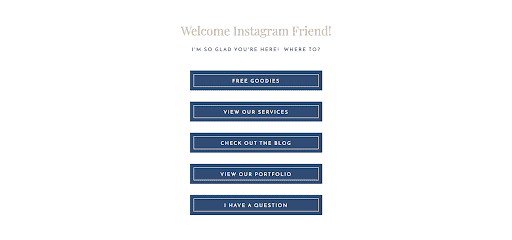
Lead followers to an Instagram landing page
We’ve talked about website visitors and email subscribers, but what about the people who follow you on social media? Seeing your follower count increase can be exciting, but it won’t contribute to your bottom line if you can’t get followers off of the platform and onto your website.
Since most creative entrepreneurs love to hang out on Instagram (myself included!), it makes sense to create a page that’s geared toward your Instagram followers. Instead of using your Instagram bio link to point to your website’s homepage or one offer, why not use a landing page that can link to multiple resources?
Now, you may be wondering why I’m recommending you to use an Instagram landing page with multiple CTAs when I previously said to keep it simple with one.
While that is true for most pages on your website, it’s okay to include links to a few areas of your website on an Instagram landing page. That way, your audience is able to explore more areas of your website and see all you have to offer. However, I recommend simplifying the amount of links you share on this page. Cut it down to five or six links when possible!
If you’re not sure how to create this page, I’ve created an affordable Instagram landing page template you can customize on Showit to fit your unique brand. You’re going to love it!
Challenge: What do your social media followers often want more information about? Use the answer to this question to determine which links you want to highlight on your Instagram landing page. Remember you can swap out these links at any time.
Which website conversion tips are you going to try?
I can’t wait to hear how you plan to use these website conversion strategies to enhance your website. You’ll see your lead generation and sales ratio increase when you strategically use your website and add value through your offers.
You’ve got this!