How long has it been since you assessed your website’s performance?
If you’re like most entrepreneurs, you probably had one of these reactions:
- Um… am I supposed to be doing that? #oops
- I don’t think I can remember that far back…
- I have it on my to-do list but it always falls to the bottom.
Auditing your site is an easy thing to forget when you spend all your time serving clients and keeping up with the day-to-day operations of your small business.
Luckily, this website audit checklist doesn’t have to take all day to complete. In as little as an hour, you’ll be able to determine how well your website is performing and what key adjustments you need to make so it runs smoothly.
I could give you a list with all the bells and whistles, but who has time for that? Instead, I’ve created a simpler version that covers the most essential elements you need to check on.
Let’s get started!
Did you check to see if your website is mobile-friendly?
This should be an obvious thing to check for, but you’d be surprised how many websites look great on desktop computers but don’t translate well to mobile devices.
Your website needs to look beautiful on ALL screen sizes. Otherwise, it’ll feel outdated while giving your visitors a poor user experience. We don’t want that!
When we build your website in Showit, you won’t have to worry about making sure your site is mobile-friendly because it’ll be built for mobile from day one!
What’s unique about Showit is that you’re able to customize how your website looks on desktop AND mobile screens. We’ll have a lot of creative freedom to make your website look exactly how you’ve always wanted it to.
Do you have a clear call-to-action on every page?
When a new visitor lands on your website, everything is brand new! If you don’t give them buttons or links to show them where to go next, they’ll likely exit out of your website altogether. I don’t want you to lose traffic because you forgot to include a call-to-action (CTA).
I recommend having one clear CTA for every page except your Home page. Since your Home page is the central hub of your website, you can link to multiple pages so people can find what they’re exactly looking for.
Otherwise, it’s best to choose one next step per page. For example, your Services page may direct new leads toward your Contact page form or to an automated scheduler to sign up for a free discovery call. A sales page, however, might link to a payment page so people can instantly buy your digital product.
You can also strengthen your call-to-action by using, you guessed it, action words! It’s much more enticing for a visitor to click on a button that reads “Get Started Today” than “Read More.” Look through every page on your website and assess (1) if it even has a CTA and, if so, (2) how strong is it? Then you’ll be ready for the next website audit question.
Are you following your visual brand guidelines?
Have you ever visited a website that looked perfectly put together? We all love landing on sites that follow a cohesive aesthetic on each page. It may seem like magic, but in actuality, it’s as simple as following your visual brand guidelines.
When you work with a professional brand designer, they will often help you design not only a logo but also choose your font pairings, color palette, and more. You can then use these design elements to give your website a unique look that’s true to your brand.
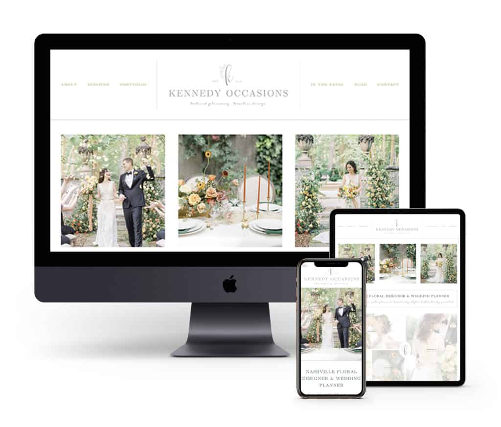
Here is an example to show exactly how a visual brand is implemented into a website:

See how it works? Take a moment to browse through your own website and assess how well your visual brand is coming through.
Are your colors and fonts consistent?
Does everything feel like it fits naturally together?
The answers to these questions should give you a good idea of how well you are following your visual brand guidelines.
Does your copywriting tell a clear story?
Your logo, brand photography, and other graphics will set the tone of your website, but you MUST pair it with clear and concise copywriting. In the marketing world, we define “copy” as any content that’s created to sell your products or services.
Writing great copy is incredibly important to your business because it’s how you primarily will communicate with your audience before they convert on your offer.
First, take a moment to review the copy on your website pages and determine whether or not it is connecting with your dream client or customer.
If you’ve changed who you ideally like to work with, you may need to make tweaks or completely overhaul your copy. I’ll let you make the decision on what the best next step is, but if you want personalized advice, my inbox is always open!
It’s natural to make adjustments to your copy over time as your business evolves, but if you are making changes every few weeks, you may want to press pause and revisit your messaging strategy. This is where following the StoryBrand framework can come in handy.
Here are a few questions to ask yourself as you reimagine your copy:
- Who is my ideal client or customer?
- What are they motivated by? What do they care about? What are their values? Etc.
- What problems are they currently facing?
- How do my products and services solve those problems?
It’s as simple as that! The rest will take care of itself as you continue to reflect and create better copy for your website and other platforms.
Have you chosen a keyword for your website page?
Depending on your level of SEO knowledge, you may have heard of the term “keyword” before. It relates to a word or phrase that is commonly searched for by other users.
For example, if you are a wedding photographer in Kansas City, you’ll want to optimize your site so it comes up on the first page when someone searches “kansas city wedding photographer.”
There are a few ways to do this, and I share more information in my Simple Showit SEO course with helpful exercises, but I want to leave you with one big piece of advice. That is to choose one main keyword for each page. ONLY one.
If you try to use the same keyword too many times, you might end up competing with your own website. Weird, huh? But that’s how it can work sometimes.
Then you can implement this keyword into your title tags, meta descriptions, and the body content of your page. If it sounds like I am talking gibberish, I have a more detailed explanation about each of these elements in this quick SEO guide.
Are you featuring high-resolution images?
There’s nothing worse than visiting a website that looks great until you get to their imagery. No matter what size screen your visitor is viewing your website on, your brand photography and graphics shouldn’t be out of focus.
You can usually test this by seeing if your images are coming up pixelated or blurry. If they do, that’s a good sign that you need to upload a higher resolution image file. Easy enough, right?
If your images are good quality but they’re too slow to update, I recommend looking into the size of your image files. If the size is too large, you may run into some loading issues. When that is the case, simply shrink the file size and reupload the image. It may seem tedious, but your website visitor will thank you for improving the user experience by staying on your site for longer.
Did you make sure your photos have alt tags?
This is a common SEO recommendation, especially for people who publish a lot of graphics and photography on their websites. That fits most of my clientele, so I always recommend writing simple alt tags so your images can easily be read by Google bots.
Wait… how do bots “read” an image? It’s quite simple, actually. Alt tags tell Google what is inside your image or what it’s about, just in case it doesn’t load properly on the site or if you encounter a visitor who is visually impaired.
It’s great for SEO because you can add more detail to your site. You can read instructions on how to easily write your alt tags in this quick SEO guide.
Just remember not to stuff your alt tags with tons of unrelated keywords. Google doesn’t love that. To learn more about what search engines like, head over to learn more about my Simple Showit SEO course.
Is your website navigation easy to understand?
In order to create the best user experience possible, you need to simplify your website navigation. This refers to the series of links you highlight at the top of your website and even in the footer, if you so choose.
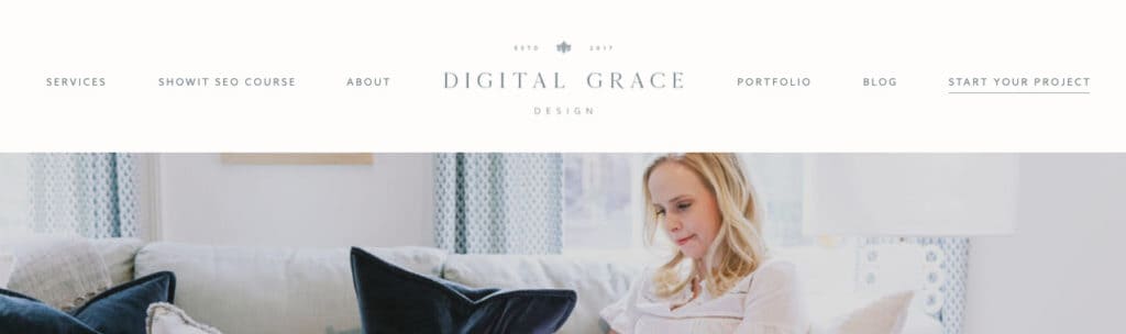
Here’s a quick example so you know we’re talking about the same thing:
Top Website Navigation
Bottom Website Navigation (also called a “website footer”)

You may notice some similarities between the top and bottom navigation on my website. This is done intentionally so it creates a sense of consistency and trust with each user.
If you have a complex site with many pages, it might be difficult to choose the most important ones to add to your website navigation. I totally get it, but defining what your biggest priorities are and having them reflected in the pages you choose is essential.
I usually recommend including four to six links in your top website navigation. You can add a few more in your footer, but don’t go too crazy. We still want to simplify your user’s path forward!
If you want to highlight more pages, you can always create a dropdown menu link in your top navigation that shows a directory of services or resources your audience can browse through. That’s the best way to make sure your navigation looks streamlined and clean while allowing you to highlight a few more pages.
Is your website legally protected?
Did you just groan hearing the word “legal?” I’m right with you. I know this isn’t the most fun part of the website audit checklist but it is really important.
If you want to ensure your website is legally in-the-clear, you’ll need:
- Terms & Conditions
- Privacy Policy
- Refund Policy
- Copyright Ownership
You can read more about these essential legal documents in this full-length guide, but I HIGHLY recommend purchasing affordable legal templates you can customize vs. trying to DIY them yourself. If you aren’t a legal expert, steer clear of the DIY route on this one.
My favorite legal templates are from The Legal Paige, and you can use code “Sarah” for 10% off instantly!
She has legal and contract templates for just about everything you need as a service provider or product creator. I can’t tell you how nice it is to know your brand AND website are legally covered.
Have you checked for broken links?
This step is even more important for entrepreneurs who are transferring their website from one platform to another. If you are switching to Showit (which I highly recommend!), their customer service team is there to help with the whole process.
However, you will want to check for broken links every few months to ensure all of your buttons and links are taking audience members to the right place. You’d be surprised how often I find broken contact links on websites that heavily rely on lead generation from those pages. It’s always good to check in. As they say, it’s better to be safe than sorry!
If you find a broken link, be sure to replace it with one that works. Otherwise, you could lose traffic after a visitor hits your 404 page too many times. That would be a bummer, so I want to save you from producing that kind of user experience.
Complete the simple website audit checklist today
Trust me, you’ll feel so much better about how your website is performing when you’ve taken the time to do a comprehensive audit.
If you’re planning to relaunch your website or rebrand, I still recommend taking the time to complete this website audit checklist. You’ll learn SO much about what’s working and what needs some improvement. Then, you can bring those findings into your new website design.
If you’re looking to improve your website conversions with a beautiful and functional Showit website, let’s talk about your project!