
Creative Entrepreneurs, Interior Designers, Photographers, Showit, Tips & Tricks, Website Design, Wedding Professionals
As you prepare to launch your first website or redesign your current website, you may be wondering what comes first.
Should you outline your website copy, tackle the design, or build your blog?
You might be surprised to hear that setting your website up for success doesn’t start with any of the above. Instead, you’ll want to begin with your website navigation.
Your website navigation has a large impact on how likely someone will be to explore your website (which will decrease your bounce rate) and if they decide to convert on your offers, helping you drive more sales and attract more client leads.
Without a clear website navigation, visitors won’t know how to find your most important website pages, everything from your blog to your services to your contact form.
If someone can’t find what they’re looking for in a quick and easy way, they won’t stick around for long. This is your opportunity to guide visitors to where they need to go, helping you build trust with them by offering a better experience through your website.
When you set up your website navigation, it will typically looks like a curated list of links placed in the top of your website, like this example from my client Lindsey Drewes:

You might also include a highlighted call-to-action (CTA) button in your website navigation to make a specific action or page really stand out, like this example from my client Sanctuary Pools:

Lastly, you could choose a more minimal look by including a hamburger menu (no, really, that’s what it is called!) in the top corner of your website. When clicked, it will show the full menu of your website navigation links, like this example from my client Marnie Cornell Photography:


After you choose the website navigation style that fits you best, you might be wondering which pages you should include in your navigation bar.
The most common web navigation for service-based entrepreneurs looks like this:
- Home, the central hub of your website
- About, the place visitors go to learn more about your brand
- Services, the full outline of your service offerings
- Portfolio, the place visitors go to see your past work examples
- Blog, the place visitors go to learn from your advice
- Contact, the place visitors go to get in touch with you
There are countless website creators who direct their incoming traffic to these six key pages because each one will help visitors find what they need to know before deciding to hire the brand or not. If you are just getting started with your first website, this tried-and-true method may be the perfect fit. You can always grow your website from here as your business expands and evolves over time.
While this method gives you a great start, you may also want include one of these other pages to the top website navigation bar:
- Reviews, Testimonials, or Kind Words
- Start Here
- Shop
- Sales Page (for Courses, Memberships, eBooks, etc.)
- Press
- Newsletter
- … and more!
Instead of trying to link to as many pages as you possibly can (which would overwhelm nearly everyone who visits your website!), think about the page links that are most important.
It may help to revisit your overall website structure as you set goals and determine which page links get a spot on your coveted website navigation bar.
Best practices for setting up your website navigation
As you think about how you want to organize your website navigation for a better user experience, it’s important to know a few best practices. These guidelines will set you up for success when you create the navigation for your Showit website.
Include four to six primary links
One of the age-old questions when it comes to creating your website navigation is to determine how many links you should include. If you choose too many, you could overwhelm your audience. If you choose too few, people may not be able to find what they need.
As a general rule of thumb, I typically recommend using four to six links in your top website navigation bar. This keeps your website navigation very organized and streamlined.
You can see I decided to use a total of six important links in my own website navigation…

… but for my client JH Events, we only used four links.

The number of links you use depends on how many pages you include on your website and how many of them you’d consider a primary goal.
If you have more links that you want to include, you could elect to use a dropdown menu option to organize similar links. This is what happens when a visitor hovers over a specific navigation link and it shows a (very) short menu of related links that fall underneath that main category.
Look at this example from copywriter Kayla Hollatz to see what I mean:
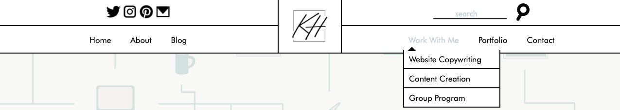
In this case, her “Work With Me” navigation menu shows a list of her services with separate page links for “Website Copywriting,” “Content Creation,” and a “Group Program.”
You can do the same with your own website navigation bar. Just make sure you limit the list of these secondary links as well. You don’t want to overwhelm your audience! I usually recommend using a dropdown menu feature like this for only one or two links in your main navigation bar. That way, you can keep everything tidy and easy to navigate.
Be clear instead of clever
Some service-based entrepreneurs have a clever and witty brand voice. If this is you, you might be tempted to title your pages with unique names that will infuse more fun into your website.
What you might not realize is that it could do more harm than good. Instead, you’ll want each link’s title to be super clear.
For example, it’s better to state that your blog is, indeed, a “Blog” in your website navigation bar than giving it a name like “Journal” or “Diary.” You may think your audience will know what you mean when they see either of those options in your web navigation, but first-time visitors may find themselves confused by the lack of clarity.
Another example of this is if you wanted to link to a course sales page and use the course’s name “Photo Warriors” instead of simply titling the link “Course.” The name “Photo Warriors” sounds like it could be a free resource, a Facebook group community, a newsletter, or any number of things. Visitors want to know what it is before they click the link, so keeping it simple with “Course” will be best if your course name isn’t well known.
If you want to give your blog or another page a special name, you can still do so on the website page itself. Just make sure the navigation link states what it is first.
Don’t forget your footer navigation
Just because your footer is located in the bottom of your website doesn’t mean it should be an afterthought. I commonly see creative entrepreneurs build websites without a footer or they just use the vague default footer that’s included in some template.
Let’s give your footer some TLC, shall we?
To start, your footer doesn’t need to exactly mimic the web navigation at the top of your website. You may repeat some of the links, but its main purpose is to give your visitors an extra opportunity to find other pages on your website that may be relevant to them.
Think of it as your website’s extended roadmap to help others further explore your site.
When someone scrolls all the way to the bottom of your website page, it may indicate that they are interested to learn more or haven’t quite found what they’re looking for yet. In either case, you can provide them with another set of links that will help them continue moving through your website.
For example, let’s take a look at my own footer:

You may notice I’ve included a few links from my top website navigation bar (like Home, About, and Services) but also featured a few other page links (like Kind Words).
Also, I have links at the very bottom of the footer that outline my website disclaimers, privacy policy, and terms and conditions for my brand. All of these are legally required to make sure your website is legit.
Lastly, my social media icons are included in the bottom right side to make sure visitors are able to explore my social channels as well. It’s in an easy-to-find place so if they need to reference it at any point during their website journey, they can do so.
I’ll show you a few other examples from my website design clients at Digital Grace Design:
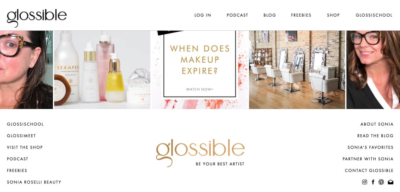
For Sonia, the founder of Glossible, I added social media links to her website’s footer along with her beautiful logo design.
You’ll also notice on the left and right side of the footer, it includes more links than Sonia has at the top of her website navigation bar. This is done intentionally so she can still highlight other website pages without making her main navigation bar look super cluttered. We were able to avoid that with this smart website footer!
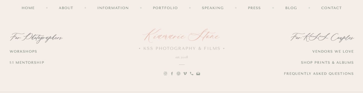
Kiamarie of KSS Photography & Films, however, features a website footer with social media icons in the middle with her website navigation links separated by audience type: “for photographers” and “for KSS couples.” This helps her audience find exactly what they need, no matter what term best describes them.
She also has a list of general links at the very top of her webinar footer that allows her audience to see some from her main navigation bar along with a few others. Breaking up each section of links gives her footer more visual interest and ensures visitors can find exactly what they need.

Lastly, in Cari of Cari Long Photography’s website footer, I decided to include the two sections to the left and right per usual, but this time, it shows a “Subscribe” call-to-action for her newsletter and studio location information. This makes sense for her local wedding photography business.
In addition, I also included links at the very bottom of her footer to make sure her audience could still find other pages of information they may need. Social media links and icons can still be found on the right-hand side.
Now that you have a few examples, you can create your own website footer inside Showit. Customize it based on your current template or, if you’d like, create your own! (Psst… this is one of my favorite elements to create when I work with clients on their Showit websites!)
Get started by building your own website navigation in Showit
If you’re ready to create your website navigation, keep these other resources in mind.
You’ll need them all in order to create the best user experience for your incoming visitors.
They will thank you!
- Creating a Website Structure for Your Showit Website
- 6 Website Mistakes You Might Be Making (And Quick Fixes!)
- 5 Essential Things You Need on Your Homepage
- How to Write & Design a Lead Generating About Page
- 6 Essential Things You Need on Your Services Page
- The Only Website Launch Checklist You’ll Ever Need
Looking to hire a website designer to create the website navigation on your behalf?
I’d love to work with you on building your very own Showit website!
Click here to learn more about my services.


