Your sales page can make or break the success of your launch.
When your sales page is optimized for conversions, you’ll have an easier time enticing visitors to buy your product or service. However, many entrepreneurs admit to feeling overwhelmed when creating a sales page.
I often hear questions like:
- How do I know what information goes where?
- What do I actually need to say in the sales page?
- How much information is too much information?
- How do I mix imagery with all of my content?
If you aren’t sure where to start, I can help. As a Showit website designer, I’ve designed dozens of sales pages for myself and my clients over the years.
While every sales page is different, there are a few guidelines I follow whenever I’m creating sales pages. That’s what I’m going to share with you today.
Essential Showit sales page design tips for creative entrepreneurs
By keeping these sales page design tips in mind, you’ll be able to create a sales page in Showit that keeps your audience engaged and informed so they’re ready to take action. Let’s begin with one of the most important elements: your call-to-action (CTA).
Focus on one call-to-action
There should only be one call-to-action on your sales page. If this is your first time hearing this phrase, a call-to-action is simply the desired action you want your website visitors to take.
On your sales page, your CTA is to buy your product or service. This means you don’t want to include any other links or buttons that could distract your visitors from this important goal.
Every part of your sales page must be designed in a way that leads people to take action on this singular goal. Inside my Simple Showit SEO course sales page, I give visitors the opportunity to immediately buy the course during launch periods. However, if someone finds the sales page when the enrollment doors are closed, the main CTA is to sign up for the waitlist.
As long as your call-to-action is clear, concise, and easy to read and see, you’ll be ready to implement it into your sales page design. When possible, try to add actionable words to your CTA button language to optimize your sales page for more conversions.
Include multiple CTA buttons
While you will only have one clear call-to-action on your sales page, it doesn’t mean your CTA button should only appear once. It would be too easy to miss otherwise.
Be sure to incorporate multiple CTA buttons into your website design. I would recommend keeping the button colors and language consistent throughout your sales page so they’re easy to find.
You never know when a visitor will be ready to make a purchase. Some may feel confident after reading through your list of benefits, while others may need to get to the very bottom of the page before they take action.
This is why you’ll want to have a CTA button at every major place where a purchasing decision could be made. I also recommend having a CTA button every few scrolls so you never have to scroll too long before you see another opportunity to purchase the offer.
Inside my Showit template sales page, you’ll notice that I have a “Show me the templates” CTA button sprinkled throughout the page in places like this:
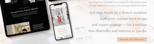

You can implement the same strategy into your sales page so it’s always primed for buyers, no matter where they are in the customer journey.
Use high-contrast colors
You already know how important it is to use consistent, on-brand colors in your website design. If you haven’t chosen these colors yet, you can read this guide on Choosing Your Color Palette and come back to this blog post afterward.
Looking at your color palette, you’ll want to determine which colors have the highest contrast. Those will likely be the colors you’ll frequently use in your website design.
I’ll show you what I mean by walking you through my template shop sales page. The benefit of using this on-brand neutral peach color is that it’s easy to see the CTA button on a light background…

… and it still stands out on a darker background.
This CTA button color works not because it’s arguably the best color in my palette. I use it because it has the greatest contrast with my other brand colors. Thus, it’s perfect for my CTA buttons, giving me more options for how I can design my sales page.
Choose easy-to-read fonts
Have you ever landed on a sales page only to realize you can hardly read what it’s trying to say? This often happens when website creators choose the wrong fonts.
You may think it’s more important for the sales page’s design to be aesthetically pleasing, but if no one can read your content, it won’t help you make more sales. Keep this in mind when you’re choosing signature fonts for your brand during the visual branding process, too.
Here are a few tips to keep in mind when selecting fonts:
- DO choose fonts that are easy to skim and read at quick glance.
- DON’T choose overly ornate script fonts that are illegible.
- DO choose a sans serif font and serif font pairing that looks beautiful.
- DON’T choose fonts with symbols, numbers, or characters that are distracting.
If you aren’t completely confident in your font selections, ask a few business friends what they think and see if they think the text is easy enough to read. If the font is more stylistic than it is legible, it might be time to revisit your typography choices.
Implement white space into your design
Adding white space to your sales page design is one of the best things you can do to encourage visitors to continue scrolling through your page. Without white space, your design may feel distracting with elements that feel crowded and cramped.
Of course, having white space doesn’t have to literally mean having lots of white backgrounds on your page. You can definitely have white backgrounds if it fits within your brand’s aesthetic, but in reality, white space refers to the amount of breathing room in a design.
Examples of white space can include:
- Emphasized headers
- Consistent spacing between lines of text
- Dividers between content sections
- Spacing between imagery and other design elements
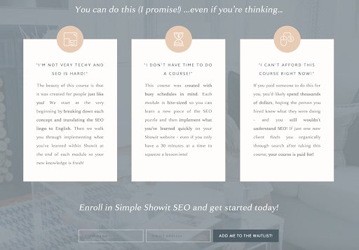
When you take a peek at my online course sales page, you might notice I’m using many white space techniques. This is done to guide the visitor’s eyes and encourage them to keep scrolling.
I used thin line dividers between each course module to give a feeling of separation within these sections. I also have equal spacing between each desktop photo mockup which shows a preview of what someone would find inside the course.
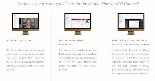
Lastly, I use the same style of headers, sub-headers, and text in this section as I do throughout the sales page for better consistency. From content to design, everything here is optimized for ample white space.
Optional sales page design strategies you can start using
While these next sales page design tips aren’t required, they are perfect for entrepreneurs who want to go above and beyond the norm. Keep reading to see if any of these design strategies are a good fit for your upcoming sales page.
Include pricing tables to increase conversions
Pricing tables are commonly used to sell online courses, membership communities, and other digital offerings that can be bundled together. Instead of including a single CTA button, you’ll instead give your audience the opportunity to purchase a bundle that fits their needs.
For example, when launching my Showit template shop, I decided to include a special pre-launch offer for business owners who wanted to upgrade their purchases. Inside the pricing table below, you’ll see an additional offer that includes a personal site audit with yours truly, all for a lower price than it would be when it’s sold separately.
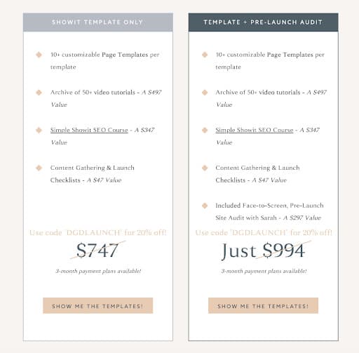
Pricing tables like this can be a great way to increase your conversions while still giving your audience the element of choice.
If a buyer is looking to get as much value as possible from your offer, they might buy the high-priced bundle. However, if they are budget-conscious, the low-priced offer will look even more affordable compared to the other options.
Here are a few things to consider when creating your pricing table:
- Make sure your prices are emphasized and clearly displayed.
- Give a list of features your buyer will get when they make a purchase.
- Make the high-priced offering look like it has far more features than the others.
- Highlight the offer that is the most popular or the best deal.
- Include a CTA button for each pricing option.
You can build a pricing table inside your Showit site or hire a website designer like me to help you with setting it up. In no time, you’ll have an optimized pricing table that’s ready to convert.
Offer payment plans
To increase conversions, think about offering payment plans on your sales page. This is a great way to make your offer feel more accessible to buyers who would benefit from splitting up their payments rather than paying the full price upfront.
Many entrepreneurs will use this pricing strategy when they’re selling premium products and services. If you’re selling a journal for $15, you probably won’t need to offer payment plans on your sales page. However, if you’re selling an online course for $1500, a payment plan could be what your buyer needs to confidently make a purchase.
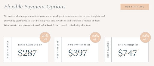
To make my Showit templates more accessible, I decided to offer flexible payment plans options. Even if someone chooses a three-month payment plan, they’ll still have immediate access to their template so they don’t have to wait.
Think about how you may want to use this feature on your sales page to entice more people to buy. This can be done in addition to your pricing table, or you can use it on its own.
Customize a pre-built sales page design template
Instead of trying to create the perfect framework for your sales page, why not customize your version based on an optimized template that already exists?
If you’re feeling overwhelmed with the idea of building a sales page from scratch, you can select one of my sales page templates as an add-on! They’re affordably priced and will fit effortlessly into the rest of your template designs.

No matter if you’re selling an online course, coaching program, mastermind, membership community, retreat, or any other offer, you can use a pre-built template to guide your writing and design process.
That way, you’ll ensure all the necessary details and imagery are right where they need to be in order to turn more passive visitors into passionate clients and customers.
If you want to look at all of the add-on sales page options, visit my Showit template shop!