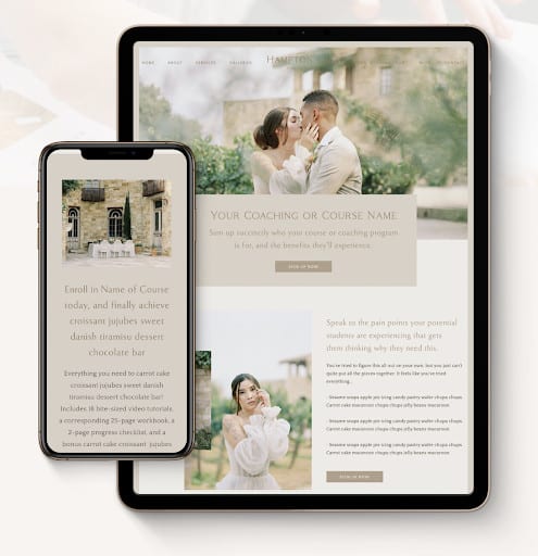
Are you hoping to make passive income as a service provider? Then you’ve probably thought about adding online courses to your evolving business model.
Online courses give you the opportunity to teach important skills to students who are hungry to learn from you. You don’t have to be the top expert in your industry to get started, either.
All you need is high-quality course content and an effective online course sales page. In order to increase your sales page conversions, you’ll want to ensure all the essential elements are in place.
In this article, you’ll learn the eight elements you need to include in your online course sales page to turn more visitors into buyers.
8 things you need to create an effective course sales page
As you design your course sales page and write its content, think about the questions your ideal course students may be asking themselves right now. How can you create a high-performing sales page that answers these questions and gives them confidence in what you’re offering?
The more confidence your visitors have in your online course’s value, the more likely they will be to enroll. Since most visitors will make their final decision while scrolling through your sales page, it’s important for this page to be written and designed with conversion in mind.
Let’s start with the first thing you need in order to introduce your online course to a new audience.
Mock-up preview of course materials
Although online courses don’t usually come with physical materials, students still want you to make the course experience feel tangible. The primary way to do this is by sharing a visual preview of items and lessons inside the course.
This will give students a sneak peek of what’s inside the course, which could include:
- Video lessons and modules
- Downloadable worksheets and checklists
- Printable workbooks with exercises and activities
- Video tutorials and interviews
- Customizable templates and prompts
- Bonus content
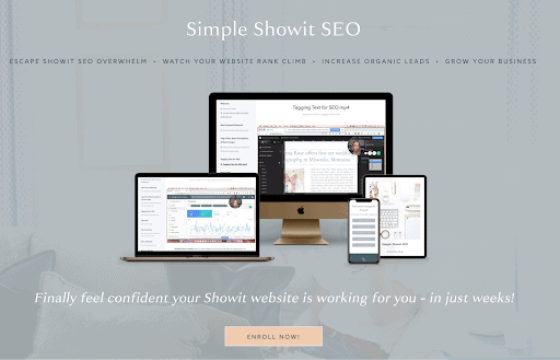
I recommend displaying the most visually engaging course materials front and center when creating your mock-up photo. I did this when introducing my course Simple Showit SEO on my course sales page.
I decided to show a photo preview of a sample course lesson, a screenshot of my workbook, and a complimentary landing page template. This highlights a variety of materials that are included in the course without taking attention away from the most important content.
Invitation to imagine the possibilities
Think like a storyteller and set the scene for incoming website visitors. Think about what they might be struggling with and the pain points they’re experiencing. How is your course the solution?
By answering these crucial questions, you’ll increase your visitor’s curiosity by inviting them to imagine what their life or business could look like after the course. Think about what their deepest desires are and how you might help them achieve these goals through the course.
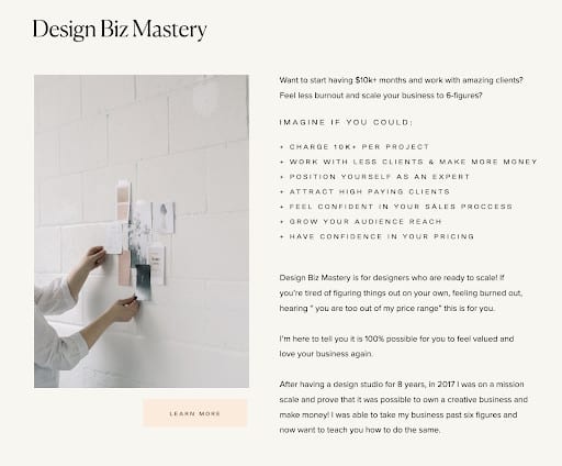
Take Design Biz Mastery from Morgan Rapp as an example. This comprehensive online course teaches designers how to charge more for their services and create a sustainable business.
Taking her students’ needs into consideration, Morgan leads with a list of actionable goals they could achieve after finishing the course. This includes highly desirable things like the ability to book five-figure projects, work with fewer high-end clients, and confidently grow an online following.
By directly stating what’s possible, Morgan is able to position the online course as the best solution for scale-minded designers who want to uplevel their business.
List of what’s included
Once you’ve hooked website visitors on what’s possible after taking your course, they’ll want to know what’s included. This is the space to share a bulleted list of everything your students will receive when they invest in your course.
For comprehensive courses with premium pricing, it’s best to create a longer list of materials your students will have access to. You may also want to include a “valued at” price for each item, showing how much value they’re getting at your price point.
If you are creating a mini-course, masterclass, or lower-priced course, you might have a condensed list of deliverables and materials. Amber did this when creating the Refine Course, helping wedding planners know what to expect from the course in advance.
Creating a shortened list of deliverables will make the course feel less overwhelming for those who want to quickly learn what they need and go on their way.

List of what you’ll learn
Once a visitor knows what’s inside the course, they’ll want to know exactly what topics are covered. Since students are looking to learn from you, it’s important to lead with how and what you’ll be teaching them.
Start by reviewing your online course outline which includes every course module and lesson. You can either list all of the topics on your sales page or create a condensed version of this list. I usually recommend saving on space by introducing each module’s theme, but it’s up to you!
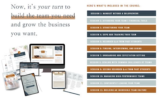
The Abundance Group did this with their intensive-turned-course offering, the Build Your Team course. By listing the title of each session in their course, it’s easy for potential students to determine if the course covers what they need to know.
Testimonials from past students
Did you know testimonials can increase conversions on sales pages by 34% or more? Collecting positive support is more important than ever as more course buyers make their decisions based on reviews.
It’s easy for a course creator to say how great their own course is, but it’s far more powerful for a past student to share how transformative the course was. If you’re gearing up for your first online course launch, it might make sense to invite a small group of beta testers to give you feedback and supply your first testimonials.
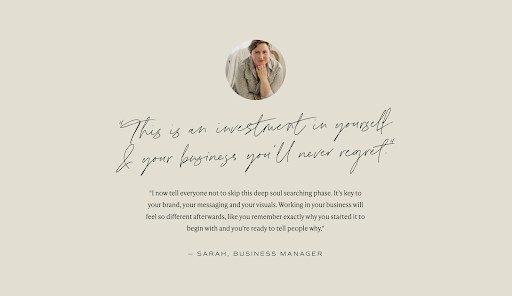
Over time, you can swap out testimonials for students who see the most success from your course. Copy Uncorked does this with their Vine to Voice course, which teaches students how to create a unique brand voice for their brand.
By highlighting a key phrase in a cursive font, a website visitor’s eye is drawn to the statement of confidence from a past student. Then, if the visitor wants to learn more, they can continue reading the rest of the student’s review in the serif font below. Social proof is even more effective when a photo and name are included, so keep this in mind as you design your course sales page.
List of qualifiers
As visitors read through your content and testimonials, they may be asking themselves if the course is really right for them. To aid in their final decision, describe who the online course is perfect for.
You might think you’re leaving money on the table by saying who the course is (and isn’t) made for, but instead, you’re making a stronger connection with visitors who are ready for the course. When they read your list of qualifiers, they’ll probably feel more confident in making a purchase.
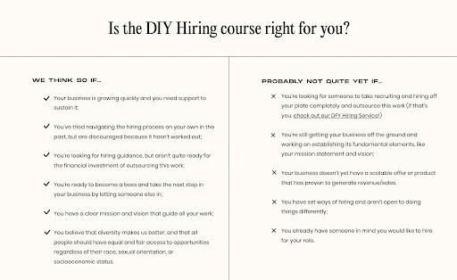
I love how clear Meg is on her sales page for the DIY Hiring course. Whenever a potential buyer is on the fence about investing in her course, they can read through this quick list of qualifiers to see if it’s right for them. She also lists who the course isn’t right for, making it easy to discern who the course will help.
Personal introduction or bio
To improve your course conversions and create a special bond with incoming students, think about including a personal bio or introduction on your sales page.
While some website visitors will already know who you are, some may land on your website for the first time through your sales page. Don’t miss this opportunity to share more about who you are, what your brand stands for, and what the purpose behind your course is.
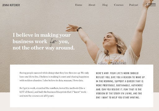
As an influencer, Jenna Kutcher knows the best way to sell her online business courses is to relate her story to her visitors. By sharing her beliefs and hopes, she appeals to her creative entrepreneur audience while introducing multiple course offerings.
However, if you’re creating a sales page that’s dedicated to selling one course, I recommend keeping your personal introduction in the bottom half of your sales page. This way, you can spend more time writing to your ideal course student and introducing your course before you build trust as a teacher.
Payment plan options
To make your online course more accessible to a wider audience, you’ll want to include a few payment options for incoming students. This strategy works especially well for online course creators who want to sell premium courses.
Instead of collecting the full payment upfront, you can offer flexible options where students can pay in monthly installments. If someone is on the fence about making a purchase because of the pricing, payment plan options might make it easier for them to move forward.
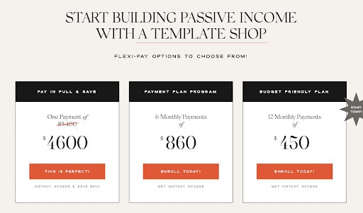
North Folk does this with their Revolving Revenue course. Since it requires a premium investment, it makes sense to offer a one-time payment option along with 6-month and 12-month payment plans.
Students can save more by making an upfront payment in full but these accessible pricing options are helpful for those who need them for cashflow reasons. If you’re selling a higher-priced course, you might want to try this pricing strategy!
Start creating a course empire with my Sales Page template!
If you’re ready to sell online courses to students who can’t wait to learn from you, get started with my Sales Page template! It will guide you through writing the content with helpful prompts as you customize the design to fit your visual brand.
You’ll also get access to:
- Built-in copywriting prompts to inspire strategic website messaging
- Bite-sized video tutorials for fast and easy customization and support
- Complimentary access to the Simple Showit SEO Course
- 1:1 support from me and live chat support via Showit customer service
- And so much more!
Click here to buy the Sales Page template for just $97!