
While gorgeous visuals and stunning designs can help your website stand out among competitors, no one will stay on your website if it’s hard to navigate. Unfortunately, too many entrepreneurs focus on how pretty their website is instead of its user-friendliness.
User-friendliness is not something to skip out on: 88% of users are less likely to return to a website if they have a bad user experience. It’s crucial to create a user-friendly website that will engage the right audience and inspire them to take action, or else you’re missing out on potential sales!
If you’re struggling to know how user-friendly your website already is, I’ve got a quick checklist you can run through to ask yourself key questions to help you discover your website’s strengths and weaknesses.
How to determine if your website is user-friendly
As you walk through these questions, try to answer them as if you are someone who is coming to your website for the first time. Better yet, you could even ask the same questions to a friend, family member, or audience member after they interact with your website.
You can jot down your answers on a separate piece of paper or simply make a mental note. Let’s dive in.
Is your website navigation intuitive?
Your website navigation is one of the first elements your audience sees when they land on your site. This main menu consists of a list of navigation links that take visitors to different pages on your website when clicked, depending on where they’d like to go.
Typical website navigation will show these links:
It may also include a Shop page, Blog page, Portfolio page, Photo Gallery page, or any number of other pages. It’s important to streamline your website navigation so you don’t run the risk of overwhelming your audience with lots of links.
If you’re not sure how many links to include in your website navigation bar, it’s best to highlight four to six primary links. I followed this same guideline for my own website and have seen better engagement with fewer links.

Simplifying your website navigation will help you reduce the likelihood of analysis paralysis, which happens when you give someone too many options to choose from. By keeping your options to a minimum, you’ll attract the right audience and build a more user-friendly website.
Is your logo easy to find?
Visual branding is more than your logo, but your logo is an important part of your brand. It’s a unique mark that represents your brand’s personality, values, and mission. If someone lands on your website and doesn’t see your logo, they may not know they’re in the right place.
When I’m creating a client website, I always ask for their logos and design elements before I begin designing. This is so I can strategically place their logo based on our website strategy.
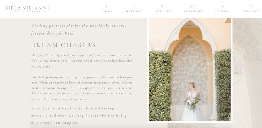
For inspiration on what this can look like, I loved collaborating with Melanie Anne Photography on her Showit website. We used her logo in two distinct ways on her homepage.
When someone lands on her site, they are greeted with a stunning, fine art style photograph that captures her audience’s attention. However, you’ll notice we included a variation of her logo along with SEO-rich description text so Melanie can build brand recognition.
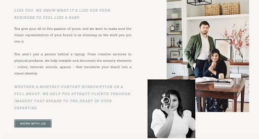
As the visitor continues scrolling, they’ll see her logo in the top left corner of her website navigation bar. This was done intentionally to keep her visual branding consistent throughout her website.
It’s a good rule of thumb to keep your logo near your website navigation, but you also have creative freedom when displaying your visual branding. Get creative and have fun with it!
Have you optimized your website for mobile?
Mobile visits now count for 61% of all website traffic as of 2020. This number continues to increase year over year as more people surf the web on their phones and tablets. If you haven’t optimized your website for mobile, now is a great time to do so!

This isn’t just a suggestion for creating a user-friendly website—it’s a necessity. Luckily, with the right tools, you can customize your mobile site for optimum usability.
If you build a website on Showit, it’s easier to ensure it looks great on every device since you can edit the mobile version of your site. Yes, even without touching the code!
This feature is really unique to Showit and is one of the main reasons why I love designing client websites on Showit. Their drag and drop tool makes it easy to get started with mobile website design. To learn more about mobile design in Showit, start here.
Have you included links and buttons?
Including links and buttons in your website will give your audience a call to action (CTA).
A call to action refers to the intended action you want someone to take. On your website, this could look like enticing a visitor to sign up for your email newsletter, schedule a discovery call, or any number of CTAs.
For most website pages, you’ll want to include a single CTA. The exceptions to this rule would be your homepage and blog because people will land on these pages with different goals in mind.
On your Services and Product pages, one call to action is all you need. If you include a link to your About page, a button to your call scheduler, and another button to an application for your visitor to fill out, they won’t know which action to take first.
It’s best to simplify your website by weaving the same CTA into your website page based on your main goal. For example, my client Radiant Photography uses a consistent “Work With Us” CTA throughout their brand photography services page.
No matter if you start at the top of the page…
Or get near the bottom of the page…
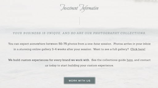
…you’ll notice they use the same CTA button copy, color, and style throughout.
When clicked, each button will go to the inquiry form embedded near the website footer. This ensures their audience knows they only need to take one action: contacting the Radian Photography team for more information.
Did you add alt text to your images?
To make your website more accessible, it’s important to add alt tags to your imagery. This is a step many entrepreneurs skip over, but it only takes a few minutes to write alt text. Alt text is easy to write and makes a big difference in your website’s performance.
Alt text is used to tell your audience what’s happening in a photo. This is helpful for users who are visually impaired or have disabilities that make it difficult to navigate your website. Creating an accessible website makes it user-friendly and inclusive to all users!
As if that wasn’t reason enough to start including alt text with your images, these short lines of text actually help your SEO. When I mention this, most entrepreneurs run back to their websites and make sure they have alt text with every image! I can’t blame them. It’s one of the easiest (and quickest) SEO fixes you can make.
While you can sprinkle in a keyword where it may fit, it’s much better to describe exactly what’s happening inside the image. Otherwise, you may really hurt your SEO with what’s called keyword stuffing. I talk more about this in my Simple Showit SEO course if you want to learn more about it.
Does your website load quickly?
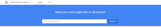
Page speed matters when it comes to creating a user-friendly website. Did you know 47% of people expect a website page to load within two seconds or less? The margin for error here is very small, so this is a good time to test your page speed.
It only takes a few minutes when you use a free tool like PageSpeed Insights. After you input your website URL, it will give you a score from one to 100 based on how optimized your site’s speed is. Along with a final score, you’ll find a detailed list of things to look out for when improving your website.
Pay attention to website speed, as it’s one of the most common reasons why people leave websites. As attention spans continue to shrink, having a fast-loading website will help you satisfy your audience’s expectations.
Is your content readable?
If someone comes to your website and sees a block of text, whether it’s on your homepage or a blog post, they may run the other way. No matter how valuable your content is, it won’t be effective if it’s not formatted correctly or written concisely. As a quick fix, formatting is the best way to make your content more readable.
Online readers prefer to read content that is formatted with headings and features short paragraphs. You may notice I keep most of my paragraphs to three sentences at a maximum. This is because visitors feel overwhelmed if paragraphs are too long.
To make your content more readable, here are a few quick fixes:
- Use headings and subheadings.
- Include bullet-point lists or numbered lists.
- Choose a font that’s easy to read.
- Adjust the text size so people can easily read on any device.
- Break up your content with interesting visuals and brand imagery.
- Shorten your sentences and paragraphs when possible.
- Be mindful of the line width on your website.
If you need more inspiration, open three of your favorite blogs in a new window. Take note of how they format their content and how you can take a similar approach. Then start making your changes when you write your next article!
Do you use white space in your design?
Have you ever visited a website that felt too… crowded? That’s usually because it has too many design elements competing for your attention. Without regard for white space, designs often look too busy or distracting to the end user.
You need white space in order to guide your audience to the most important elements on your website. Ample white space gives your website breathing room to deliver valuable content while minimizing distractions.
Designer Ellen Lupton says, “Design is as much an act of spacing as an act of marking.” I couldn’t agree more! This is why I tend to gravitate toward more minimal, clean designs. You too?
Some of the easiest ways to include white space in your designs include:
- Use ample padding (which increases margin space).
- Remove borders.
- Adjusting your letter and line spacing.
- Limit your design elements.
- Shorten copy whenever possible.
Of course, white space doesn’t need to literally be white. Instead, look at this example from Marnie Cornell Photography. Before collaborating, we knew it would be important to include short snippets of copy, a couple of photos, and lots of white space around this section so it didn’t feel overwhelming. We’re both happy with the final result!
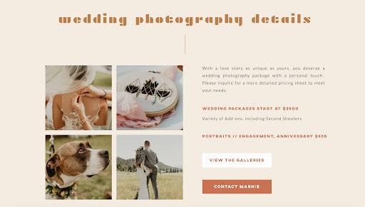
I remember hearing that you should always take away at least one design element before presenting a final design to a client. This is done to create an even simpler, more user-friendly end product. I usually follow this principle when designing client websites, and you can do the same on your own website.
Have you selected high-contrast colors?
You’ll need to choose a brand color palette in order to keep your visual branding consistent, but it’s important to think about contrast. Using high-contrast colors will not only help your design look better, but it’ll also make it more accessible to those with visual impairments.
There’s a reason why most books feature black text on white pages. These two colors have incredibly high contrast, making it easier to read the content on each page. This doesn’t mean you have to use white and black for everything, but it’s the reason why you have to squint to read white text on a light grey background.
When you want a design element or piece of copy to stand out, use high contrast colors! Let’s see this in action on Hotsource Yoga’s website. When you look at the section below, what stands out to you first? You’d probably say the teal “View Class Schedule” button.
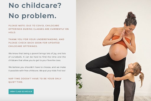
That’s because this color has the most contrast of any other element in this section. This is done intentionally to guide visitors toward their main CTA. You can use the same principle of design when you create your website.
Are you tracking your website’s performance?
Lastly, it’s difficult to create a user-friendly website if you aren’t making ongoing improvements. You won’t know how users are interacting with your website until you track its progress and performance over time.
Some of my favorite tools for doing this are Google Analytics and Hotjar. Google Analytics is great for gathering metrics, measuring your website’s growth, and monitoring each user’s actions on your site.
Google Analytics will help you discover theories for improving your site, but Hotjar will help you test those theories with their website heatmaps. Instead of playing the guessing game, you’ll have insights from real users who are interacting with your website.
It’s also easier to install Hotjar into your website versus sending a long survey to clients or people in your audience. You’ll actually see how they’re interacting on your site and get unbiased opinions from people who are visiting your website for the first time. The insights are truly invaluable!
Is your website user-friendly?
Now you have all the knowledge you need to put your website to the test!
Use these questions as a checklist as you walk through your website and assess your progress. How user-friendly is your current website, and what changes do you need to make to improve it for the long term?
Remember, the first (or second or third) version of your website doesn’t need to be the last. Instead of stressing about making it perfect, dedicate your time to making improvements as you go. I recommend revisiting this list every six to nine months to ensure you’re on the right track.
You’re already well on your way!


