Creative Entrepreneurs, Interior Designers, Photographers, SEO, Showit, Website Design, Wedding Professionals
Contact pages are often treated as an afterthought because they seem so simple.
All you need is a short contact form and you’re good to go, right? Wrong.
While you may be tempted to use a bare bones Contact page, you could be missing out on converting more leads.
A Contact page acts as the gateway between you and your audience. It’s the place that transforms a website visitor into a potential client or buyer.
Don’t let your Contact page design, content, and form let your sales momentum stall out. Instead, create your Contact page with intention. You can’t have a strong website strategy without it.
If you’re struggling to bring traffic to your Contact page or not seeing enough people convert, let’s determine where website visitors are falling off.
Why no one is using your Contact page
I’m not arguing for your Contact page to be the most inspiring or creative page on your website. That’s not why people are ignoring your Contact page.
Instead, it might be lacking some of the essential elements your Contact page needs to succeed. You don’t need a lot of bells and whistles to make a great impression on this page. A few small tweaks can make a world of difference.
If you find yourself making these mistakes with your Contact page, let’s clear them up so you can start generating more leads.
It’s hard to find
One of the biggest mistakes you can make is hiding your Contact page. It should be visible on every page of your website. This makes it easier for incoming leads to contact your team when they’re ready to learn more about your offers or hire you.
It’s essential to have your Contact page linked in your main website navigation bar or in the top menu. We did this when creating Aisle & Co.’s website and even added it as a bold button in the top right corner of their website.

Ideally, if you add a Contact button to your website navigation, it will be in a high-contrast color as compared to the background color of your navigation.
Since we used a standard white background, it made sense to choose black because it has the highest contrast with white. You can also choose a color from your brand color palette if you’d like.
It isn’t titled Contact
Do you ever feel like you have to be overly creative or innovative with your page titles? Some entrepreneurs title their Blog page as ‘Journal’ or ‘Thoughts,’ but it would be so much easier to find it if it was simply titled ‘Blog.’
This is your permission slip to not feel like you have to reinvent the wheel. Instead, streamline your website navigation by using ‘Contact’ or ‘Contact Us.’
This is what we did for Kennedy Occasions’ website/contact, and it works really well. Every page is clearly labeled and easily understood. Incoming website visitors never have to pause and think about what they’ll discover on each page.
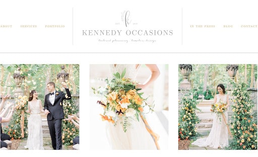
However, if you decide not to use a term like ‘Contact’ for your page, please make sure you use a word or phrase that says the same thing. This could be a title like ‘Inquire’ or ‘Get in Touch,’ but ‘Contact’ is still the winner.
As a final note, be sure to use the URL format of “[yourdomainhere].com/contact” whenever possible. This will make it easier for people to find your Contact page if they’re directly searching for it.
It has too many form fields
If you’ve been around the business world for a while, you probably know all about decision fatigue. When you give visitors too many options to choose from, they’ll feel overwhelmed and won’t want to take any of them.
Also called analysis paralysis, this feeling can lead to a decrease in website conversions. To ensure this doesn’t happen on your Contact page, try to use as few form fields as possible.
How many form fields do you need to use so that you still get the initial information you need but don’t ask too much of your audience upfront? This will be your sweet spot.
When designing Morgan’s Contact page, we decided it’d be best to reduce her form fields so it’s easier for brands and client leads to reach out. Since Morgan offers many services, she added a question to determine what each person is inquiring about.
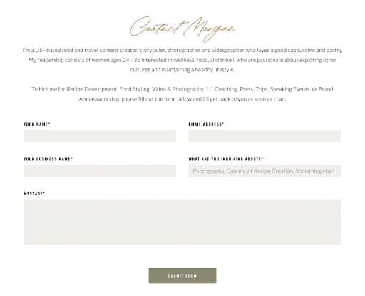
By doing this, Morgan can skim the inquiry and know exactly what the person is looking for and how they’d like to work with her. She could have asked even more questions about their ideal timeline, budget, needs, availability, and more, but she leaves that information for her email replies and discovery calls.
As a rule of thumb, look at your Contact page form and see if you can eliminate one thing from the list. If so, do it! Then, monitor your website analytics and see if it makes a difference.
It’s missing a photo of you
While it isn’t a requirement for you to have a photo of yourself on your Contact page, it certainly helps! Some people may go straight to your Contact page if they want to get a hold of you, meaning they could bypass other areas of your website that may have more photos of you.
If you are building a personal brand, want to be the face of your company, or simply want to show incoming leads who they’ll be talking to, adding a photo to your Contact page just makes sense.
When we created Lindsey’s Contact page, we knew it was important to show the face behind her Drewes Real Estate brand. This way, upcoming home buyers and sellers know who they’ll be hearing from and working with.
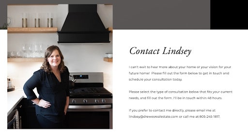
You can repurpose a headshot of you from a recent brand photoshoot or add a photo of your growing team. A photo can add a personal touch to an otherwise simple Contact page.
It doesn’t include your direct email address
Some visitors won’t want to use your contact form. Studies have shown that 67% of people would rather email someone directly than fill out a contact form.
Ideally, your Contact page will have a contact form and will include your email address for those who want to contact you directly. Depending on the visitor’s preference or the nature of their inquiry, they can decide how they’d like to get in touch with you.
Following the example of Corry’s Contact page, you’ll notice how she includes her email address after a short welcome message. You can do the same on your Contact page.
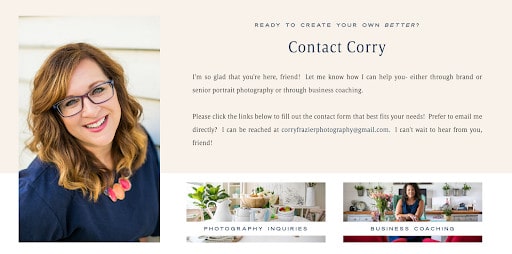
I recommend all of my clients include a direct email address on their Contact page. Sometimes it makes sense for them to include their email address in their website footer or other parts of their website, depending on their goals.
It leaves out your location and office hours
Did you know adding your location to your Contact page can help with strengthening your local-based SEO? It tells Google that your Contact page aligns with the rest of your website and you truly are locally based in your area.
It also makes it easy for visitors to quickly find where you’re located so they can decide if they want to stop by. Since Axiom Tattoo’s shop is based in San Diego, it made sense for us to include their location and shop hours on their website.
We created a sidebar to keep this information separate from their contact form. It also stands out so anyone who is skimming through their Contact page can find the exact information they need.
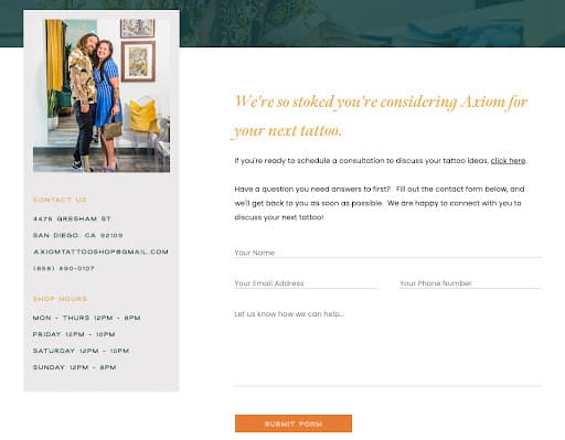
I recommend doing the same if you run a brick-and-mortar store or work out of a studio location that clients will frequently visit.
Including office hours can also be helpful for all service providers—even those who work online—so people know when they’ll hear from you. That way, they aren’t waiting around for a message over the weekend if you clearly state you take Saturday and Sunday off, for example.
It’s time to rethink your Contact page
First things first, use these guidelines as a mental checklist you can go through as you review your current Contact page.
Is it missing these key elements? Are there any tweaks you need to make?
No matter if you want to reimagine your current website or launch your first website, my Showit website templates all come with an optimized Contact page layout. Following the video tutorials, you can easily customize it to fit your needs.
Of course, a Contact page is only one piece of the bigger puzzle that makes up your website strategy. However, it’s usually a simpler place to start when building your website.
To see these Contact pages in action, check out my Showit website template shop and see which one is your favorite!