Creative Entrepreneurs, Interior Designers, Photographers, SEO, Showit, Tips & Tricks, Website Design, Wedding Professionals
Getting more traffic to your website is hard enough.
Trying to keep your audience’s attention while you have it? That’s even more difficult.
However, I have a few tried-and-true strategies to help you keep visitors on your website for much longer than you ever thought possible.
This will help you decrease your bounce rate and increase your conversion rate, giving you the best of both worlds!
So, what are you waiting for? Let’s get started!
Format your content so it is easy to digest
One of the simplest techniques you can use to keep visitors on your website longer is in formatting your content. As people’s attention spans continue to shrink, you’ll need to create scannable content.
Sure, some readers will read all of your content, but others are simply there to skim it. This is why it’s best to frequently use headers that state the main focus of each section and capture your audience’s attention. From there, they can decide whether or not they want to continue reading the summarized content.
A perfect before-and-after example of this quick fix is from my client Allie Atkisson Imaging.
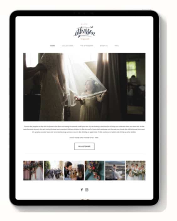
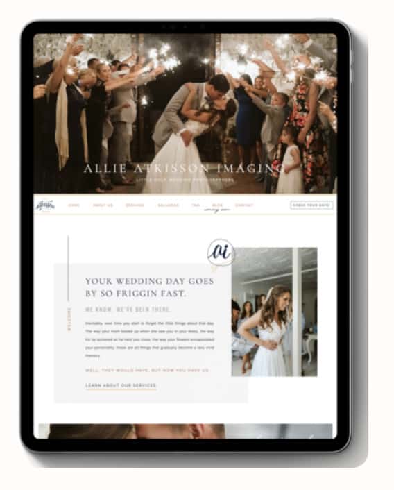
Her previous site (pictured left) didn’t have a header that introduced her main section of copy. In her redesigned site (pictured right), we wanted to make sure her clients knew exactly who she helps (brides) and what she can help with (being more present since their wedding day goes by fast).
Another formatting tip is to avoid writing blocks of text.
Walls of text feel overwhelming to your reader, making them feel like it’s even more of an investment to read your content. Instead, break it up by including two to three short sentences in most of your paragraphs.
Let’s look at another before-and-after example, but this time, it’s from my client M Cake Design.
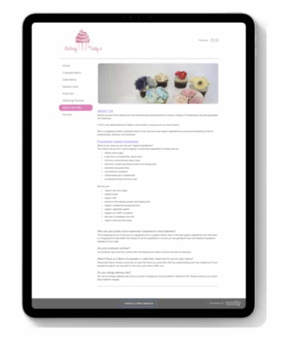
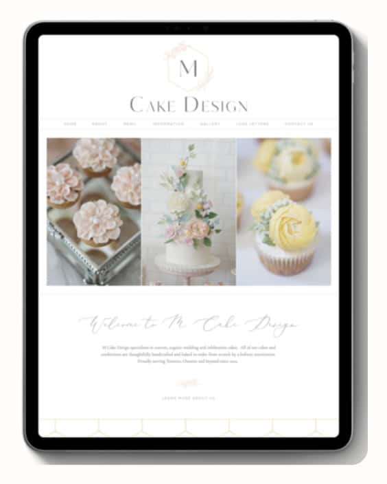
We were able to really uplevel her website design simply by condensing the amount of copy she had on her previous website (pictured left) and making her mission statement easier to read on her homepage (pictured right). Paired with a few gorgeous product photos, this new website looks immediately more warm and inviting than the other.
My hope is that these tips allow you to make small tweaks that will make a big difference!
Improve your website loading speeds
No one likes a slow site. I repeat, NO ONE.
In a recent study, it was found that 40% of website visitors are not willing to wait longer than three seconds for a website to load. Three. That’s it.
That means if your website is loading much slower than three seconds, you will be close to losing half (or more) of your website traffic. Most people in this case would click the exit button and possibly go to one of your competitors’ sites. We don’t want that!
To make sure your website is performing well and loading fast, I recommend checking your site speed with Google PageSpeed Insights. You can find this in your Google Analytics account, which you hopefully have set up with your website.
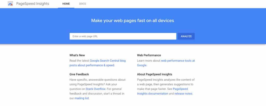
If you’re looking for another option, you can also look into Pingdom Website Page Speed Test or GTMetrix. Since Google is the most popular search engine, I usually recommend it above these other alternatives for a more accurate result.
Most of these tools, however, will give you an idea of how well your site is running and you’ll walk away with a few tips to help you make quick improvements.
Simplify your website navigation
Are you making your website visitors work too hard to find what they want? If so, this may negatively affect your website performance. One of the best ways to improve this is by focusing on simplifying your website navigation.
When you are streamlining your navigation, it’s best to begin by determining which pages are the most important on your website. You don’t want to include dozens of links on your top website navigation bar. That would be overwhelming and disorienting for any user.
Instead, feature the most important pages prominently on your website. My own website has six main navigation links which look like this:
They include:
All of these links and pages tie back into my main website goals. While I could add more free resources and other helpful pages to this navigation, it’s better to keep it simple and straightforward with these six links.
I usually recommend highlighting four to seven navigation links at the top of your website, but you may wish to include a few more in your bottom navigation. This also helps you save on space in other areas of your website without confusing your visitor.

Include search functionality on your site
After talking about your website navigation, let’s keep going with strategies to help your visitor easily find what they’re looking for. Another way to do this is by adding a search bar to your site.
Depending on your website platform, this can be a relatively easy functionality to add.
Since I usually design my client websites on Showit, this option is easy for me to include. You can put the search bar in your top website navigation, but I really like how we included it in my client Rachel’s blog sidebar for The Holistic Mrs.
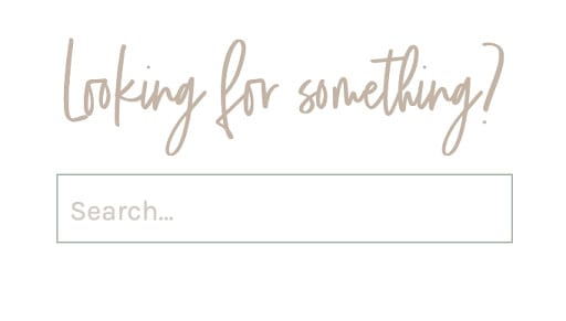
By adding a search bar, you’ll help visitors search for topics, words, or phrases they’re interested in learning more about.
They can easily find what they need without having to email you directly or going back to Google to find your best resources. Naturally, this will keep them active and engaged on your website!
Minimize advertisements and other distractions
Have you ever visited a website that’s packed full of ads? It’s one of my biggest turn-offs as a website user, and I know other people feel the same way.
It’s too easy to get distracted by pop-ups, ads, and anything else that tries to take your attention away from the content on the website page or blog post. There are other ways to monetize your website, but if you decide to use advertising strategies, just be sure to minimize the number of ads you include in your site.
Otherwise, you may see a large amount of traffic coming to your website, but soon after, they’ll leave because they feel confused or overwhelmed. That’s why I like reading blogs that have a simple and clean layout, like my client Lindsey from Drewes Real Estate.
As a simple exercise, think about your top five favorite blogs or websites. My guess is that they either aren’t crowded with distracting ads or they use ads very thoughtfully.
Add internal links to your blog and website pages
Speaking of blogs, let’s talk about an important strategy for increasing your website performance: internal linking! This practice is SEO gold, by the way. I teach more about it in my Simple Showit SEO course, but I’ll give you a quick recap.
Internal linking is the process of including links to other pages or blog posts on your own website. A link to an outside source would be called an external link which we won’t be talking about today, but as a bonus tip, make sure those links open up in a new window or tab so people stay on your website.
Back to internal links! When you’re writing an article for your blog, it’s smart to include links to other relevant articles you’ve written. Then, if a visitor is interested in that topic, they can click on the link and spend time reading the other article.
If you mention a product or service on your website pages, you can also link to the specific sales page or landing page for it. These internal links tell Google that your website is more valuable because your content is woven into your site multiple times as a helpful resource.
A fun example of how to do this well comes from my client Maria from Bloom & Grow Radio! Each of her podcast notes comes with a list of links from her site that were mentioned in the episode.
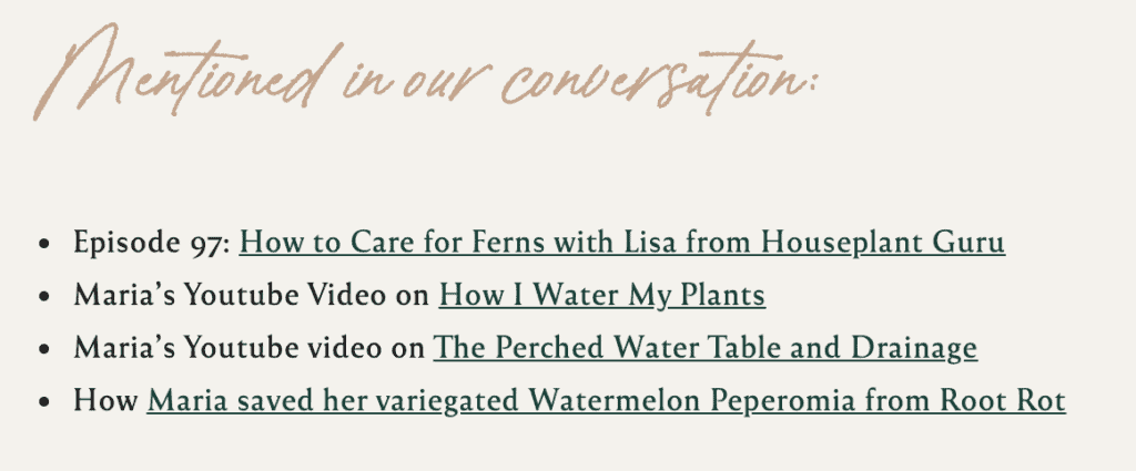
This is a great way to keep people on her website for longer because she’s supplying them with additional educational content. In this case, it’s plant watering! For you, it may be completely different, but you can use the same strategy to keep more of your website traffic.
Include engaging calls-to-action
To keep people engaged on your website, you’ll want to strategically add calls-to-action. Commonly abbreviated to CTA, a call-to-action is defined as the ideal action you want someone to take on your website.
On a Services page, your CTA will likely be to sign up for a discovery call or contact you through a project inquiry form. On an About page, it might be to sign up for your email list or go to a relevant sales page.
Excluding your homepage, every page should have ONE main call-to-action. You can have multiple buttons sprinkled throughout the page, of course, but they should be pointing in one clear direction. That way, your audience doesn’t get analysis paralysis.
CTAs are there to help our website visitors make informed decisions on where they want to go next, which also happens to keep them on our website for longer. That’s why following a website strategy is so important!
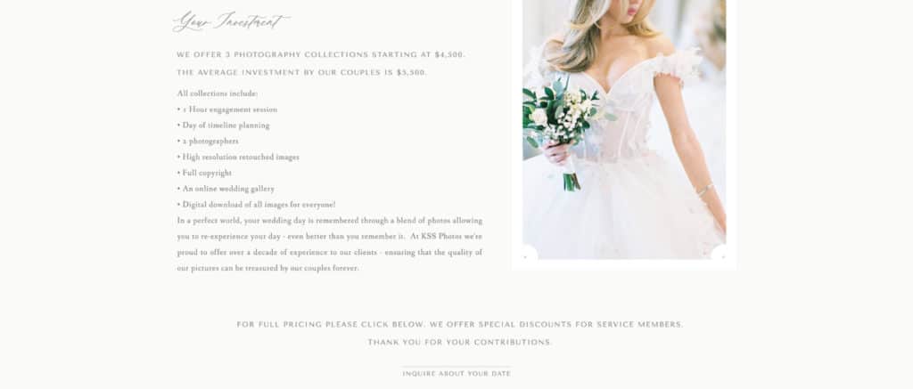
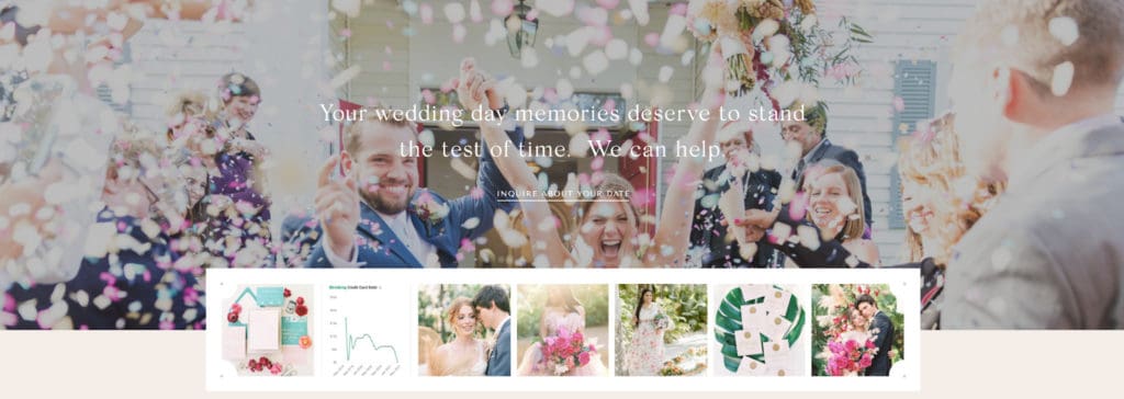
I kept this in mind when I designed a gorgeous website (if I do say so myself!) for Kiamarie of KSS Photography & Films. On her wedding photo information page, it made sense for the CTA links to all lead to the contact page so brides can complete the inquiry process.
That’s why you’ll see the “Inquire about your date” CTA after the investment breakdown…
..and you’ll see the same CTA in the bottom footer of this page!
The only place where you may want to have more than one CTA is on your homepage or if you’re using another page as a directory. This is an easy fix if you’ve included one too many CTAs!
Add interesting videos
Who doesn’t love a good video? Video marketing is on the rise and consumers love interacting with videos. It’s easier than ever to embed videos into your website, whether you use a video player like YouTube or upload it to your site directly.
Video backgrounds have also become all the rage in the design world lately, and I’ve been lucky enough to work on some projects that allow me to play with this strategy.
One of my favorites is from my client Providence Vineyard. They have a completely stunning video background on their homepage that I could sit and watch forever.
Here are a few screenshots from it:
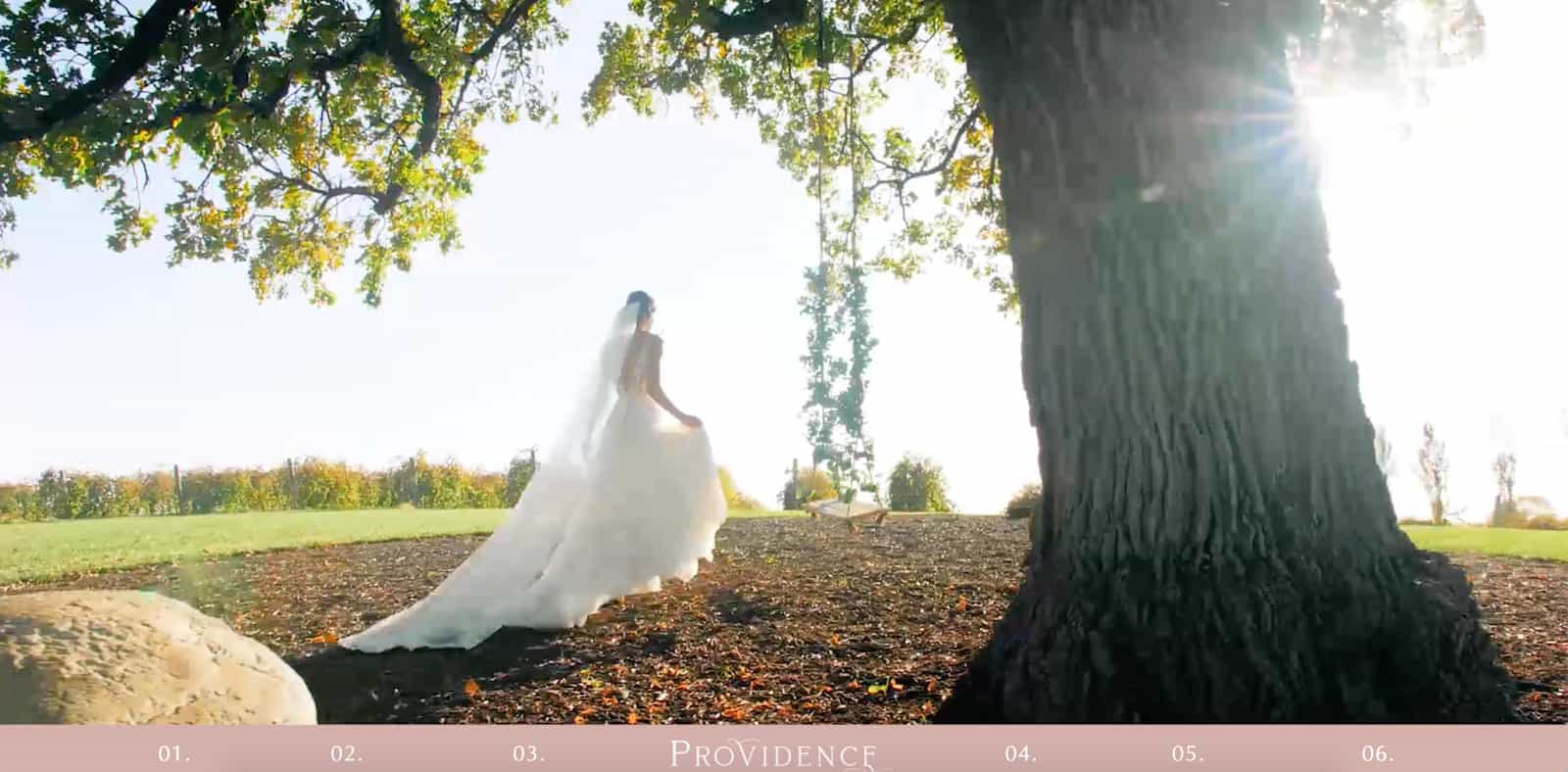

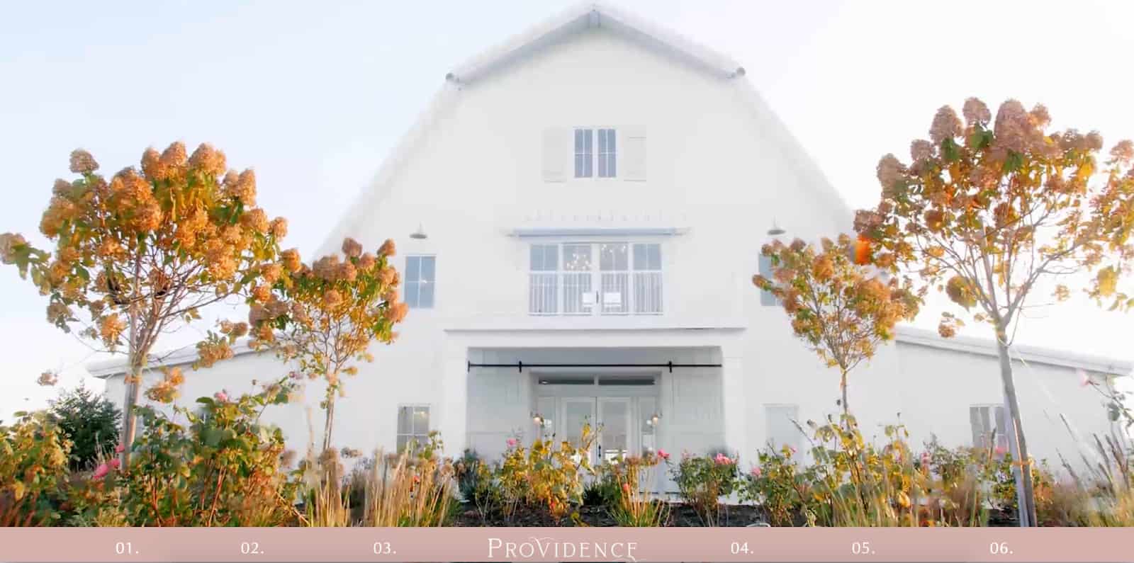
Talk about gorgeous, right? You can see the full version on their website.
While video backgrounds are very eye-catching, they only last for so long. It’s better to keep video backgrounds around ten to fifteen seconds long at the very most, so you may want to use other videos to engage your audience.
A perfect example of this comes from my other client Amber of Refine for Wedding Planners.
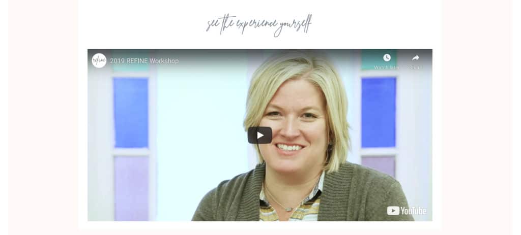
She created a really helpful and beautiful video about her Refine Workshop experience. About five minutes in length, it is featured on her homepage and aims to keep website visitors more engaged with her content.
If you have the budget or capacity to create a video that highlights your business, go for it!
It’s one of the best ways to make a personal connection with your audience while leading them to other areas of your website they’ll be interested in.
That concludes today’s list!
How many of these strategies are you currently using on your website, and how many more do you need to implement?
Good luck experimenting with this!