Business, Creative Entrepreneurs, Interior Designers, Photographers, SEO, Showit, Tips & Tricks, Website Design, Website Platforms, Wedding Professionals
When a visitor lands on your Showit website, they have a goal in mind.
Your job is to build a website that guides them to where they need to go in order to help them accomplish their objective. But how do you do this effectively when each person is driven by a different motivator?
This is where website structures come into play.
Website structure is just a fancy word for explaining how your website is set up. It determines how your pages are linked together, helping you outline every pathway to your end goal.
This may seem like a term that can be hard for creatives to understand, but don’t worry. I’ll break down what it looks like from a non-tech perspective.
First, let’s talk about the benefits of having a clear website structure.
Having a great website structure will help you:
- Improve your SEO so your website attracts the right visitors
- Reduce your bounce rate by keeping website visitors engaged
- Create a better user experience so people get to where they need to go
It’s helpful to outline what your website structure will look like before you create a Showit website (or work with a Showit website designer like me!) to ensure every page has a clear purpose.
If you’ve ever wondered what pages you should add to your website and where they should go, this article will give you the definitive answer you’ve been looking for.
It’s easy to get lost in the weeds, so to speak, when you look at jargon-filled guides on website structure. For a simpler solution, I’ve broken down the basic three steps of creating a website structure that will work for your creative business.
You can complete this activity in less than an hour, seriously!
So, what are you waiting for? Let’s get started…
Determine the number of pages to add to your website
Your first step in creating a website structure for your Showit website is to decide how many pages you want to include. Not only that, but you’ll also need to determine which pages they will be.
It might be helpful at this stage to think about what you ultimately want your website to accomplish. Your goals will dictate how you structure your website.
Do you want to drive more leads for your service-based business? Would you rather build your email list so you can sell your knowledge through digital products? No matter what you choose to do, your website should be built with these goals in mind.
Since many of my Digital Grace Design clients offer services through their business, we will use the most basic example of a website for service-based entrepreneurs.
Most websites in the service industry have at least four pages:
- Home, the central hub of your website
- About, the place where people go to learn more about you
- Services, the place where people can find information about your services
- Contact, the place where you turn interested visitors into leads
It is common for entrepreneurs to include a Portfolio page to show off their work and a Blog to share their thoughts, but we’re going to keep it simple for this example with the four pages you see above. You can surely add more, but you’ll need these four in order to launch your Showit website.
Set call-to-action (CTA) goals for each page
Once you have a total number of pages, you’ll want to determine what the goal of each page will be. Without goals, you won’t know where to point your visitors.
Many entrepreneurs forget this step when they create their Showit website. I’ve seen some creatives add a beautiful photo gallery of their work without any copy and call it good, but they are often hurting their website conversions.
It’s hard for a new visitor to know where to go next if you don’t show them. The best way to guide them to the right place is to think about the direct action you want them to take and include a link or button to help them get there. This action will vary from page to page.
For example, when someone lands on your Home page, they are often starting their journey on your website. They want to scroll through it to learn a little bit more about what you do and determine if you have created content that will help them. If not, they’ll move on to another website.
On your Home page, you can direct people to your Services page so they can learn more about your offerings and how they might benefit each visitor.
Once they are on the Services page, however, what is the next step? Most entrepreneurs would say convincing the visitor to fill out a contact form, and they’d be right!
You can use this same example to guide you through the rest of your pages. Make a simple list that shows the goal of each page before you determine what pages it should lead to next.
This is what it would like for our simple four-page website structure:
- Goal of Home page: To explore what your website has to offer them and if your content positions you as the perfect fit for them.
- Goal of About page: To learn more about your mission and what inspired you to start your business, along with personal details that make you seem more relatable.
- Goal of Services page: To learn more about your services so the person feels comfortable and confident enough to fill out a contact form.
- Goal of Contact page: To fill out the contact form with their personal information so you can follow up during business hours.
Let’s finish the final step with a mindmap!
Create a simple mindmap to show the full user journey
At this point, we know the four pages in our example (Home, About, Services, and Contact) will need to be intentionally linked together in order to move the website visitor through the rest of the site.
One of the easiest ways to see how they all connect is to create a mindmap. You can use a free mind mapping tool like I did or create your own inside Photoshop or Canva.
Your mindmap simply is a visual representation of every path your website visitor can take before getting to your end goal. In most cases, it will be your Contact page because that is where you can turn visitors into warm leads.
You’ll notice that this mindmap starts with your Home page. I consider this to be the epicenter of your brand since many people who visit your website for the first time will come through your Home page. This is especially true for new visitors who are directly searching for your website or a keyword you rank for.
From there, we have added another layer with your other three website pages. Do you see how the Contact page is in green? I did this to remind myself that the Contact page is where we ultimately want each person to land. It’s our end goal. Of course, you can choose whatever colors you’d like (or even fit them to your visual branding!) but this bright palette works for our example.
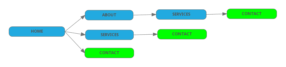
With every potential path outlined here, you’ll notice it stops after the Contact page. This is done intentionally to remind us that it’s the final destination for every website visitor.
For example, if the visitor clicks on a button or link that brings them to the Services page, the entire page will point them to the Contact page. If they want to learn more about you on the About page, they can explore the page until it leads them to the Services and then Contact page. No matter what page they start on, they’ll end in the same place.
If you want to invest in a Showit website but aren’t sure where to begin, I’d love to help you create a streamlined website structure and design a website that’s uniquely your own.
Click here to learn more about my services or contact me today for more information!