
52.79% of website traffic comes from mobile devices, the mobile design of your website can no longer be an afterthought.
While you may have more freedom and flexibility when designing for larger screens, many visitors will be landing your website’s mobile version. Mobile traffic is predicted to increase year over year as smartphones grow in popularity.
Did you know 80% of the top-ranked websites are mobile-friendly? Google prioritizes websites that are built for mobile marketing, making it more important than ever for you to build an effective mobile site.
Why design websites for mobile screens first?
Designing for mobile devices isn’t new, but mobile-friendly design is different from mobile-first design.
Mobile-friendly website design simply means all of your images, text, videos, and links are easily seen and accessible on mobile devices. Mobile-first website design, however, takes it a step further by encouraging designers to create for mobile devices first.
In the past, website designers almost always designed for larger desktop screens first and then tweaked their design to fit mobile screens. Mobile-first design says to flip the script and prioritize smaller screens first.
Let’s talk more about why mobile-first design matters for modern website designers and entrepreneurs alike.
Prioritizes website features that matter
By starting with mobile screens, designers must prioritize the most important aspects and features of their design. They don’t have as much visual real estate to design on a mobile screen as they do on a desktop.
It’s been said that once a website is designed for mobile, designing for other devices—like desktops, laptops, and tablets—will become easier. Mobile design is, by nature, very streamlined.
By considering how you want your user experience (UX) to look and function on mobile, you’ll have a clearer picture of how to create a similar UX design on desktops.
For example, you can turn a quick list of how-to steps on a mobile screen…

…and transform it into a stunning three-column design on desktop screens, much like we did for The Abundance Group’s website.

I usually recommend using one or two columns at the very most on mobile devices. You’ll have more room to play with on desktop screens, but for now, focus on designing for smaller screens.
If you’re planning to use interactive features on your website—such as quizzes, sliders, timelines, chatbots, and slideshows—make sure they function well and look great on mobile. Otherwise, they may create a poor user experience.
Helps you simplify your design
Less is more when it comes to designing your website. Even if you have a variety of features and plugins you can add to your website, it doesn’t mean you should.
If you start designing for larger screens, you may be tempted to add bells and whistles to your site that can’t be duplicated on mobile devices. When this happens, you’ll either have to scrap it altogether or create a different mobile version, which is still possible with Showit.
In addition to reducing distractions and decision fatigue, taking a minimalist approach to design will also help you improve your SEO performance over time. It’s easier for search engines to crawl your website content and imagery if it’s designed in a simple, strategic way.
Speaking of design, there are a few strategies you can use to create a more seamless user experience on your mobile devices.
You’re more likely to see hamburger menus on mobile screens that hide your main website navigation, leading to a more minimal look and feel. An example of this can be seen on Jenna Greenawalt’s website where we kept her links hidden beneath the menu, only to be seen when clicked.

Minimal websites often feature bold headings and large typography that makes a statement. This makes your content easier to read and understand at a quick glance as someone scrolls through your website.
You can see how this is accomplished in HotSource Yoga’s website. With a bold, sans-serif font, each header stands out and tells the reader what they can expect to learn about as they continue exploring the site.


You’ll also see plenty of white space used on minimalist mobile sites. White space refers to the amount of space (also called padding) that’s used to give your design more breathing room.
To ensure Aisle & Co’s website had enough white space, we added additional text spacing and line elements to break up the text and images.


All of these design decisions led to a minimal website that subtly encourages users to continue scrolling their site. You can use the same strategies when designing your mobile-first website.
Highlights the best quality content
When you don’t have as much space to utilize on mobile devices, you’re forced to create concise messaging. This is a great practice to improve your website copywriting as you learn to say a lot with as few words as possible.
Any additional clutter may distract your mobile user from the more important things they’re meant to explore and discover on your website.
When we were building Radian Photography’s website, we knew their content had to speak to mobile users as much as desktop viewers. Because their imagery is displayed on a smaller screen, their website content had to pack a punch and create a lasting impression.

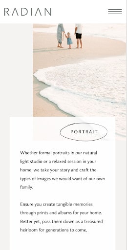

The same can be said for any business that heavily relies on visual storytelling to sell its products and services. Don’t overlook your content when you’re creating a mobile-first design! It’s truly the heart of your website.
Get started with a mobile-first website design
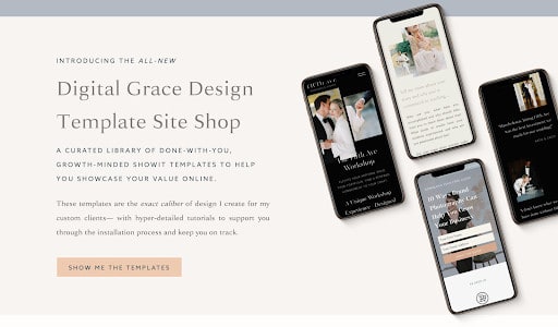
If you aren’t sure how to get started with mobile-first design, get inspiration for your site by visiting my Showit template shop!
In the shop, you’ll find a variety of mobile-first designs that look stunning on any device. All you need to do is customize them with your visual branding, content, and imagery for a website that’s completely your own.
If you want to eliminate the learning curve and work with a designer to customize your template, let’s schedule a 1:1 call and talk about working together!


