Is it possible to add features to your website that actually do more harm than good? Yes, and you’d be surprised how often it happens, even unintentionally.
Take it from me. I’ve created hundreds of Showit websites for my clients and seen thousands more. While there aren’t many rules to follow when creating a website, some site elements should just be removed altogether.
Poor-performing websites tend to have a few things in common, and most of them are these website features. Luckily, you can remedy them quickly with the right guidance.
Let’s talk about the key features you’ll want to avoid adding to your website, and what you can do instead.
6 website features you’ll want to avoid
As you go through this list, you may want to audit your current website to determine if you’re using any of these features. Make a mental (or digital) checklist of what you need to tweak and what’s already working well on your site.
Let’s get started with the first element: autoplay videos.
Autoplay videos
Have you ever landed on a website and started hearing music and other sounds out of nowhere? It’s probably because the website features a video with an autoplay setting.
This was one of my biggest pet peeves back in the Myspace days, and it still is. I’m not alone, since 80% of visitors react negatively to autoplaying videos with sound. I’m not sure why websites continue to use this trend, but nearly all of us can agree it needs to end.
If you want to autoplay your video, think about adding it as a background to your website. We used this strategy on Lindsey’s website for Drewes Real Estate. I mean, who wouldn’t love seeing the sprawling landscapes of Santa Barbara neighborhoods and the coast?

The best part about this video background is that it doesn’t autoplay any sounds. Any incoming website visitor can simply enjoy looking at the moving background before they continue to scroll through Lindsey’s site. It’s a win-win!
Low-resolution images
While I’m all for adding bold, brilliant imagery to your website, it’s important to ensure you upload high-resolution image files to your website. Otherwise, your photos and graphics may look a little pixelated, blurry, or fuzzy.
Improving the resolution of your imagery is an important step whenever you launch a new website or audit your current site. The best way to do this is to simply view your website design on multiple devices to see how it looks.
Does an image look great on mobile but not on desktop? Does your website cut off a certain part of the image when your screen reaches a larger size? These are all important things to consider when designing your website.
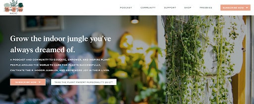
For example, look at Maria from Bloom and Grow Radio’s homepage. You’ll notice how her hero image (meaning the main photo background) is crisp on the right-hand side, showing the beautiful potted plant. However, on the other side, the image has a bokeh effect to intentionally blur the background so it’s easier to read the overlay text.

When you look at her site on mobile, you’ll notice that we created a cropped version of the same photo, showing off more of the plant. This creates a striking design on any device with this high-resolution brand photo.

You’ll have more control over how these images are shown when you build your website inside Showit, but you still need to check on the resolution. Each website platform comes with its own resolution and file size requirements, so feel free to look into what’s needed to make your site shine.
Too many plugins
When you use Showit, you’ll have the opportunity to add on a WordPress blog if you so choose. I highly recommend it because blogging can improve your SEO performance and help you build more trust with your audience.
I love how Showit and WordPress work together, but with WordPress, you can install virtually any plugins you want. Plugins like Yoast SEO can make a huge difference in your business, but it’s easy to get carried away and add too many plugins to your website.
While plugins can power up your website, too many of them can slow your website way down. It can also cause site crashes, security breaches, and more. Experts recommend never exceeding 20 plugins, although I’d recommend more around 10-15 when possible.
If you find that your website’s loading speed is dwindling or you’re experiencing other issues, be sure to check on your plugins. Also, you’ll need to regularly update your plugins like any piece of software so you’re running the most current version.
Hard-to-read fonts
Can you imagine landing on someone’s website and seeing any of the fonts below? You’d either squint to try to read what it says or scroll past it without bothering to give it a second glance.


Some fonts look really cool from a design perspective, but when you try to use them when writing content, it can look like a big ol’ mess. If your content is hard to read, people will be more likely to skip over it.
Since copywriting is an essential part of the conversion process, you’ll want to choose fonts that are easy to read. This is especially important when using script fonts which can often seem hard to read.
I also recommend creating a brand board that defines when and how you use each font. That way, you’re always using easy-to-read fonts for the most important content.
Overwhelming portfolios
It may be tempting to show a wide variety of your work through your website portfolio, but it’s much better to choose your best quality work. Otherwise, you may overwhelm your audience with options.
You may be wondering how many projects you should include, and my honest answer is that it depends. It’s better to ask yourself how many projects your ideal client will need to see in order to determine if you’re the right fit.
If you choose a small number of projects, be sure to include case studies that give a deep dive into each project. If you choose a larger number, you may want to keep the focus on the actual work itself and include other testimonials throughout your site to increase trust.
Corry of Corry Frazier Photography wanted her website to not only look streamlined but also include a select number of brand photography sessions in her portfolio.

To make sure it didn’t look cluttered with photographs, we decided to show a highlighted image from each featured session while giving visitors an opportunity to view the full gallery if they’d like to.
This is a great way to ensure you don’t skimp out on showing your work while keeping your website looking organized and minimally designed. No matter what industry you’re in, think about using categories to group similar projects together or choose your favorite projects to highlight.
Outdated blogs
I can never recommend blogging enough, but you must consider how often you will be able to post on your blog. Creating blog content will help you create a high-performing, SEO-optimized website in the long run, but it’s better if you can publish content consistently.
This doesn’t mean you need to create daily content in order for your website to stay relevant. You’re a business owner and wear too many hats to make that happen! Instead, it’s best to post weekly if possible or even monthly if that feels more doable.
No matter which posting schedule you choose, it’s best to keep it consistent from month to month. For over four years, I’ve been consistently posting on my own blog so my readers have fresh content each week. I also have a team that collaborates with me to write, repurpose, and schedule all of my content, so you don’t have to do it alone.

If you aren’t sure whether blogging is worth the time investment, I challenge you to commit to blogging weekly for up to six months. If you can utilize keywords in your posts, that’s even better! Once you finish, regularly check into your website analytics to see how much of your traffic comes from blog posts. You will likely see an increase simply by blogging regularly!
Moving forward with your website design
Now that you’re aware of what website features to avoid, you’ll be able to spot elements that could be decreasing your website’s performance.
It’s always good to ask yourself if you’ve been annoyed by any of the website features you’re adding to your website. If so, chances are other visitors will feel the same way.
Sometimes you may need to remove a website feature from your website, whereas other features may need to be adjusted. For example, if you don’t like email pop-ups but see that they can increase opt-ins, find a way to create a pop-up that doesn’t feel as intrusive or distracting to the user.
Keep asking these questions as you keep an eye on your analytics. Also, revisit this list whenever you need a reminder so you can determine the right path forward.
Happy testing!
