Creative Entrepreneurs, Interior Designers, Photographers, SEO, Tips & Tricks, Website Design, Wedding Professionals
Once you’ve launched your website, it might be difficult to know how it’s really performing.
This can especially be true if you haven’t seen as many inquiries as you expected but aren’t quite sure why that’s happening.
If you discover your site traffic has been steadily increasing but you aren’t seeing many conversions, your website bounce rate could be the culprit.
Surefire ways to decrease your website bounce rate
Your website bounce rate shows how often someone lands on your site and takes no other action before closing your site. They may scroll through your site for a few seconds, but if nothing catches their attention or they have a poor user experience, they will likely leave your website as quickly as they came.
Average bounce rates change based on your industry, but it’s best to keep yours around 41-55% if not better. If you check your Google Analytics dashboard and see that your bounce rate is much higher, don’t fret!
There are a few simple yet strategic moves you can make in order to decrease your bounce rate. In most cases, you won’t need to rehaul your entire website to make these necessary edits. They can be done at any time, so let’s jump right in!
Optimize page loading speeds
Let’s face it: nobody likes a slow website. I’m sure you know what it’s like to land on a website or a blog post you really want to read but it ends up taking way too long to load. What do you do next? If you’re like most people, you’d click the exit button and search for another resource.
Optimizing page loading speeds is more important than ever, especially since we have shorter attention spans than goldfish now. As technology advances, we’ve come to expect faster speeds with every upgrade.
In a study by Google, they found that only 53% of users are willing to wait three seconds for a website page to load. If your website is packed with too many features, plugins, or even images, you may end up with a very slow-loading website.
If you’re unsure if this fits you, you can conduct a simple website speed test with this free Pingdom tool by inputting your website URL. It’ll only take a moment to analyze your site before giving you a series of grades and numbers based on your website’s current speeds. Also, you’ll receive a list of personalized recommendations for improving your site speed. Pretty cool, right?

Another way you can test your website speed is to look into your PageSpeed Insights in Google Analytics. This will help you determine which pages may be slowing down your website so you can make the necessary changes.
For brands who use a lot of imagery on their website (I’m looking at you, photographers and interior designers!), it might be helpful to compress your image files and shrink the size of your photos if they don’t need to be displayed in a large size.
As you make these changes, keep an eye on your website analytics to ensure your website speed is improving over time. You’ve got this!
Simplify your website navigation
Have you ever been to a site that was nearly impossible to navigate? Maybe the pages listed at the top were titled in a way that didn’t make sense, or there were far too many links to choose from. In this case (and in many others), it would be much better to have a streamlined website navigation.
Since your website navigation refers to the pages you feature at the top of your website, or even in the bottom of your website footer, this collection of links needs to be simple and straightforward.
As an example, my website only highlights six main pages in my website nav bar. Most experts recommend including four to seven pages at the top of your website. Otherwise, it will get too crowded and confusing for your visitors to know where to go.

If you have additional pages you’d like to add, you have two different options. One is to include the pages underneath dropdown links. The other is to add the page to your secondary website navigation which happens to be located in the footer of your website, like this from Glossible:

If you need more help with simplifying your website nav, read this guide on How To Streamline Your Showit Website Navigation. It will tell you everything you need to know in order to get started with this crucial part of your website.
Create a mobile-friendly website design
Well, it finally happened: mobile users have now officially outpaced desktop users. Since 51% of searches are made on mobile devices, I expect this number to only increase with time. If your website wasn’t designed with mobile in mind, it may be time to make some tweaks.
This is a huge reason why I love designing websites on Showit. You don’t have to worry about creating a design that isn’t mobile-friendly because Showit gives you the ability to freely adjust your mobile design. This is a really unique feature that isn’t offered in most website platforms. Trust me, I’ve tried them all!

To learn more about how this works, you can watch this Showit mobile tutorial or even my own tutorial of the whole Showit platform. I have a feeling you’ll love it as much as I do!
Include several call-to-action buttons
One of the best and easiest ways to decrease your bounce rate is to include multiple call-to-action (CTA) buttons. Notice how I said buttons and not multiple CTAs. There’s a big difference, and here’s what I mean.
Most website conversion experts recommend choosing one CTA per page, with the exception of your homepage since it is the central hub of your site. If you try to point people in too many directions, they’ll get analysis paralysis as they become too confused to take any kind of action. That’s the opposite of what we want!
Instead, I recommend having one clear CTA present on each page and sprinkling a few buttons into your main content. Let’s look at my Services page to illustrate this. You’ll notice that I chose a simple “Start Your Project” call-to-action that leads to my Contact page. This CTA button (or link, in my case) shows up multiple times, as seen here:

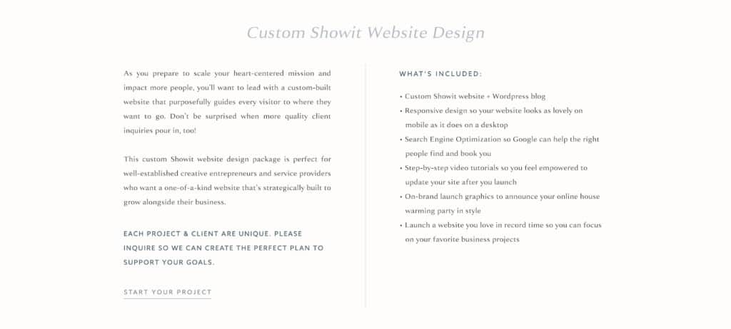

If you only put one CTA button on your page, there’s a good chance someone will miss it as they scroll through the page. By adding multiple CTA buttons, you’ll decrease your bounce rate because your audience will know with absolute certainty where they should go next.
Write longer, high-quality blog content
This recommendation is one of my favorites because it’s the cornerstone of what I do at Digital Grace Design. I’m a huge believer in blogging and think most (if not all) creative business owners should have one. You may not be able to commit to blogging every week like I do, but that doesn’t mean you can’t get a lot out of it!
By publishing several blog posts to your blog, you’ll have the opportunity to personally connect with your audience while educating and entertaining them.
Having a blog will also help you with decreasing your website bounce rate because as more traffic comes in, you’ll need other pieces of content to keep them on your site — not to mention coming back for more!
As you create each blog post, think about how to format it in a way that’s easy to understand and skim through. No one wants to read a wall of text, am I right? This is one of the key ways to ensure your audience stays engaged with your writing. That way, you can direct them to other parts of your website and reduce your bounce rate in the process.
Highlight other relevant articles
Speaking of blogging, it’s also helpful for you to recommend relevant articles at the end of your articles. Not only will you give your readers access to more information and knowledge, but you’ll also decrease your bounce rate. Win-win!
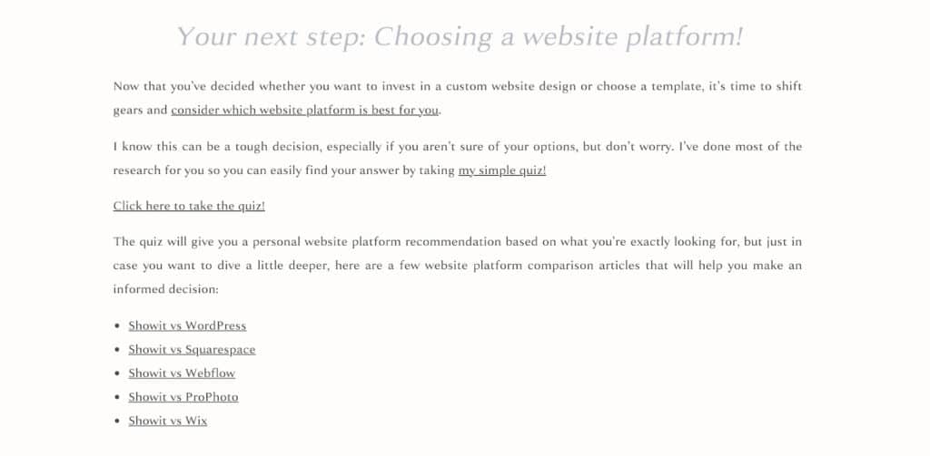
There are a few ways you can do this. One is to create a list of articles you’ve already written and manually link to them at the very end of your blog post. I did this at the end of my custom design vs. template customization article by showing a collection of website platform comparison articles that might be helpful to look at next.
This was simple to do since I know exactly what’s in my archive, but if you don’t want to do this manually, you can add a related-post plugin to your WordPress hosted blog (which still integrates with your Showit website).
Include multimedia content
Who said all content had to be in written form? If you’ve been on social media or surfed the web lately, you’ve already noticed how influential audio and video content is becoming. While it’s still helpful to have written content for the additional SEO value, it’s a great time to mix in some multimedia content.
If you want to start a podcast, you can embed the audio files into your website along with detailed show notes. For more inspiration, check out my client’s podcast at Bloom and Grow Radio. We strategically built Maria’s site to reduce her bounce rate with long-form blog content that features recent podcast episodes, keeping people on her site for much longer.
By offering a curated collection of podcast episodes, new visitors know exactly where to start and how to find what they’re most interested in. It doesn’t hurt that the plant imagery also makes you want to kick your feet up and stay a while on her website. 🙂
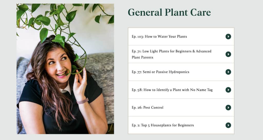
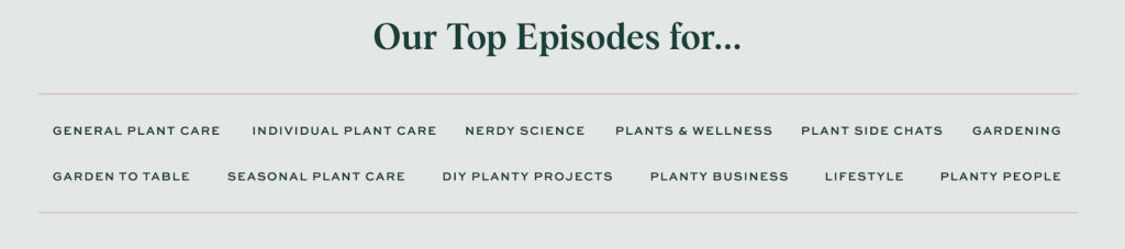
Another thing we did on Maria’s main podcast page was add a list of categories her visitors can choose from to find their ideal episode. Since Maria has recorded over 100 episodes for the podcast, this directory helps a LOT. The more people click through these links, the lower her bounce rate will be.
If you want to take your content one step further, it might be helpful to embed video content in your website. Videos are great for both auditory and visual learners, and their popularity is increasing. Even Instagram has been pushing hard for video with features like Reels, Live, and IGTV. This, along with the rise of Tik Tok, shows us that videos are the future.
There are so many ways you can introduce video into your content strategy. You can:
- Create a step-by-step video tutorial (like this)
- Show a behind-the-scenes look into your business
- Share your best tips and advice on any subject related to your niche
- Collect video testimonials from your past clients or customers (like this)
- Offer a recording of your speech at a conference (like this)
Video content is often seen as more engaging than any other content type, largely because it satisfies more of our senses. Also, we process visuals up to 60,000 times faster than text, so it’s no secret why video content is on the rise. Add this to your website the next time you want to experiment with strategies to lower your bounce rate.
And there you have it! You now have seven new strategies you can implement into your website. How many of them are you already using, and which ones do you want to try first? It’s completely up to you.
In the meantime, here are a few articles that may help you on the rest of your website journey:
- How to Choose the Right CTAs for Your Website
- 10-Point Website Audit Checklist for Entrepreneurs
- Creating a Foolproof Website Strategy
- 10 Website Conversion Tips for Creative Entrepreneurs
(See how I used one of the seven strategies here? So easy!)