Creative Entrepreneurs, Interior Designers, Photographers, SEO, Tips & Tricks, Website Design, Wedding Professionals
When creating new websites, we often focus on everything from design to conversion strategies to copywriting. However, to create the most strategic and effective site, we must also take accessibility into account.
Despite its importance, website accessibility can be easily overlooked when it’s not intentionally woven into the design and development process. That’s why it needs to be addressed and defined from the very beginning.
After all, a website isn’t truly designed with its users in mind if it isn’t accessible.
What I mean is that websites need to be created for ALL users, not just those who can easily navigate any website.
Consider this article your introduction to website accessibility, especially when it comes to design and content creation. It’s not a definitive guide, but it will help you get started and make small tweaks to your site that will make a big difference for this community.
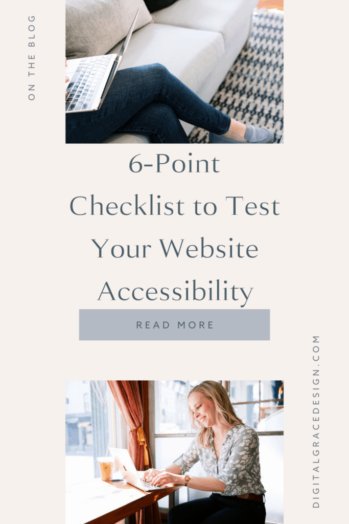
Keep reading for six quick ways to optimize your site for accessibility.
Is your website accessible?
This is the question we want to answer today! While you won’t see every accessibility practice listed in this guide, you will find the most common ones to look for.
As you read through this checklist, keep a mental note of how many practices you’re currently following. Are there any improvements you can make? Which practices are new to you, and how can you incorporate them into your website?
These questions will give you valuable insight into how to make your website more accessible. Without further ado, let’s dive right in!
Are you using heading tags?
A well-organized article or website page always has appropriate heading tags. These heading tags tell your visitor what they can expect to read as they explore your website. My guess is that you often read them when you’re hoping to skim an article to understand the main points. I do this too, and heading tags help us do this with ease!
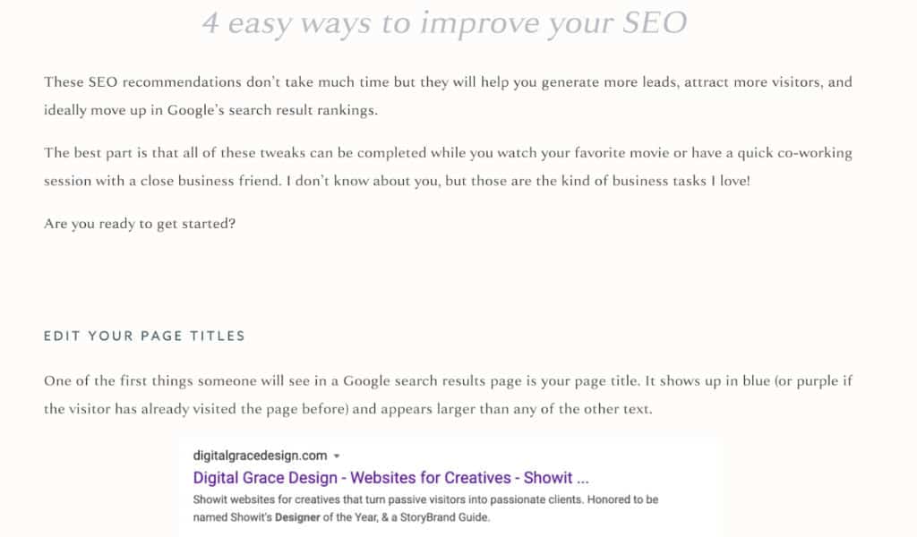
Heading tags will often look like <h1>, <h2>, and so on if you look at them in HTML. However, most website platforms allow you to choose Heading 1, Heading 2, and Heading 3 options inside their user-friendly website builders. You can customize them to look however you want, but in the end, it will look a little something like this:
You’ll notice the heading tags for “4 easy ways to improve your SEO” and “edit your page titles” are different when it comes to font size, color, and placement. This is intended to better organize the content and guide the user’s eyes through the rest of the article.
In addition to better organizing and explaining your content, heading tags also help those who have difficulty scrolling through your website, are vision impaired, or have low literacy skills.
It also improves your website’s navigation and makes it more search engine-friendly, especially when you include relevant keywords into your heading tags. I teach about how to write great heading tags in my course, Simple Showit SEO, but you can get the basics in this blog post.
Are you creating alt tags?
Not only are alt tags helpful when it comes to improving your SEO performance, they also make your website more accessible to those who are visually impaired. Without descriptive alt tags, someone with vision impairments may have a difficult time understanding what’s on the page.
This accessibility tip is important for every business owner, but especially photographers, designers, and other visual creatives. Including an alt tag with your imagery takes less than a minute and will improve your overall user experience.
Since an alt tag is meant to tell users what’s happening in the image, it’s important to write them in a natural way. Refrain from stuffing them with keywords in hopes that your website ranking will increase. Instead, write a short and simple description that explains what’s in the photo.
Let’s see alt tags in action with this portrait photography example from Unsplash.

- Great: “brunette girl smiling with red shirt and lipstick”
- Okay: “woman with brown hair smiling”
- Bad: “portrait photography, model photography, female photography”
Now you know what to expect the next time you have an opportunity to write an alt tag. Don’t miss out on this opportunity to make your website more accessible and user-friendly!
Are you using high-contrast colors?
Have you ever visited a website where the font color was so similar to the background color, you had to squint to make out what it said? This happens frequently and can be detrimental to users who have vision disabilities.
Designers know that the contrast between colors is an essential part of creating an attractive design. This is especially important when it comes to typography design. That’s why the standard is black text on a white background. These two colors have the highest contrast, making it easier to read than other color combinations.
Of course, that isn’t to say you can’t choose other colors than black and white for your website. Where would be the fun in that? Instead, it’s best to be mindful when creating your brand color palette by being mindful about how you intend to use each color. Create guidelines for yourself so you won’t be tempted to use low-contrast colors together. For example, most brand guidelines will indicate which colors to use for call-to-action buttons, headlines, and other key website features.
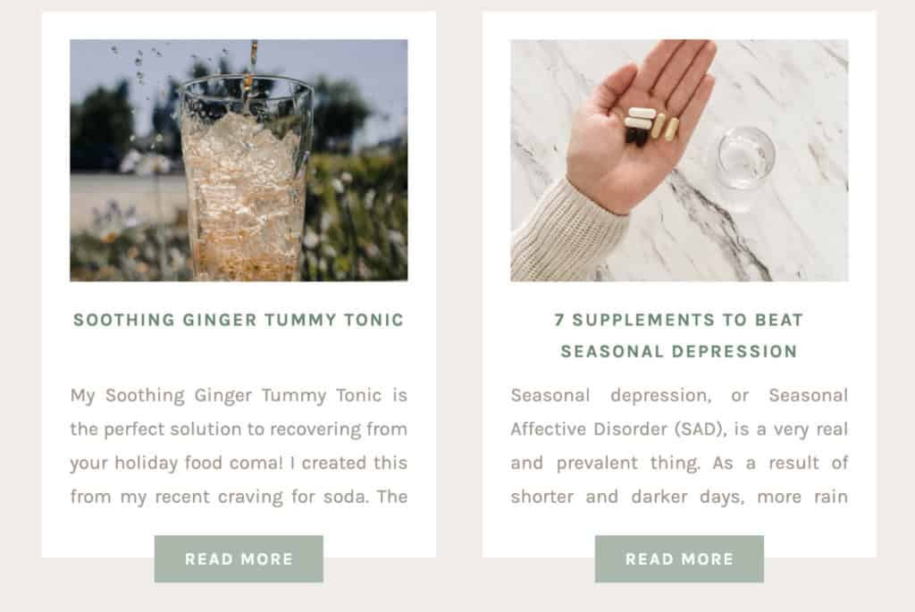
If you look at my blog post preview images, you’ll notice that I have a distinct set of brand colors I use. If I created a graphic with a light orange text color on top of the light beige color, the design would not only look “off” but it would be inaccessible to other visitors.


As a rule of thumb, if it’s hard for you to read or see something, others will find it difficult too. When that happens, swap your design and use high-contrast colors.
Do you allow for text resizing?
A few years ago, it was really trendy to write blog posts with a very small text size in a serif font. Do you remember that? I remember having to squint and readjust my eyes in an attempt to read the text. I can’t imagine how frustrating it would be for someone who is visually impaired.
When someone lands on your website, it’s fairly obvious that it should be easy to read your content, but that’s not always the case. Many websites still miss this key accessibility feature. Most browsers will allow users to adjust the size of your text or zoom in so they can better read your content, but why not make it easier by designing with this in mind?
In order to make your website more inclusive, it’s best to go up a font size. It’s recommended to have a font size of at least 16 pixels on screens or a size 14 on printed documents. This way, it increases your website’s accessibility and readability simultaneously.
Take my client Rachel, the blogger behind The Holistic Mrs. When we created her website, it was important for us to make sure anyone who visited her website could read the content in its entirety. She has the “goldilocks” of font sizes because it’s not too big and not too small for easy reading.
If you’re looking for more accessible fonts, here are some that make the top list:
- Tahoma
- Calibri
- Helvetica
- Arial
- Verdana
- Times New Roman
While you don’t necessarily need to choose one of the fonts above, it can help you start comparing fonts and deciding which is the most accessible choice for readers.
Have you eliminated flashing images or blinking elements?
Did you know flickering and flashing lights can trigger seizures for those with epilepsy? This feature has become really common on video-based social media platforms like TikTok and Instagram. It’s not uncommon to see trends and challenges that involve strobe lights and flashing colors.
Because of the popularity of these engaging features, we’re now seeing more flashing imagery incorporated into websites. While it may seem like these elements create an interesting design, it’s more important to preserve the end user’s experience on your website.
Before you create your website, think about how your use of flashing imagery could affect someone else who is visiting your website. This isn’t to say you need to throw out all interactive elements on your website. Instead, be aware of how they may affect your audience.
I’ve seen more people use content warnings in their video captions when they use flashing imagery, but it’s best to stay away from them when you’re creating content for your website. If you do choose to use flashing images, most website designers recommend slowing down the pace of each flash or blink so there’s less risk of triggering seizures.
Do you utilize audio captioning?
As video marketing continues to grow, it’s more important than ever to make your videos more accessible. One way you can do this for the hearing impaired community is to include auto-captioning with your videos. Some video platforms like YouTube already do this for you!
Much like the closed captioning and subtitles on movies or TV shows, captioning your videos will allow viewers to read what’s being said in the video without needing to hear it. For those who prefer to listen with the sound off, it also helps them have a better experience on your website.
When you are using captioning, it should look a little something like this:
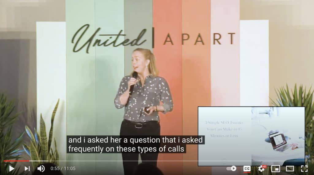
YouTube automatically generates these captions for you, which can save you a lot of time and money. You can even download an audio transcript of your video to include in your blog articles when you’re highlighting a video. I’m so thankful for tools like this that make video accessibility so much easier.
You might also notice that the closed captions appear with a black text box around white lettering. This is done purposefully to make the captions easier to read. Remember when we talked about the importance of using high-contrast colors? You can see how it works here!
While there are other improvements you can make to your website accessibility, these are some of the most important (and easiest) changes you can make to quickly improve your site.
How well are you doing with website accessibility?
After going through this checklist, you’ll have a clearer understanding of what website accessibility means and how you can improve your own website.
To summarize, use the checklist below to make a mental note of anything you decide to edit or introduce into your website in the future.
- DO use heading tags
- DO use alt tags
- DO use high-contrast colors
- DO allow for text resizing
- DON’T use flashing lights or imagery
- DO use audio captioning